Learn about all the built-in modules available in the Template Builder.
Customize your page using tray modules
Begin by setting up your modular pages. To create a new page, under the Pages section, click the + ADD NEW button. See the "Creating a new modular page" article for more information.
To add modules to an existing page in the library, open the page from Pages > Modular Pages and click Add Modules in the header section. From the Modules list, find the module and pull it into the page.
Types of Modules
Below is a list of all modules available in our Page Builder engine. Modules are logically arranged into module types as shown below. Please contact your ViewLift Project Manager to arrange for a demo if any of these modules interests you.
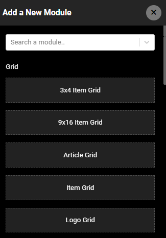
Grid
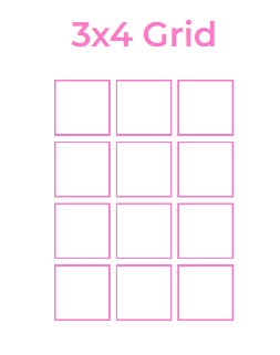
3x4 Item Grid
The 3x4 item grid is a layout that displays four rows of three columns of tiles on a single tray. It is designed specifically for mobile apps, but you can customize the grid number by inputting a desired count in the "Number of Display Items" field. Note: OTT and Smart TV apps do not support grid layouts.
9x16 Item Grid
You can use the 9x16 item grid app layout to arrange thumbnails in a 16x9 matrix. This layout allows for up to 16 rows and 9 columns, but you can customize it to suit your needs. You can also limit the number of tiles you want to display. Additionally, you can add a "See all" icon to the grid and link it to a category page. When a user clicks on the icon, they will be redirected to the corresponding category page.
Article Grid
The Article Grid module can be used to add a grid of articles to a mobile app. The module is similar to other grid formats, but it is specifically designed for mobile apps. This means that the articles will be displayed in a way that is easy to read and navigate on a small screen.
Item Grid
Use this module to programmatically fetch all contents of a specific category on a single tray.
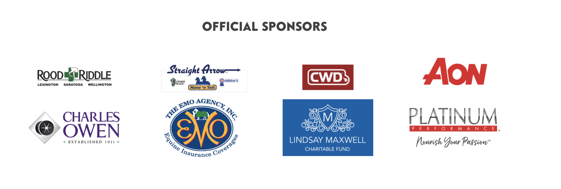
Logo Grid
Use this module to display logos on a page by simply adding the image URL for the logos and publishing the page.
 Tray
Tray
Trays can be used for both website and TV apps. Add a variety of trays to your modular pages.
9x16 Tray
Here is an example of a web tray in 16X9 framing in portrait orientation. Use the module settings to set the desired content type and curate or programmatically add contents into the tray. In a programmatically populated tray, as depicted in the screenshot below, you will see the category info in the foot of the tray, to hide this, click to toggle on the Hide Video Categories option from the tray settings.
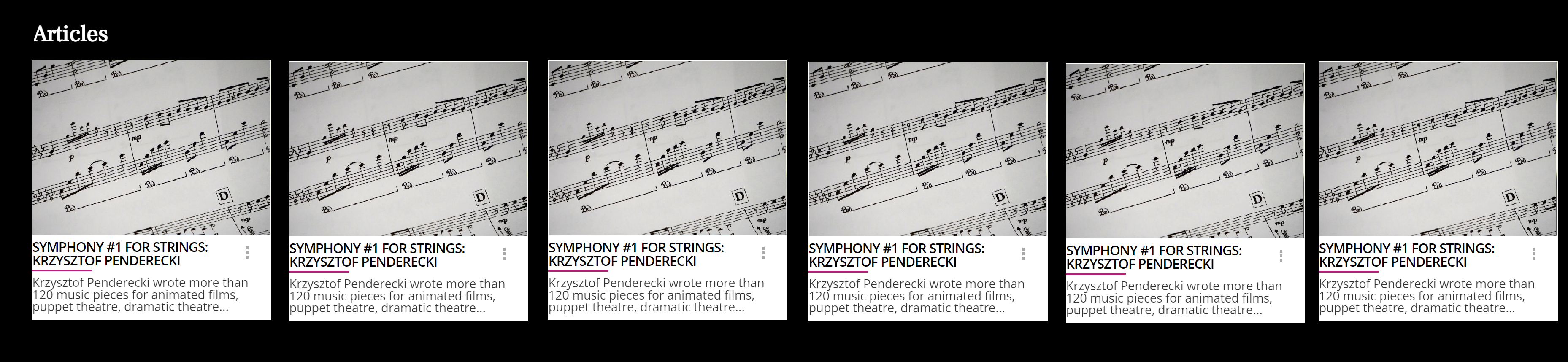
Article Tray
The Article Tray can be used to programmatically generate or curate articles. The tray is not compatible with OTT apps, so it will not render in these apps. If you are creating an app that will be used on televisions, you should create a separate modular page with modules compatible with OTT apps. You can restrict the Article tray to Web and mobile apps by configuring the module settings. For mobile, use the Article Tray (Apps) module.
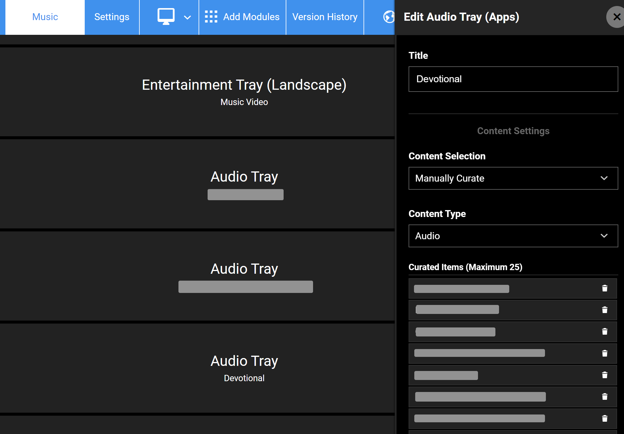
Audio Tray
Use this tray to curate or programmatically fetch audio content. For video songs, the Entertainment Tray (Portrait) and Entertainment Tray (Landscape) modules can be used.
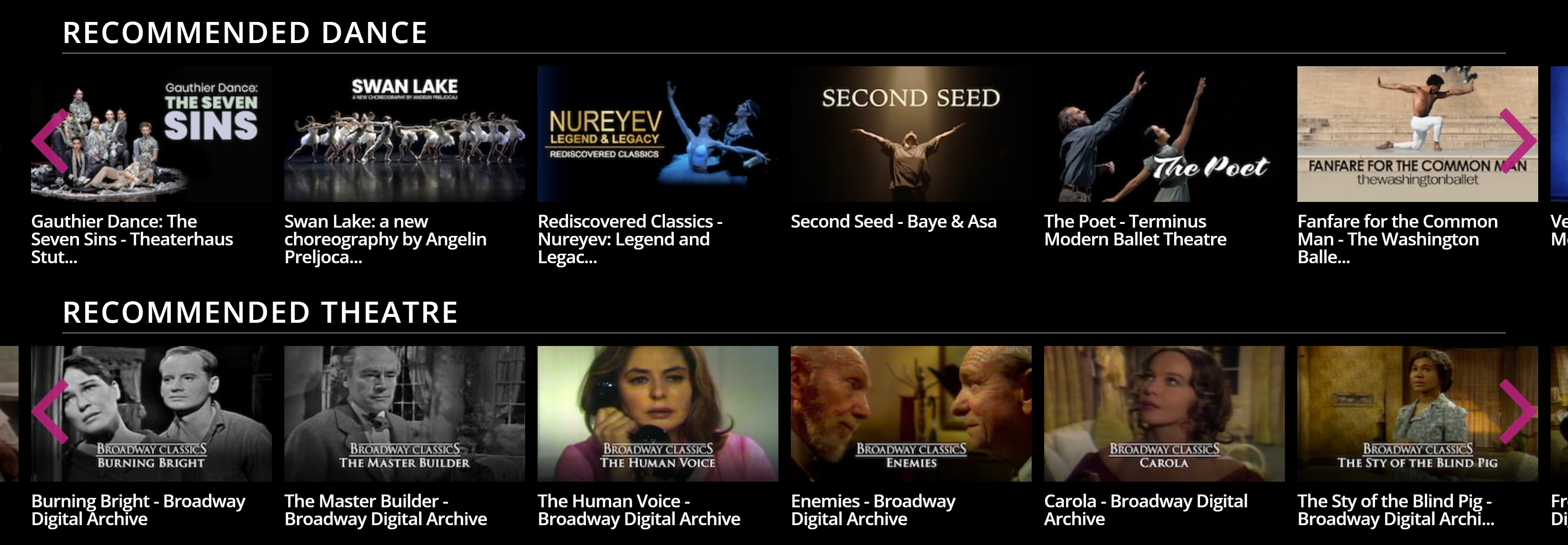
Category Tray (With Count)
Add a category-specific tray to a page. Unlike the Item Grid tray, here you're in control of the video count you want to display in the tray. All the settings are similar to other entertainment trays.
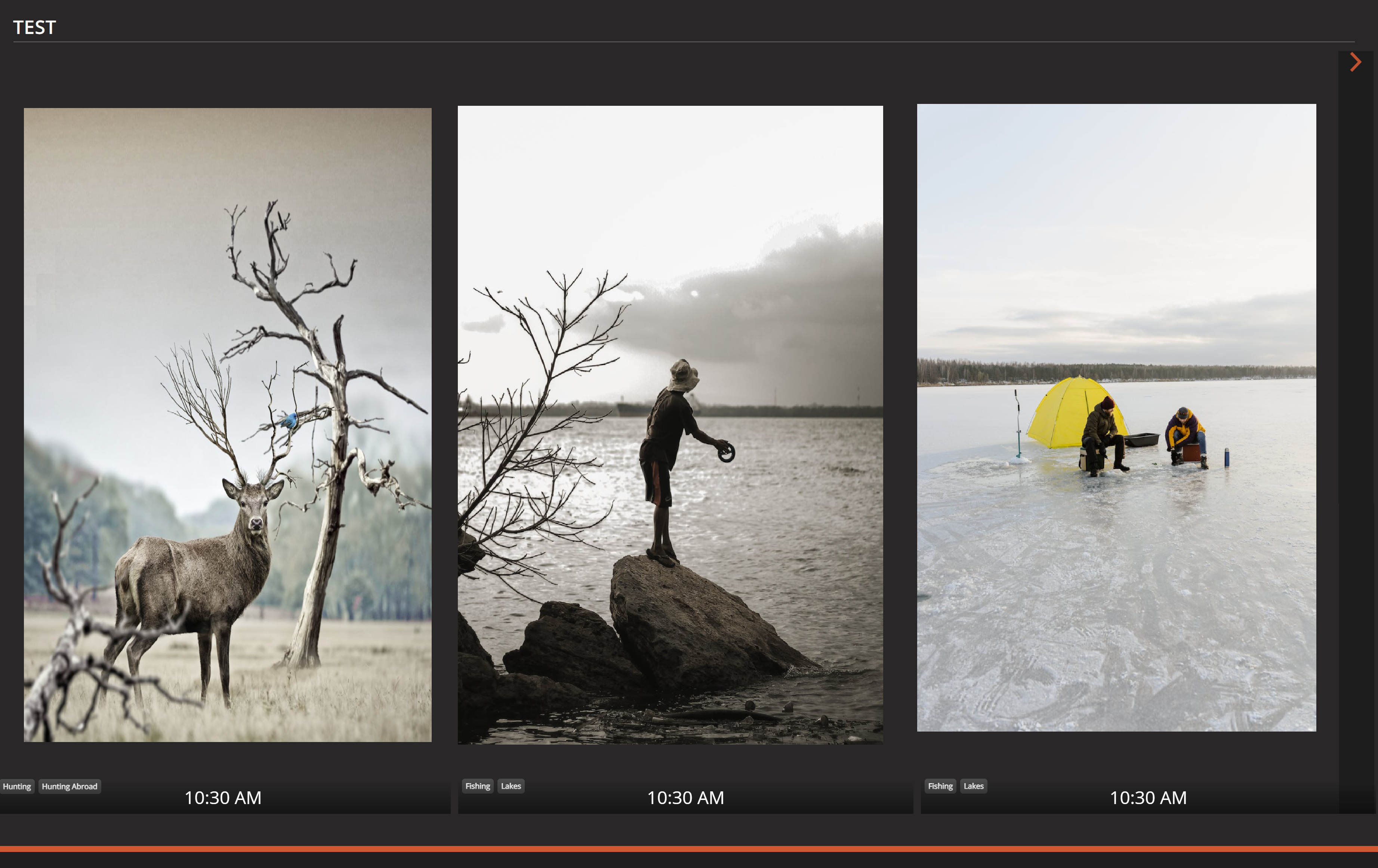
Entertainment Tray (Landscape)
This is the most commonly used module on a Home Modular Page and other pages. The video object page should contain an image thumbnail in the 16X9 aspect ratio.
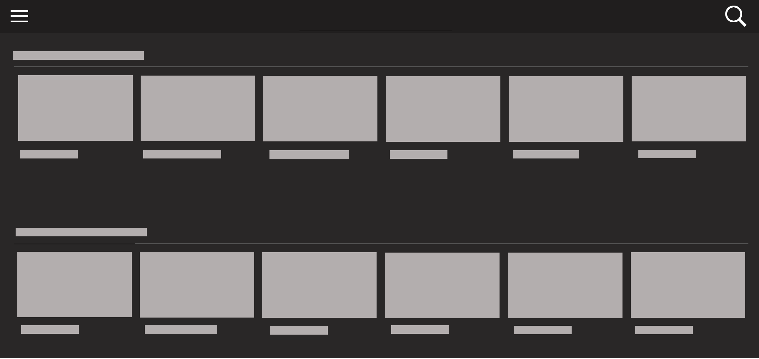 A staple tray on a Homepage
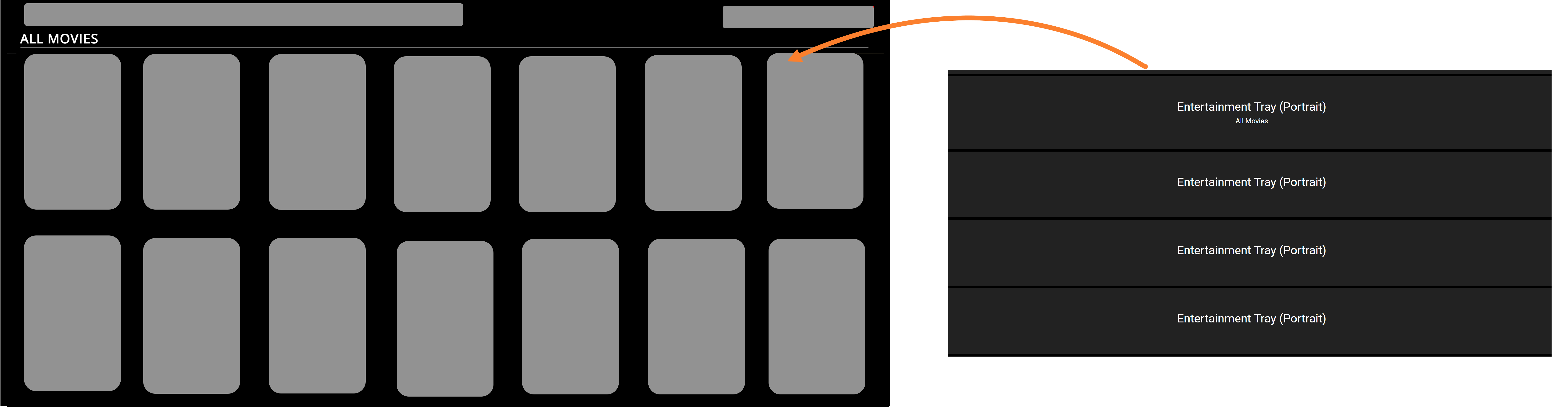
Entertainment Tray (Portrait)
Create trays with Portrait tiles. The ideal image aspect ratio is 3X4.
If you want to continue displaying content on the next row, simply omit the title for the tray below. This allows the content to flow seamlessly, creating a continuous display of your curated or fetched content.
Entertainment Tray (Shows)
Very similar to Entertainment Tray (Landscape), use this module to curate or programmatically populate shows/series. All the menu settings including the override settings remain the same as other Entertainment tray modules.
Featured Video Tray
Use this tray to display any content type (video/article/news, etc) on a slider display. In the Template Builder, provide a title for the tray, such as Featured videos, Latest Weather Forecast, etc, and specify a category/tag if you're programmatically fetching data. Note: This module will not work outside of the Web platform.
An example featured tray on a live site.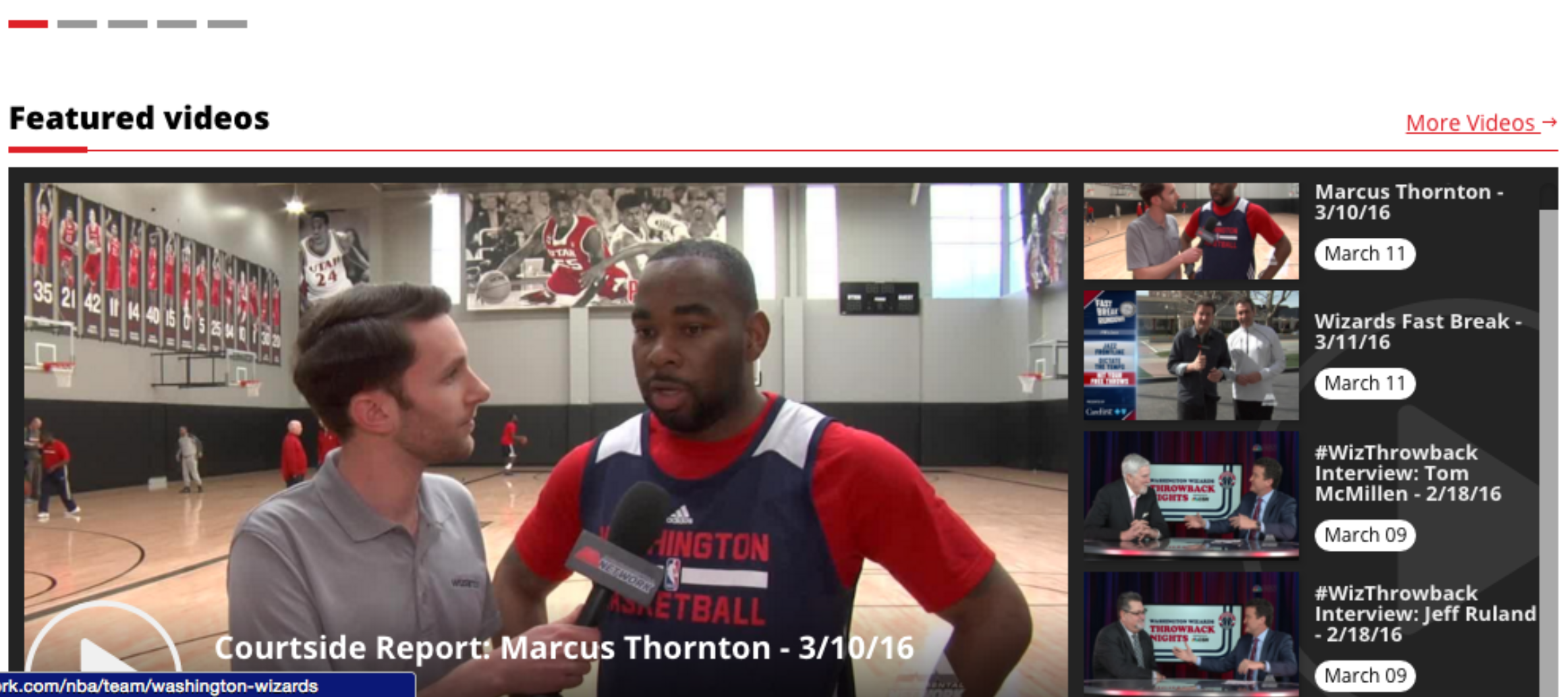 | An example configuration of a Featured Video Tray tray in the Template Builder: 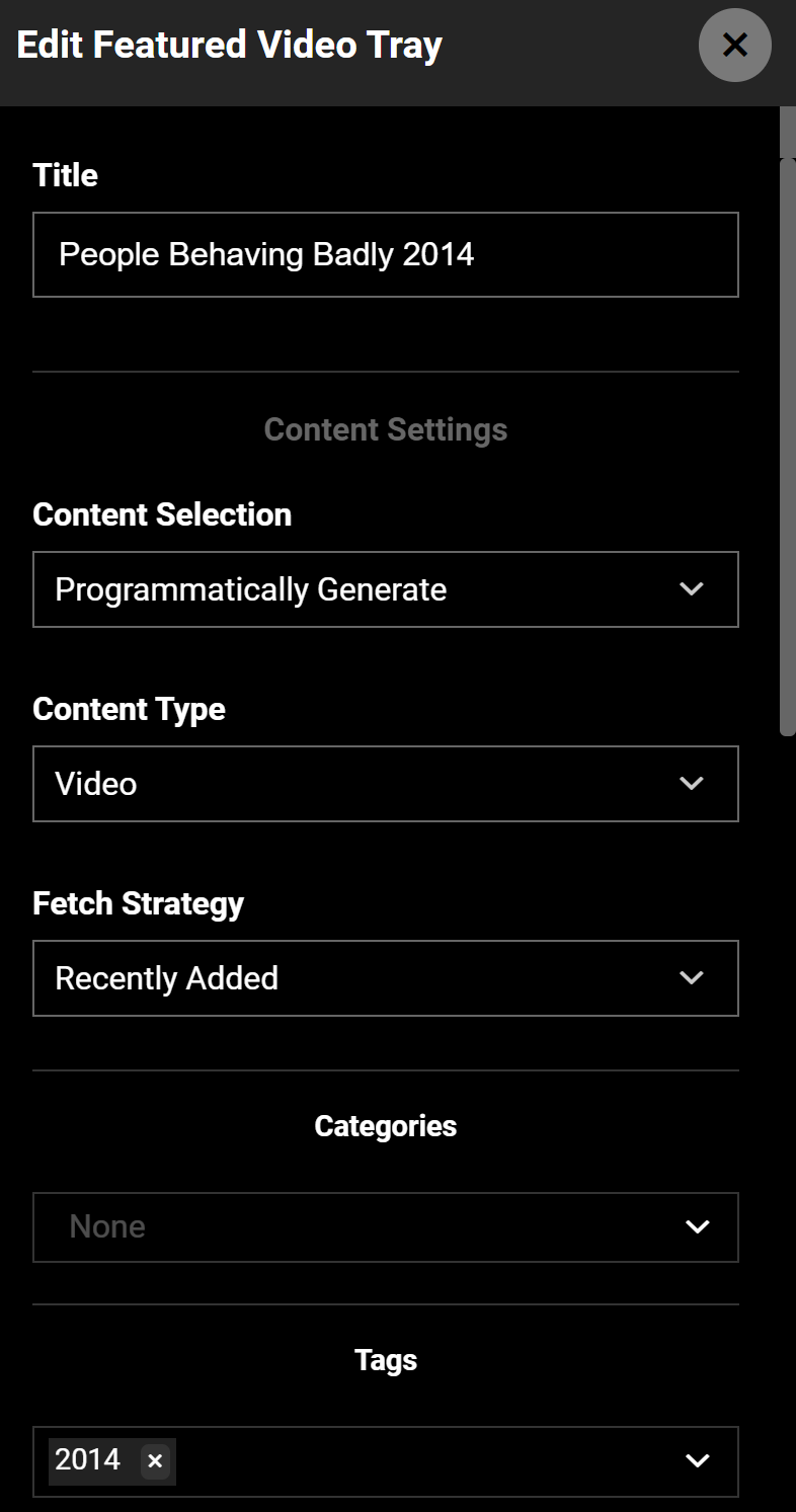 |
Hover Tray
Using a Hover Tray is a great way to give viewers a preview of your content. By incorporating this feature, users can simply hover or place their cursor over a video thumbnail on the tray, and the trailer, if one has been uploaded to the Content CMS, will begin playing.
Page Tray
Use the Page tray to surface the sub-navigation pages or just about any page you want to see in one place. This tray is available only for Web.
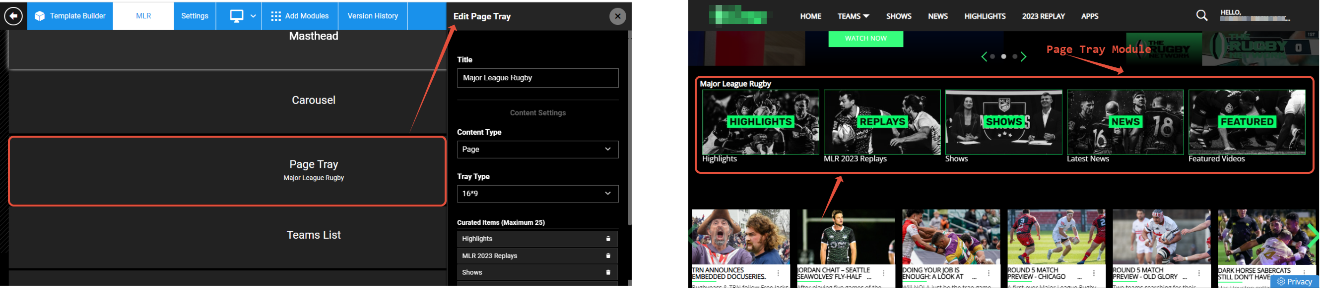
The thumbnail image of the pages added to the Page tray is picked from Settings > Page Details > Manage Page Thumbnails settings of each individual page. As always, the Thumbnail Type setting for each page in the tray should have the same aspect ratio: either 3:4 or 16:9.
Poster Item Tray (title on poster)
Long posters never fail to evoke fond memories. Use this module to display your best content in the look and feel of a real poster. Use the module settings to change up the Number of Display Items visible per view (1, 2, 3 (ideal for web view), 6) for different platforms. The Poster module is a 3:4 tray, so the thumbnail images must have an aspect ratio of 3:4. View an example here.
.png)
Preview Tray
This tray will play a preview of the video on a modal without redirecting to the video detail page. Enable the Show Preview on Hover (Web Only) toggle to show preview on hover.
VideoPlayerWithInfo 01 (No Stars)
This is a module for a video detail page whereby you can include title, description, runtime, and perhaps other metadata like cast or crew information. The tray won't feature any rating or review stars.
Weather Tray
Use this module to incorporate weather information to your site. Enter the API endpoint URL of your data source. Contact the ViewLift Add TechSupport for more information.
Here's an example of an API for weather forecasting and data services provided by the company Weather Services International (WSI).
.png)
Page Link Module
.gif)
A Page Link Module features a navigation menu that will lead you to different sections within that page. It allows you to link between different trays on the page.
Raw HTML
The Raw HTML module brings you the flexibility to create custom design elements for your web and app pages by writing your own HTML code and CSS. Another possibility is if you want to run scripts on specific pages on your site (in case a code won't integrate site-wide), you can add the script on an HTML module and go live.
The HTML module allows you to add custom HTML code to your page. This code can be used to add any type of content to your page, including images, videos, and text. However, it is important to note that if you do not apply CSS styling to the code, the page may not look the way you want to as it may pull the CSS specifications from the global class. To avoid this, you should always add CSS styling to your HTML code. Example:
.html-module {
  background-color: #fff;
  padding: 10px;
  border: 1px solid #ccc;
}

.html-module h1 {
  font-size: 20px;
  font-weight: bold;
}

.html-module p {
  font-size: 16px;
}
The above CSS code will style the HTML module to have a white background, 10px padding, and a 1px solid border. The heading will be styled to be 20px in size and bold, and the paragraph will be styled to be 16px in size.
Technical restrictions
- The Raw HTML works only on the web and it is not supported over the apps. If you want we can workaround and load the web page on Android and iOS but it will not be supported over the TV apps. In such a case, you can create a separate page for TV apps and link it to the appropriate platform navigation.
- For SEO reasons, we do not show h1 & h2 tags on site, so please adjust your HTML to replace h1 & h2 tags with <p> or similar tags for inline styling.
Examples
Here's a form written in HTML:
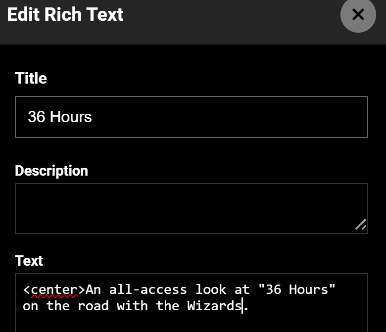
Rich Text
Add creative headlines or interactive buttons using the Rich Text module. You can add a wide range of markups and formatting features to your text such as font sizes, colors, underlines, strike-throughs, italics, bolding, shadows, and highlights. For TV apps, use Rich text without specifications and avoid using formatting, such as bold, italics, and underlining.
Other
Activate Device
Configure the settings in the Activate Device module (left image) in TB and publish the changes to the front (right image).
.png)
Contact Us
The Contact Us module is an ancillary page module so it will not perform on the Home page, in combination with other tray modules.
Contact Us (Fresh Chat)
This module was used to receive inbound messages on Freshchat via apps and your website. Due to operational issues, we had to cancel the integration and disable the module.
EPG Feed
An electronic program guide (EPG) feed is an interactive on-screen guide typically used in TV and now also in OTT. Use this module to load the EPG feed for your Live channel page. To learn more about setting up EPG for your site, see here and here. It typically displays a list of current and upcoming programming schedules, as well as program descriptions, ratings, and other related information.
Image Text Row 01
Use this module to add/update image-text pairs on a modular page.
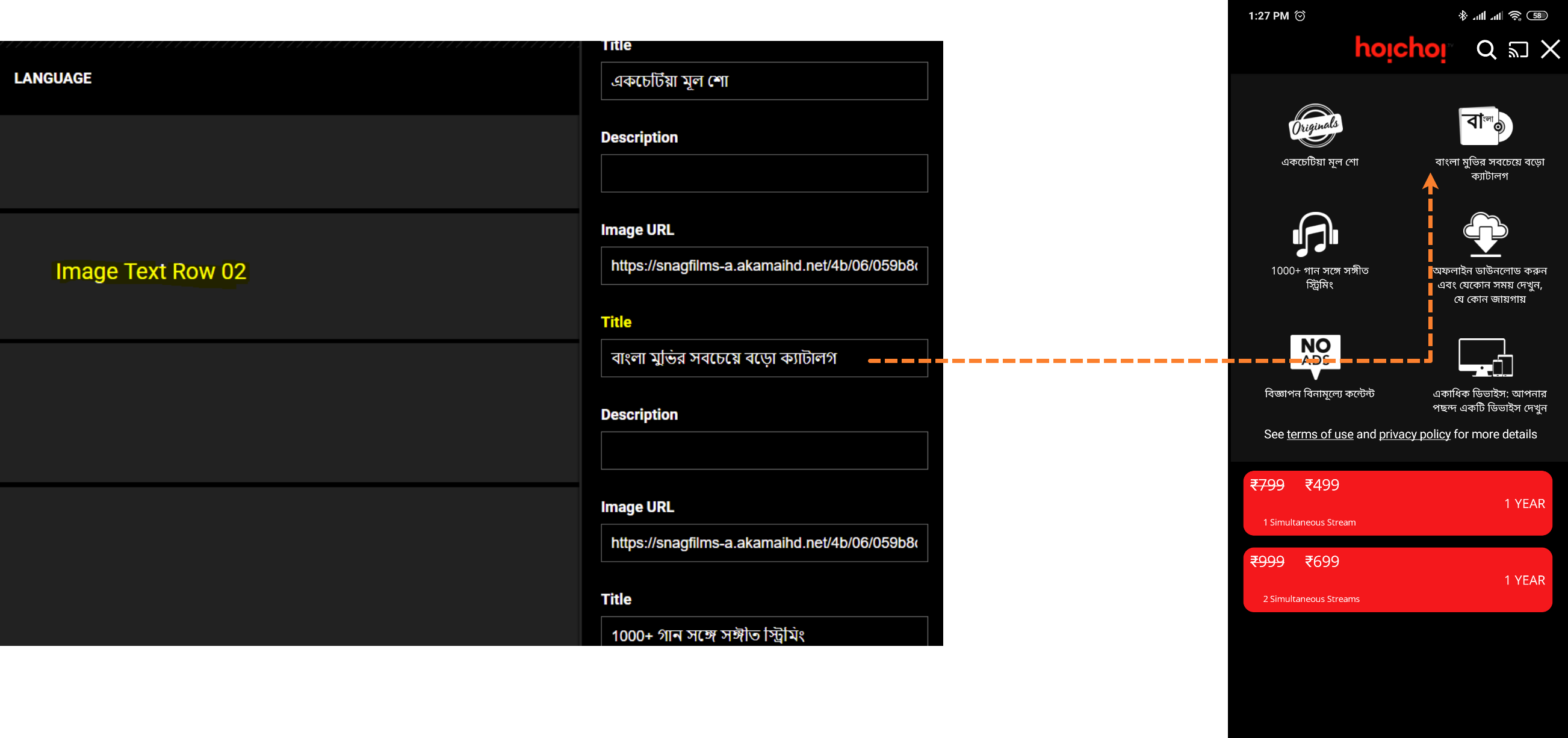
Image Text Row 02
Use this module to add/update image-text pair on a modular screen like View Plans in apps.
Refer and Earn
Add this module to your "Refer and Earn" landing page. For more information, see Create a Refer & Earn plan.
Article
Article Feed module
Add this block onto a modular page to show content like news feeds, blog posts, press releases, or any type of content marketing. This illustrative example presents manually curated articles taking advantage of settings like Image Placement, Content Alignment, and Subheading. You can also programmatically add content to the tray module by choosing categories or tags.
.png)
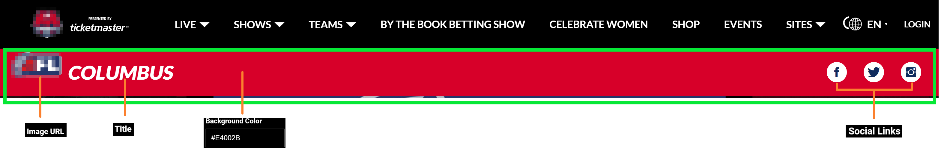
Banner
Banner
Typically positioned below the masthead, the Banner block lets you add a dash of your brand identity. Think of it as an extension of your Masthead and Carousels, adding an extra layer of visual interest. Key features include a logo, customizable background, and text colors, support for integration with your socials, all that you can configure right within the context menu of the Banner module.
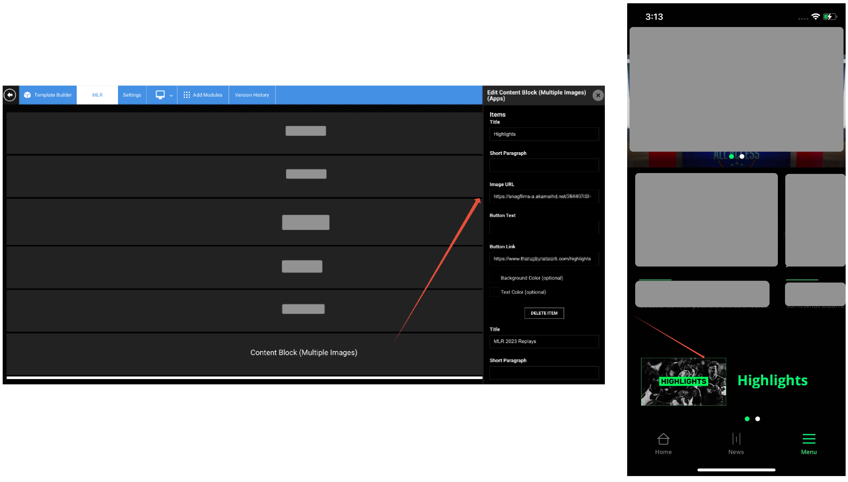
Content Block (Multiple Images) (Apps)
The Content Block (Multiple Images) module is a great way to add multiple images and clickable links to your mobile app. This can be used to direct users to different pages within your app, or to external websites, such as for ticket sales. This is helpful when a module like a Page tray is only available on the web and not on apps.
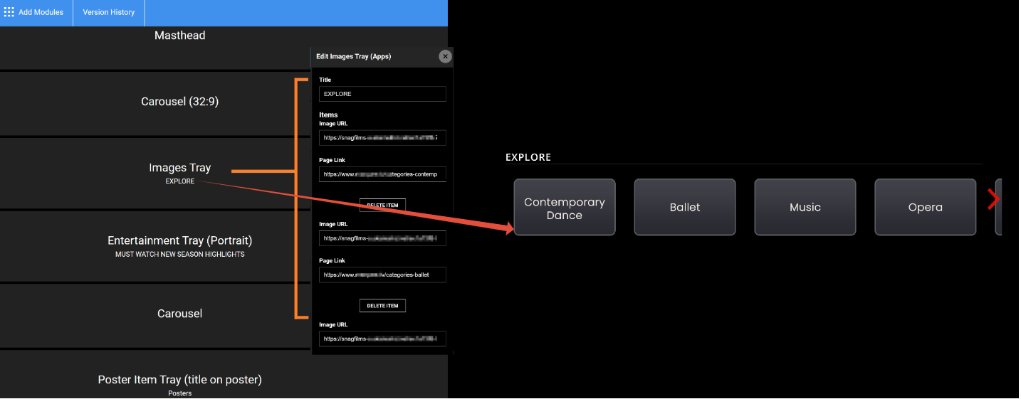
Images Tray module
Use this module to add a tray with only images to a page. A good use case for you might be to bring a couple category trays into the Image tray by linking the images to category pages so they quickly load on the home page. Currently, we have added support for only 16:9 images, so using images of other aspect ratios will make a thumbnail appear stretched out.
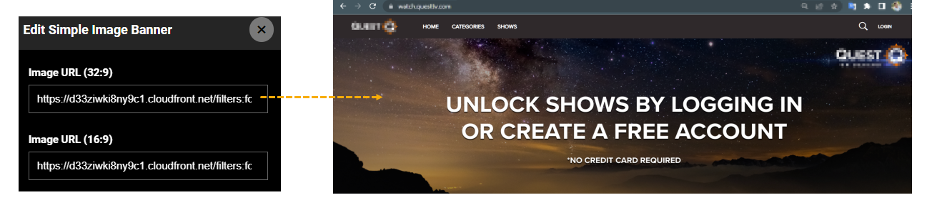
Simple Image Banner module
The Simple Image Banner module allows for clickable or redirectable banners spanning the entire page width.
Ad
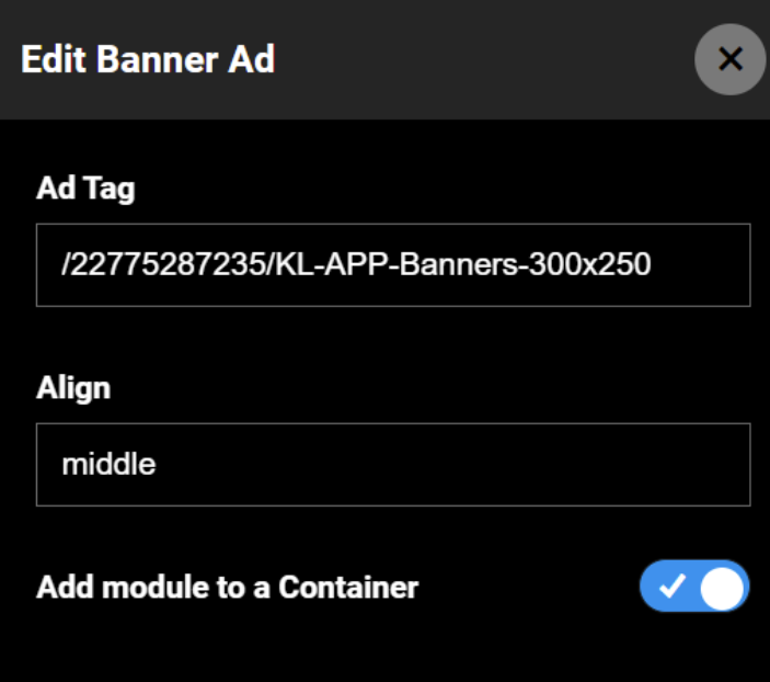
Banner Ad
Use the Banner Ad module to place Google Ad Tags in ViewLift's container and display ads across all platforms. ViewLift don't handle Google Ad Manager side of operations. We recommend you check the ad dimensions before adding it to the Google ads field in the Template Builder. We do not modify the dimensions of display ads. Feel free to repeat the module on the same or other pages.

Here are the recommended Google ad sizes: [300,100],[750,300],[750,200],[750,100],[950,90],[88,31],[220,90],[300,31],[980,90],[240,133],[200,446],[292,30],[960,90],[970,66],[300,57],[120,60],[320,400],[600,314],[468,60],[728,90],[250,250],[200,200],[336,280],[300,250],[120,600],[160,600],[320,50],[320,100],[300,50],[425,600],[300,600],[970,90],[240,400],[980,120],[930,180],[250,360],[580,400],[300,1050],[480,320],[320,480],[768,1024],[1024,768],[480,32],[1024,90],[970,250],[375,50],[414,736],[736,414]
Medium Rectangle Ad
If the Banner ad doesn't render well, use the Medium Rectangle Ad Banner tray container to place your Google Ad Tag in an acceptable size as referenced above.
Footer
Big Footer
Add a Big Footer tray to display a big footer for the page. You can curate a Big Footer module to show Anciliary pages such as About Us, Terms of Service, Privacy Policy, Contact Us and more. To define the Footer navigation, see Editing a footer. The copyright year on footer is fetched automatically from the frontend code, so it will automatically change.
Small Footer
Add a Small Footer tray to display a small size footer for the page. See Editing a footer for more information.

Masthead
Generic Masthead module contains the built-in functionality to display the primary menu navigation structure of your site and apps on the front end. In addition, this area includes your app logo on the left, a Search functionality, and a language selector. The Sign-up and Login flow buttons on the masthead initiate the sign-up/login flow.
For more information, see Editing Mastheads.

Brand Navigation
This module is useful for navigating between multiple brands within your website. To learn to apply the module, see Applying the multi-tier navigation on Pages. To ensure that users can differentiate between the masthead and navigation with brand names, we call the primary navigation component "Brand Navigation."
The Brand Navigation is the primary navigation in this case instead of the standard Masthead tray module. For example, in terms of differentiating between the header when selecting ABC and XYZ, the design solution is to have the same header as PQRS. Additionally, each brand has its modular home page with customized navigation and masthead. For instance, PQRS serves as the landing site and has a home page path of "/" and "/home". In comparison, ABC and XYZ have home page paths of "/abc" and "/xyz" respectively.
Other pages can also have the same path convention, example, for XYZ About Us, the page path can be "/xyz/about".
Custom Masthead
This module allows you to customize your primary navigation bar and turn off any CTA you want, including the search function. In the standard Masthead, you can't turn off the search function. To learn to apply the module, see Applying the multi-tier navigation on Pages.
Network Masthead
Masthead with Company logo in between and navigation items on both sides of logo.
Filters Masthead
Masthead with Filter item in it, clicking on which opens a side menu from the right.
Filters
Filters Module
This module is currently unsupported.
Carousel
Reference the Carousal section in Types of Modules to learn more.
Carousel
This carousel module supports only 16:9 image size.
Carousel (32:9)
The module enables the use of an image size up to 32:9 for the carousel although the carousel also supports 16:9 image size.
Carousel Kids 32x9
The module enables the use of an image size up to 32:9 for the carousel although the carousel also supports 16:9 image size.
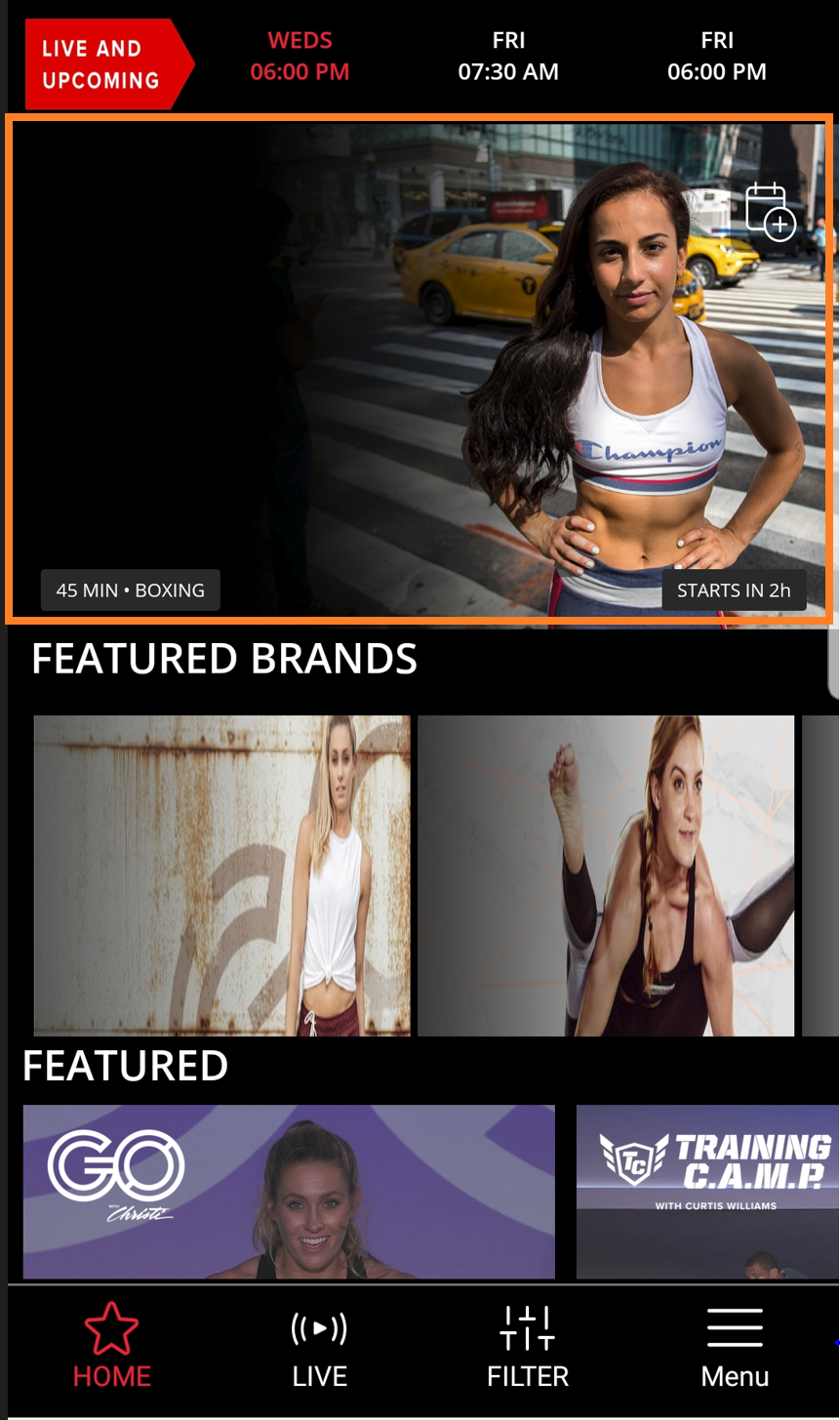
Events Carousel
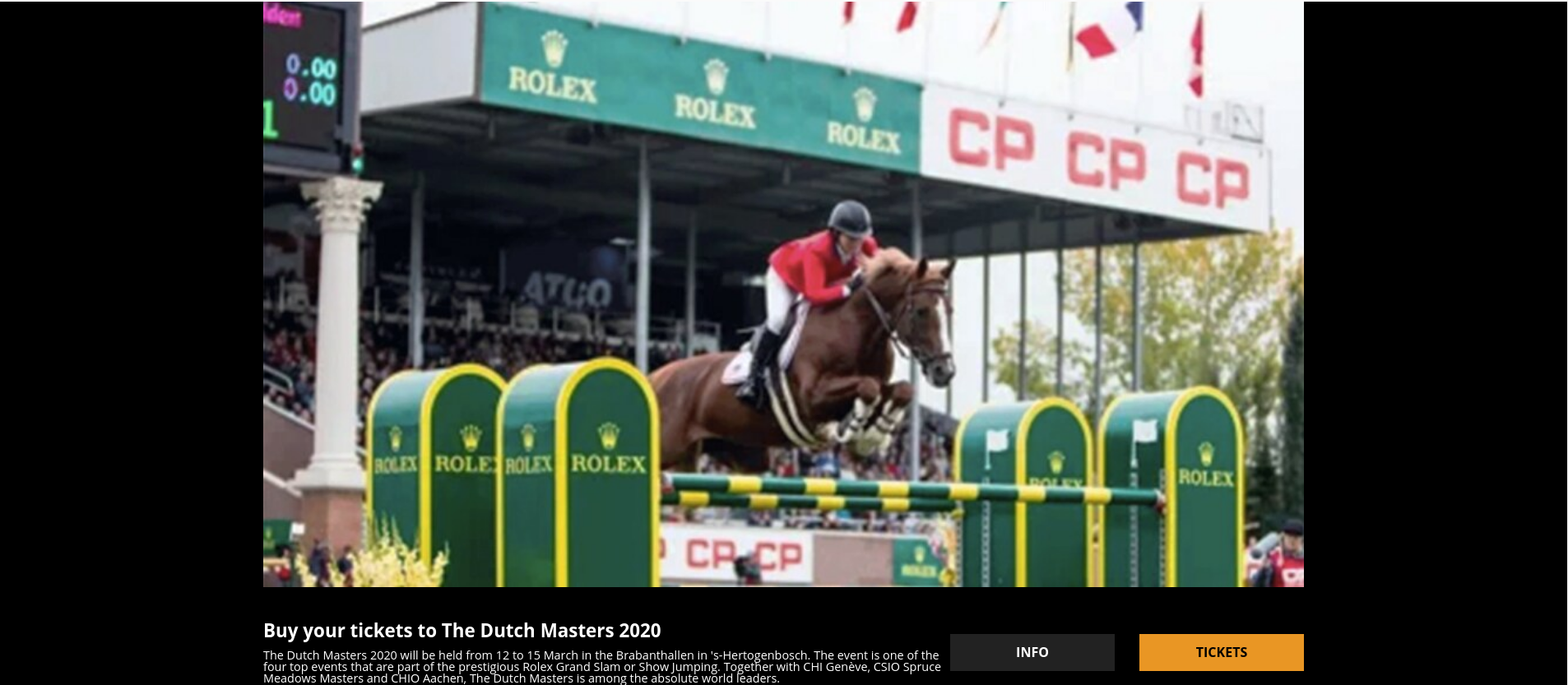
The events carousel is a web-only module designed to curate Events or even Articles as the Content Type. For example, you can link to a venue's site with a ticket link. Use the Scheduling Settings to add date, time, and timezone info to the carousel. Check out the settings to customize the carousel to suit your needs.
Full Width Carousel
Technical restrictions - Continuous Loop toggle and Time Delay setting are currently not functional in Full Width. The Time Delay settings are hard coded to 5 seconds. The visual indication of the number of clips is a custom enhancement.
Live Schedule
Add this module on a Live page to display live events.
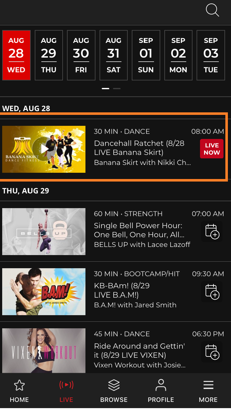
Live Schedule Carousel
Use this module to display a schedule of upcoming live events or shows. The scheduler selects content based on its corresponding date and time.
Person Carousel
This module displays a person's image in the carousel. In the Template Builder, set the Content Type as Person and add the individual's name in the Tag field in the settings.
Schedule Carousel
This module picks the Live events set according to the frequency configuration (Daily, Weekly, or Monthly) that you set in the Frequency Type of Live Videos field.
Continue Watching
Continue Watching (Entertainment)
Use this module to resume videos from where you left off. The data syncs across all platforms with a progress bar showing how much you've already watched.
Page API for tracking watch history
In the Tools' backend, a user's watch history information is passed from the Page API when you set the Fetch Strategy to Continue Watching or Watched History. On the platform's frontend, the watch history parameter is located under the "gist" of every video that is available. This parameter can be found in various places such as "user/userId/history/video" and "gist.watchHistory.watchedTime". In case a video is unpublished by the Tools admin, it will no longer appear in the user's watch history, and it will be removed from the API's response in "/user/userId/history/video".
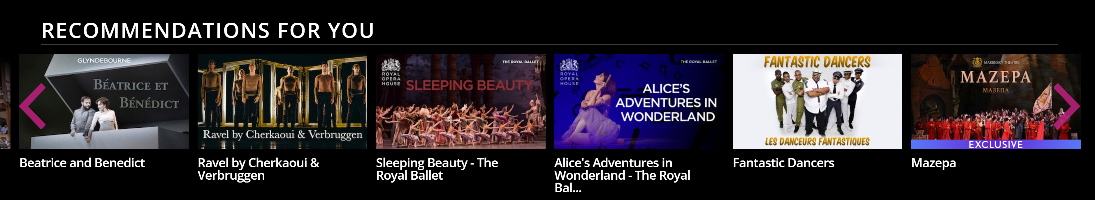
Recommendation Tray
When you enable a Recommendations engine on your site, the Tools CMS will begin collecting data on users' viewing history to generate recommendations. This module displays suggestions based on the user's past interactions. See Personalization and Recommendations to learn more.
Recommended Popular Tray
Currently, the popular content is unavailable. Instead, we suggest using the standard Recommendation Tray, which uses your watch history to suggest content. If you prefer to use this tray, be sure to select Personal as the Tray Type in the configuration.
User Personalization Tray
User Personalization lets your users choose topics of their interests and they will get tailored recommendations based on category. Enhance your user engagement by incorporating this module onto your Homepage. See Personalization and Recommendations to learn more.
Watch History (Horizontal)
Use this module to add a watch history tray.
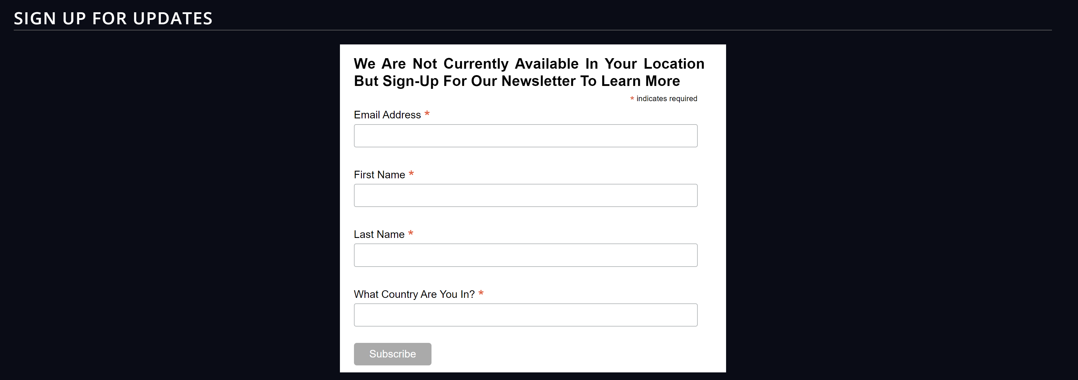
Subscription Plans
Custom Select Plan
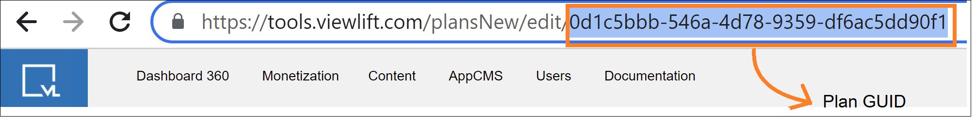
You can create a custom plan page for select users, say, churned users. Create a custom page and add this module. The most essential settings to fill up in the module are Title and Plans (Separated by Comma) fields. Add the GUID of a discounted plan into the Plans field and publish the page.

Redeem Offer 02
Add this tray module on the Redeem Page of your web platform to make it easier for users to redeem their prepaid offers. In the tray's menu settings, add a redirect path in the "Redirect path after redeem code" field so users are automatically redirected to a specific page on your website after redeeming the code. You can also change the default editorial of the UI messages for Redeem page from here.
Referral Select Plans
Use this module to set up Refer & Earn View Plans.
Select Plan (Horizontal)
This is a legacy module to display the view plans page.
Select Plan (Vertical)
Aside from the default View Plans page, you can use this tray on multiple pages such as Offers, About Us page, and so on. Adding the tray will display the View Plans heading.
In the tray menu settings, enable the Stripe option, and review all the UI messages that users might see when interacting with the tray. The tray will then pick the feature list from the corresponding plan pages in the Monetization module and display on the live site.
Select Plan (With Feature List)
A View Plans module which allows you to add a feature list to a plan. Apps need this to show new UI for the plans page
Web Frame
Embedded Web Frame (Large) & Embedded Web Frame (Small)
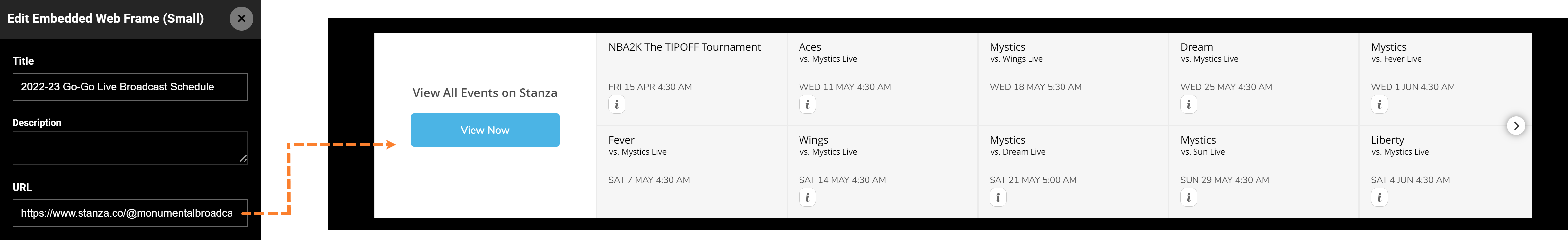
Want to embed an external web frame within your page? The module allows you to showcase external third-party content within your platform. For instance, embed an event calendar directly within your website, so users can access the information without redirecting anywhere.
Event Calendar
Event Calendar
Add an Events calendar module to a page so users can see and subscribe to a live of upcoming events via the calendar. Create a daily, weekly, or monthly calendar view from module settings.
Provide a URL in the "View All Events URL" settings to redirect users to a webpage where they can view all the events that are available or upcoming. The URL typically leads to a landing page or a section of a website where users can browse through various events and filter them by date, location, type, or category.
Small Event Calendar
Displays the event calendar at half the height of the regular event calendar.
Video Player
News Standalone Video Player
Show live videos on a standalone player.
In the Template Builder, we recommend you add both the V1 and V2 standalone player modules below the other as OTT apps pick the v1 module. Clients or apps which are v2 compatible will pick the v2 module like iOS, Android, Fire TV, and Web. Enable the "Show Mini Player" toggle in the configuration to minimize the player to the right corner of the screen as you scroll down the page while keeping an eye on the video.
To activate the functionalities as the controls suggest, toggle on "Show Playback Controls" and "Enable OTT Zoom" to show playback controls on the player and enable zoom on OTT screens.
Standalone Video Player / Standalone Video Player v2
Similar to the live standalone player, curate on-demand content in the standalone video player. Please keep both standalone player modules v1 and v2 to a page one below the other as smart TV apps currently pick the v1 module. Clients or apps that are v2 compatible will pick the v2 module like iOS, Android, Fire TV, and Web. While scrolling down the page, the standalone player becomes a mini-player at the bottom right of the screen.
Splash Page
This module displays a splash page upon app launch that can feature a logo, animation, or video. You can also use it to showcase your website's features, subscription, or promote a product or service Take a cue from the example below.
Thank You
Create a "Thank You" landing page and use this module to configure a thank you note for users paying through Stripe.
List
Top Headlines List - To incorporate a box for news headlines into the UI, which is currently unavailable. You can use a tray to showcase news articles instead. The List module also cannot be used as a standalone unit. It was originally intended to be added within a container, occupying 1/3 of the width and positioned next to a carousel that would take up 2/3 of the width.
Weather Ticker
In the weather ticker settings, you can add a weather feed URL to display a weather ticker on your site.
Module types in Fitness & Sports templates
The modules library in the Sports template has the capabilities to manage live streaming, social media integration, team rosters, and more. Here are a few modules you will probably use a lot:
Alert Box - This module is used to create an alert overlay that can take inputs such as title, alert clickable URL, coloraturas, and messages in the form of Raw HTML.
Teams List - Used to display teams in a column (sports template). Configure the following parameters directly in the Teams List settings: Team Name, Team ID, Team Image, and Default Tab (Page to Open).

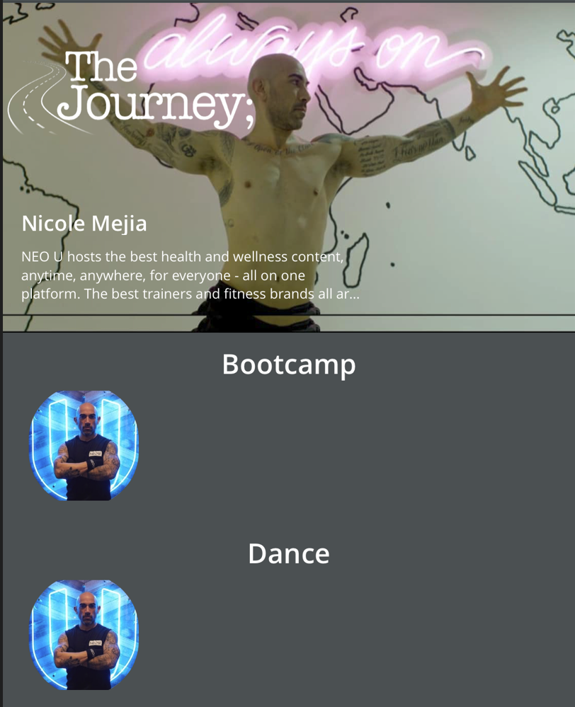
Category Tray (With Count) - Used to display categories along with item count (custom Fitness template).
Concept Tray - Tray used to display episodic content (custom for the Fitness template)
Featured Video Tray - This Tray is used to display items/videos in a slider.
Preview Tray - This tray is used to place such videos in a Tray which will be played on a Modal instead of moving & playing on the video detail page.
Sports Tray - This is used to create a different tray with a unique tooltip to provide options to add a video to the watchlist or share on social media. Here is an example of a configuration.
Browse Module - This is used to display the Browse Concepts page (custom Fitness template).
Filters Module - This is used to display the Filters page and feature (custom Fitness template).
New Series Carousel - Used to display carousel for concepts (custom Fitness template).
Schedule Carousel - This is a combination of two sections. One is the schedule of upcoming events on top of the Event carousel (custom Fitness template) and the other is the Event carousel which shows the upcoming events with time.
Leaderboard standalone module: This module comes along with a standalone video purpose-built for streaming a live match. This is useful for showing the current standings of the match, as well as providing a live video feed of the action. For more information, see Editing a Leaderboard.
Leaderboard module: This module does not include a standalone video player and is built to serve the scoreboard of the previous match including match highlights. The match stats will take up the entire area of the screen. For more information, see Editing a Leaderboard.