.png)
Header Navigation
- 16 Jan 2024
- 4 Minutes to read
- Contributors

- Print
- DarkLight
- PDF
Header Navigation
- Updated on 16 Jan 2024
- 4 Minutes to read
- Contributors
- Print
- DarkLight
- PDF
Article summary
Did you find this summary helpful?
Thank you for your feedback
The Header Navigation section is where you will define your primary (main) navigation and sub-navigation.
About Primary Navigation
The primary navigation is the first-level menu on the top, or the left (on mobile apps). This Home menu is typically given focus on launch in apps, guiding users to your most important pages in an organized and accessible manner. This screenshot illustrates a primary navigation and sub-navigation in a web application:

Building the Primary Navigation

To define primary navigation:
- From Global Settings, click Header Navigation, then click the +ADD NAVIGATION button.
- In the Navigation Name field, change the default Navigation1 text to add your Service Name. Then, set the navigation as the Primary Navigation using the toggle on the right.
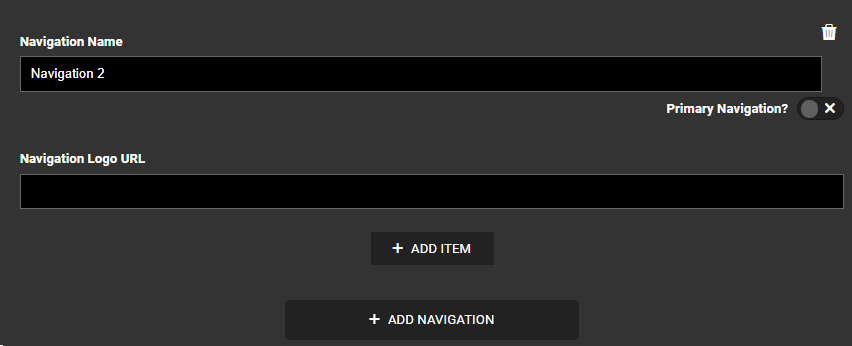
- To create a main menu item, click + ADD ITEM. The following form appears.
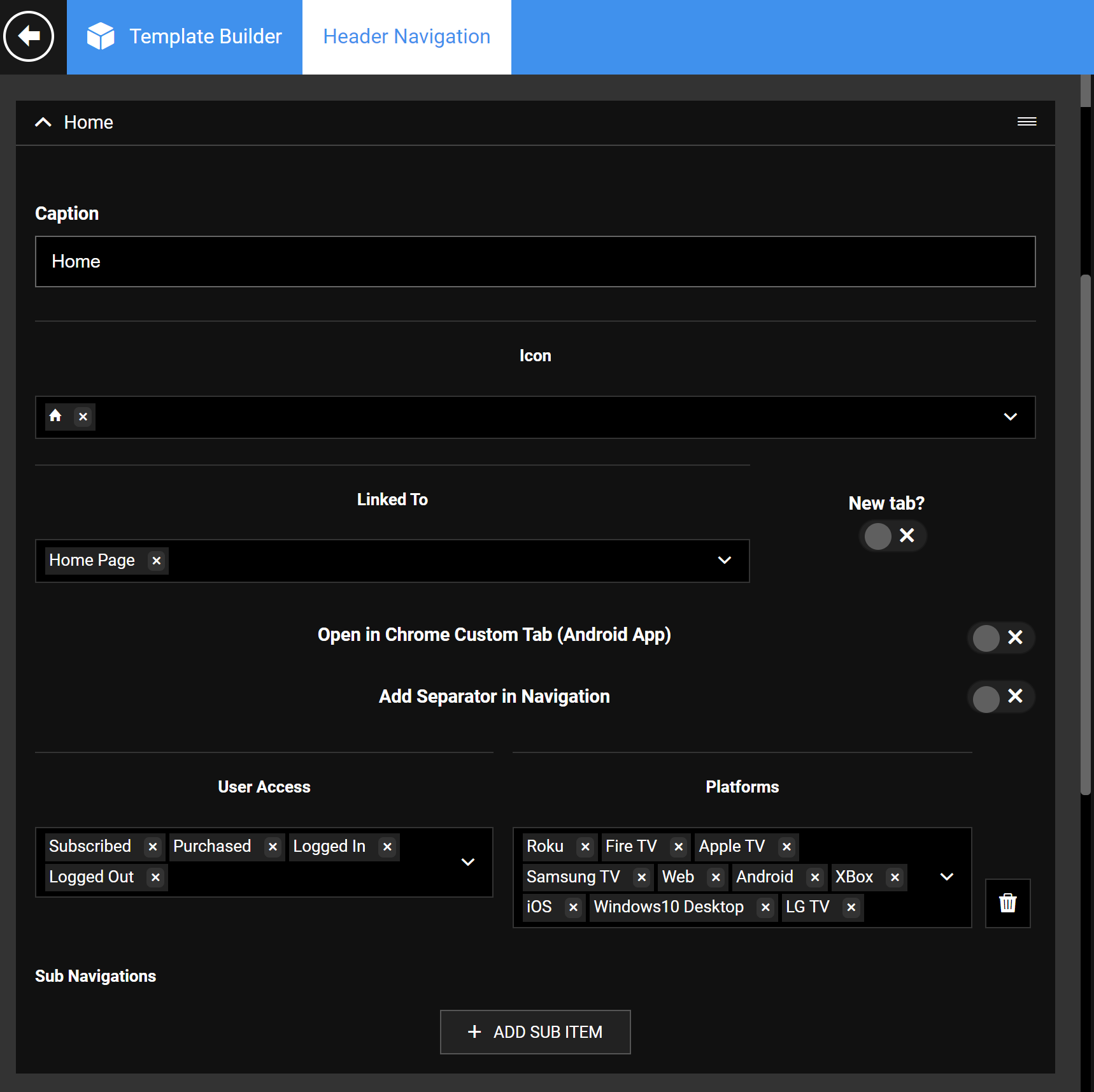 A Home Menu Configuration
 - Complete the fields as described in the following table and click Publish to publish your changes to your live apps and site.


| Screen element | Description |
|---|---|
| Caption | Provide the menu item display name. |
| Icon | Add an image icon for the navigation item. |
| Linked To | Link to a Modular Page within the CMS or an absolute URL outside the site (for example, for gift subscriptions). Linking navigation to a permalink is not supported on Apps, hence always link to a modular page instead of a permalink to make it work on all platforms. |
| New Tab | Select if you prefer to open the menu in a new browser tab. |
| User Access | Display a navigation piece based on the user's subscription, purchase, and login status. Learn more. |
| Platforms | Allows for navigation to be displayed in the selected platforms. By excluding a platform, that navigation piece will be hidden on that platform. |
| Delete | Deletes the navigation item, permanently (no hiding of items). |
| +ADD ITEM | Add another primary nav item. |
Build a Sub-navigation
1. To create a submenu below a primary navigation, click + ADD SUB ITEM under that primary menu item.

Sub-navigation screen details
| Screen element | Description |
|---|---|
| Caption | Title for the sub-navigation item. |
| Icon | A logo for the subnav item. |
| Linked To | For the sub-navigation to work as expected on apps and OTT, it needs to point to a modular page. It cannot have a permalink as the Linked To destination. |
| New Tab | Turn on to open the sub-menu in a new tab. |
| User Access | Hide/show a menu item globally by logged-in/entitlement status. Learn more. |
| Platforms | Hide/show a menu item by device platform. |
| Delete | Delete a sub-navigation. |
| +ADD SUB ITEM | Add another subnav menu item under a primary item. |
User Access states and behavior
The User Access setting lets you define exactly who sees what based on user login and entitlement status.
For simplicity, let's take the case of the View Plans page. We may not want to show the Plans page to users who are already subscribed to a plan. The different user states are Subscribed, Purchased, Logged In, and Logged Out.
| User State | Behavior |
|---|---|
| Subscribed User | Ideally, the View Plans menu must be hidden for a logged-in, subscribed user. However, if included, the subscribed users will be shown the message "Thank You For Subscribing" instead of the actual View Plans page. |
| Purchased User/Logged-in User/Logged Out User | Users for which the View Plans page must be made available. |
Creating a multi-tiered top navigation
Some apps have more than one primary menu on top, such as two brands can co-exist in the header menu area, instead of single-tier navigation.
In this case, you will need to create respective navigations and subnavigations, for example, Brand1 and Brand2 under the Header Navigation, the same way as you define it for single-level navigation.
An example of a website that utilizes a multi-tiered top navigation system for brands within a brand is shown here.
Note: Only one navigation can be checked as "Primary" if you have multiple primary structures.

Applying the multi-tier navigation on Pages
Custom navigation must be manually applied when there is more than one primary navigation in the Header settings.
- Go to the page where you want to use custom brand navigation.
- Click on the Add Modules button on the top navigation. Add both the Brand Navigation and Custom Masthead modules to the top of the page as shown in the accompanying screenshot.
From the module settings, use the Select Navigation dropdown to assign the appropriate navigation.

Apply the FTF navigation on FTF pages, for example.

Use the other toggles as per the requirement.
Once done, Publish the page and verify your changes in the app build and the website. (consider cache time to reflect the changes).
If, on FTF Page the Custom Navigation module has a header added which has two primary navigation items, LSN and On Demand. Then the FTF Page would look like the following on different platforms:
On Web

On OTT
Master/Primary Navigation: swipe up from the top.

Once the navigation is linked to a page, the left navigation will show up where the associated items show up for the header added in the Custom Navigation module. Then the FTF Page would look like the following:

On Mobile Apps
To show the Master/Primary Navigation, click the hamburger menu on the left. The menu items display in the bottom Tab bar. (Max number of brands that can come in tab bar - 4. If the number of brands exceeds four, the remaining sites go to the More tab.)
Navigation Items that come under each brand are accessible using the left hamburger icon highlighted in the screenshot.

Was this article helpful?