Accessibility support in the Roku experience works with the Roku Voice Guide setting on the device for voice over. There is no separate accessibility mode inside the app.
This guide describes what is available for Roku remote navigation, Voice Guide, and screen-reader users across browsing, search, account flows, schedules, and video playback.
1. Global page accessibility
Headings
- A screen-level heading is available for assistive technology where implemented (for example tray titles in 2 lines such as Minnesota Lynx @ New York Liberty).
- Tray and section titles can use clear heading levels as you move through the home screen and related pages.
Visible focus
- Interactive controls show a clear focus state when you move with the Roku remote (highlighted menu items, focus rings on program cards, and highlighted buttons).
- Focus styling works across menus, trays, the program guide, settings, and player controls.
- When the Voice Guide is on, it speaks the item that currently has focus.
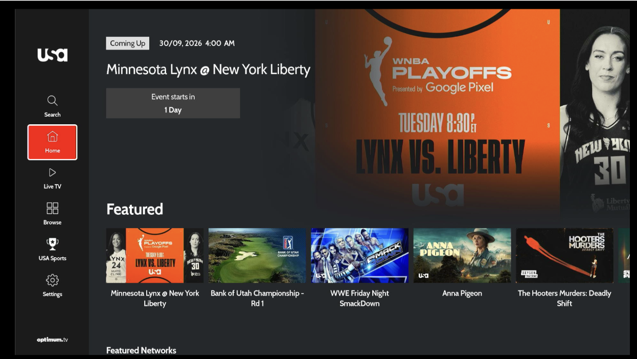
Figure 1. Visible focus on a left-menu item during remote navigation; featured content and trays on the right.
2. Images
- Informative images use descriptive spoken labels where needed (logos, content titles, provider names, channel logos).
- Decorative or redundant images are not announced separately when the parent item already has a full spoken name (for example a schedule tile that already speaks the program title). This avoids duplicate announcements.
3. VoiceGuide attributes (catalog)
Naming and description
| What you hear | Where it is used |
|---|---|
| Accessibility label | Icon buttons, tiles, logos, keyboards, input boxes, and actions |
| Accessibility value | On/Off style states, selected options, progress bar percent, caption choices |
State and relationship
| Pattern | Use |
|---|---|
| Selected/Unselected tab | Left menu items such as Home, Live TV, Browse, Search, Settings |
| On / Off | Subtitles and similar toggles |
| Selected option | Caption, audio, or quality choices in player settings |
| Live updates | Search empty results, tile position, total tiles etc, progressbar duration |
| Pop up | Exit dialog, RFI screen |
Common control types
| Type | Use |
|---|---|
| Button | Tiles, CTAs, player controls, account actions, activation actions |
| Heading | Titles and section headings |
| Adjustable | Playback progress bar (left/right to seek) |
| Menu / tab | Primary left-menu and tab items |
| Text | Metadata that should be read but not treated as a button |
4. Roku remote and Voice Guide
Remote actions
| Input | Behavior |
|---|---|
| Directional pad (up / down / left / right) | Move focus through controls; dialogs and panels may keep focus inside while open |
| OK / Select | Activate buttons, tiles, menus, and similar controls |
| Back | Dismiss overlays and return focus where supported |
Focus management
- Settings and closed-caption panels keep focus on the relevant options while open.
- Lists can remember the last focused item where implemented
- When a panel closes, focus returns to a logical place in the player or menu flow where supported.
Areas with Focus / Voice Guide support
Header and logo, search, left navigation and profile / account, trays and carousels, schedule tiles, program guide, TV-provider activation, settings and account actions, watchlist / like, and player controls / captions.
5. Accessibility by area
Header and navigation
- Left-menu controls are labeled and usable with the remote (for example Search, Home, Live TV, Browse, Login, Settings).
- Menu items announce their name with tab-bar traits.
- Selected or focused menu items use a high-visibility highlight so it is clear where you are.
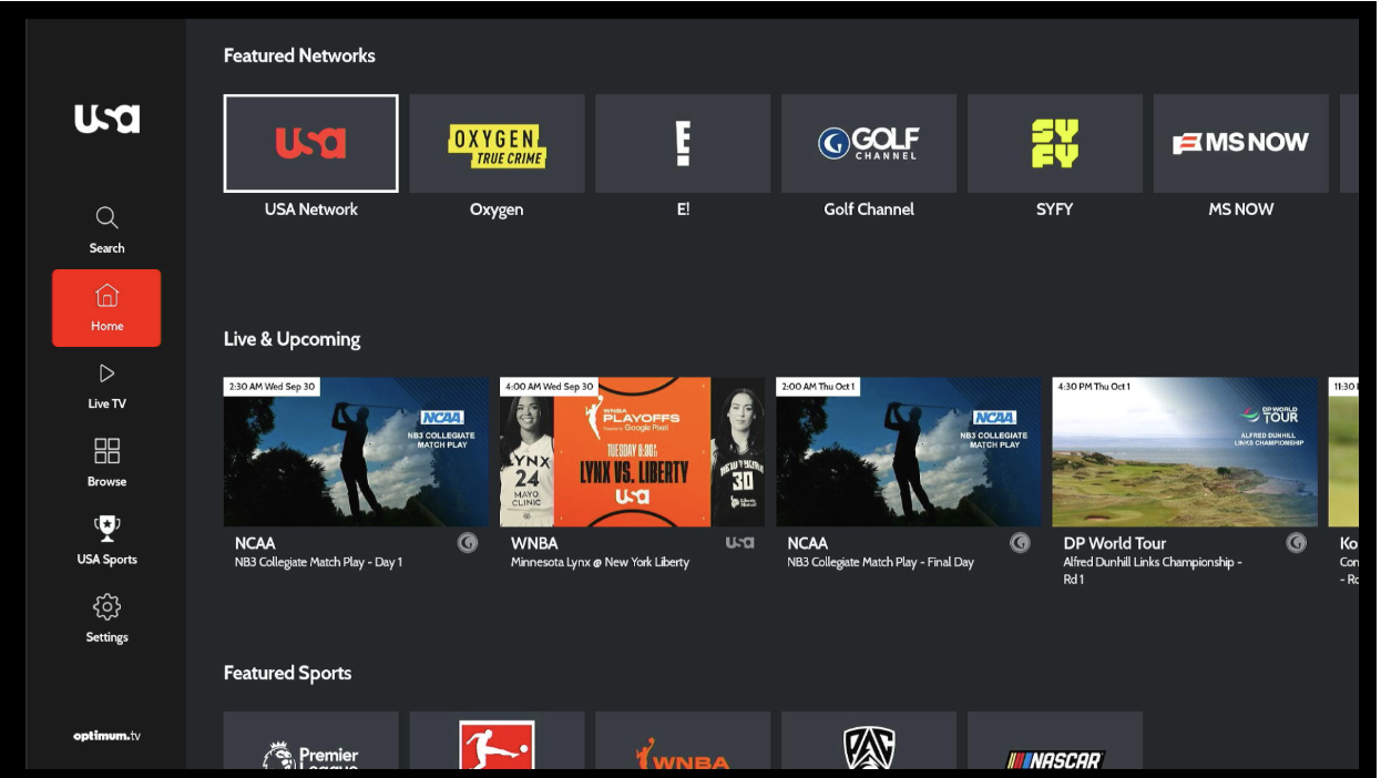
Figure 2. Header / left navigation with Home selected; Featured and Live & Upcoming trays in the main area.
Search
- The search field and on-screen keyboard actions are labeled and usable with the remote.
- Category filters and result cards are focusable and use content titles for spoken names.
- If there are no results, Voice Guide can announce that clearly (for example “There are no results for your search”).
- Actions such as clearing recent searches are announced when focused.
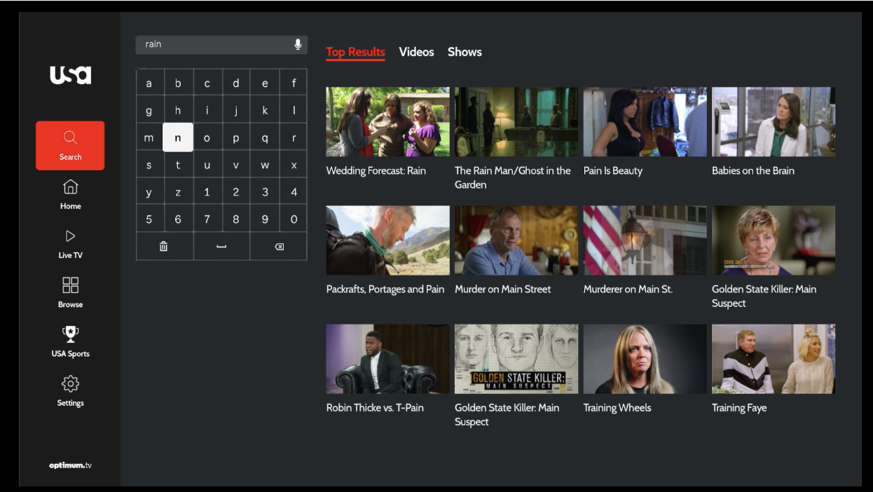
Figure 3. Search field, on-screen keyboard, and results grid used with Focus / Voice Guide; Search menu selected.
Home, trays, and carousels
- Carousels support remote focus and accessibility labeling.
- Tray items and primary buttons have accessible names.
- Section headings (for example Featured, Featured Networks, Live & Upcoming) are available where implemented.
- Watchlist, like, and related actions are usable with the remote where offered.
- Live / upcoming tiles can include useful spoken details such as title and timing context.
Schedule and live listings
- Live TV landing shows LIVE status, program title, progress, and schedule entry points where offered.
- Date controls are labeled and usable with the remote.
- Schedule / On Now program cards use screen-reader labels covering title and related details when relevant.
- Decorative tile visuals are not announced separately, to avoid duplicate speech.
- Tiles and related actions are usable with the remote.
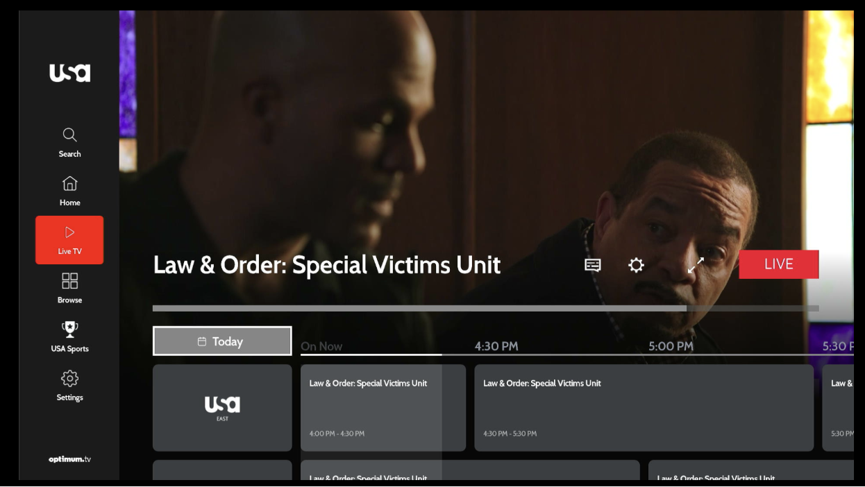
Figure 4. Live TV schedule — LIVE badge, current program title, date control (focused), and program cards.
Program guide
- Channel identification and program tiles are selectable with the remote.
- Program tiles announce title, description, and time information where implemented.
- Date / calendar controls provide schedule context and announce your position in the list (for example “1 of 7”).
- Focus rings on the active program card make the current remote target clear.
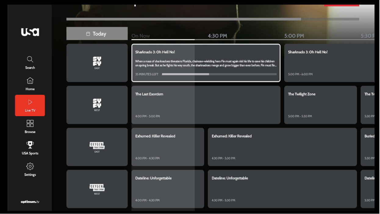
Figure 5. Program guide grid — channel column, program cards with titles, descriptions, and times; Live TV menu selected.
Video and show detail
- On-page information (title, description, rating, seasons) is available to assistive technology where implemented.
- Primary actions (for example Play or Resume) are labeled buttons with a clear focus highlight.
- Season and episode lists are focusable; episode titles are included in spoken labels.
- Watchlist, like, and related actions are usable with the remote where offered, and confirmations such as “Added to watchlist” can be announced.
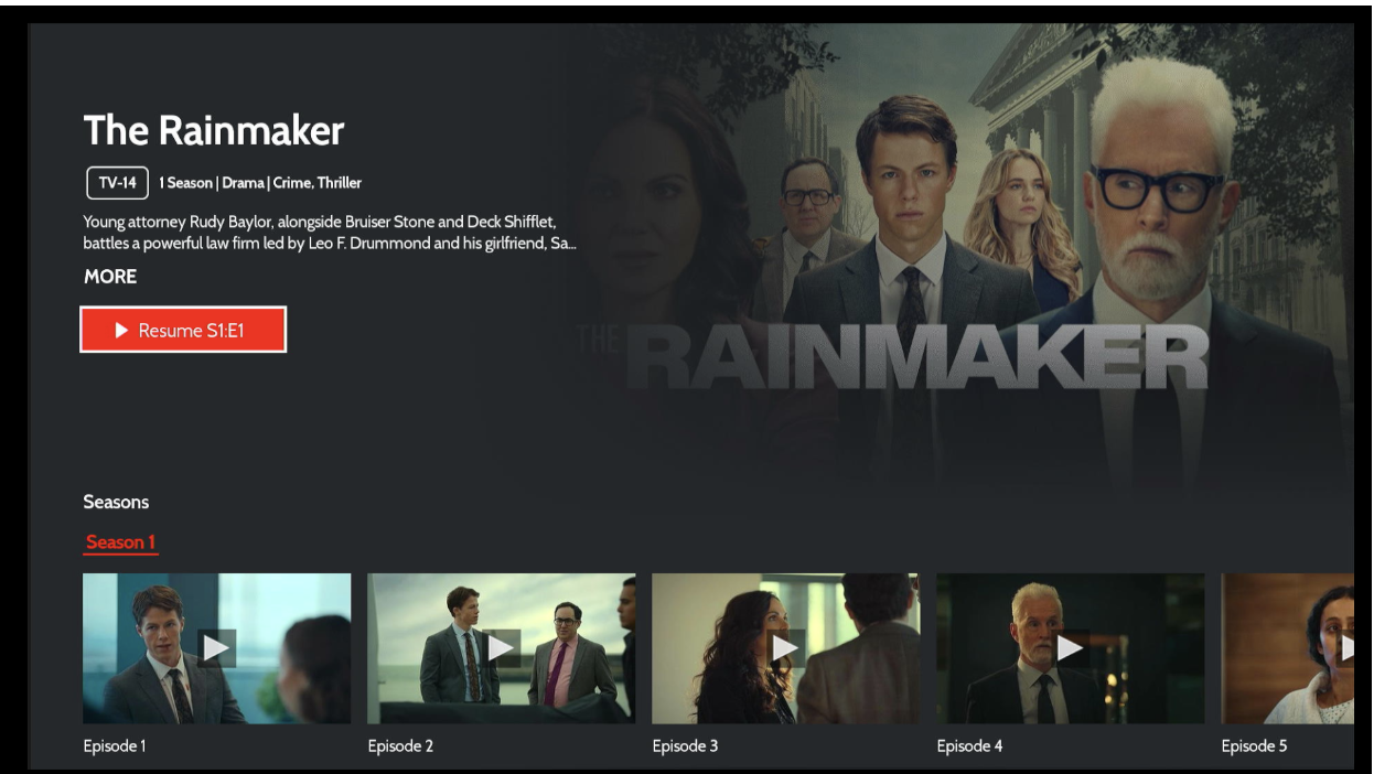
Figure 6. Show detail — rating, title, description, Play / Resume button (focused), and episode tray.
Account, forms, checkout, and settings
- Form fields and actions have accessible names where implemented.
- Device activation / pairing fields and submit controls are labeled where offered.
- Account settings, customer care, legal, and related screens can announce important information when opened.
- Consent checkboxes can announce when consent is given or removed.
- Checkout and plan buttons are focusable; spoken coverage may vary by screen.
TV provider sign-in
- Sign-in instructions and activation details are available to Voice Guide where implemented.
- Activation URL, activation code, and Get New Code are labeled; the code is spoken as text.
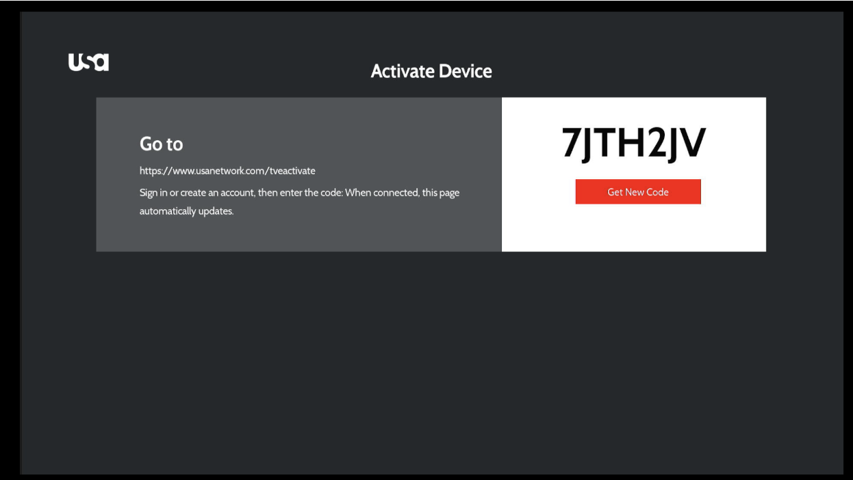
Figure 7. TV provider sign-in — activation URL and code, Get New Code action
Pop-ups and overlays
- Account and related overlays keep focus inside the dialog while open and offer a clear way to dismiss where implemented.
- Settings panels restore or keep focus on the intended controls when opened.
- Confirmation dialogs announce the message and which button is focused (for example button 1 of 2).
6. Video player accessibility
Captions and subtitles
- Closed captions / subtitles can be turned on or off and selected from captions or settings panels where offered.
- The captions / subtitles control is usable from the player controls with the remote.
- Caption and audio options announce the focused choice in the settings list.
- Caption appearance also follows your Roku system caption settings.
Controls and live status
Accessible player controls include:
| Control (as shown) | Spoken / accessible behavior |
|---|---|
| Title | Content title at the top of the player where set |
| Play / Pause | Announces Playing or Paused |
| Playback progress bar | Announces progress and that you can press left or right to seek; for live, announces live progress |
| Current / total time | Spoken time values for on-demand video |
| Captions | Closed captions button |
| Settings | Settings button |
| Broadcast | Broadcast button where offered |
| Skip intro / Skip recap / Share / Like / Watchlist | Labeled where offered on the player |
Live playback can show LIVE / Watch live status. Seek controls expose progress information for assistive technology.
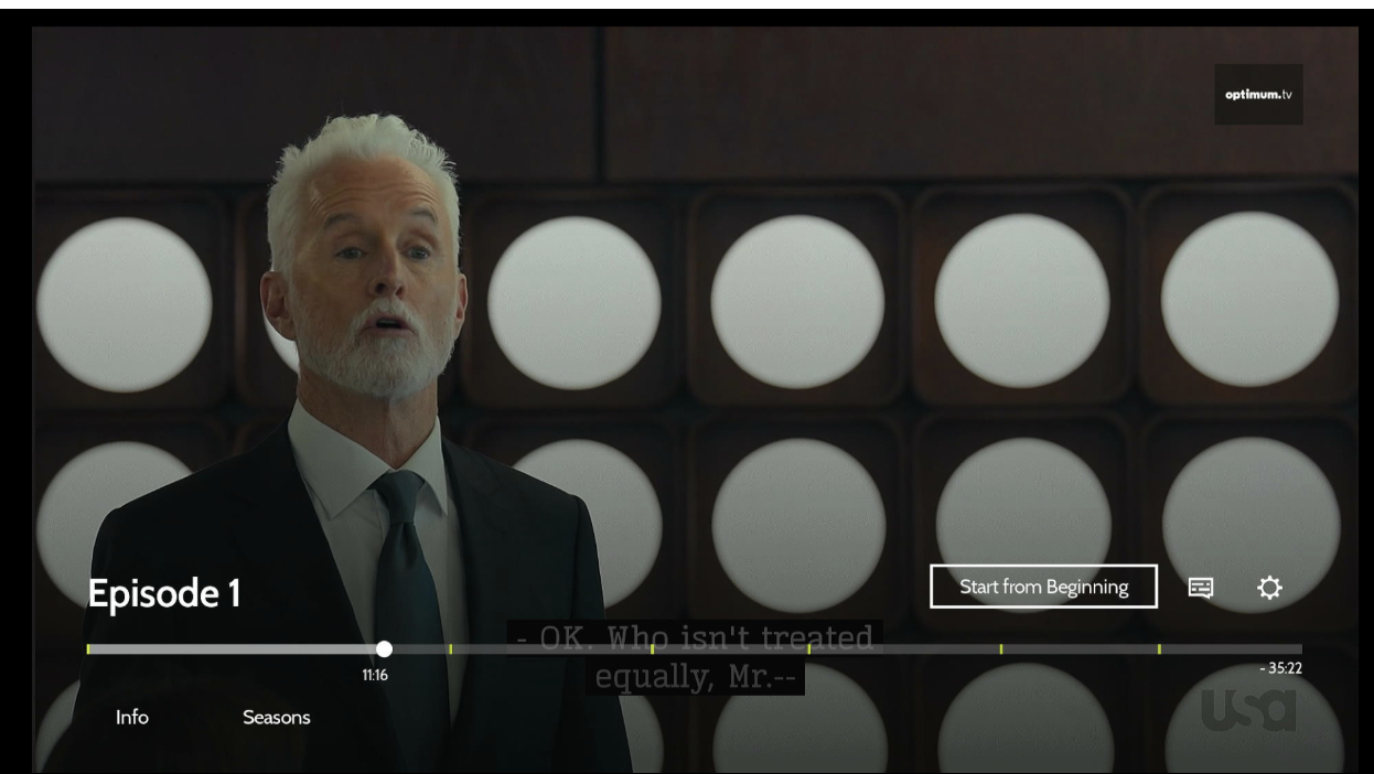
Figure 8. Player captions / controls — title, Play/Pause, progress bar and time, Captions, Settings, and related controls.
Focus / Voice Guide notes
Focus stays inside settings and closed-caption panels while they are open.
After layout changes, focus returns to the main playback controls where supported.
7. Coverage summary
| Area | Labels | Voice Guide | Images | Focus | Captions |
|---|---|---|---|---|---|
| Headings & global experience | Yes | Yes | — | Yes | — |
| Header / nav / search | Yes | Yes | Logo / result labels | Yes | — |
| Trays / carousels | Yes | Yes | Mixed | Yes | — |
| Schedule / Live TV | Rich tile labels | Yes | Often hidden by design | Yes | — |
| Program guide | Channel + program labels | Yes | Channel labels | Focus rings | — |
| Detail pages | Information + actions | Yes | Mixed | Yes | Page + player |
| Account / checkout | Field & button labels | Announcements | Where needed | Yes | — |
| TV provider / pop-ups | Code, names | Yes | — | Focus kept in panel | — |
| Video player | Control & progress labels | Yes | Episode / thumb | Logical return focus | Yes |
8. Summary
Accessibility support combines screen-level improvements (navigation, labeling, remote focus, and Voice Guide speech) with video player support (captions, control labels, seek guidance, and in-player panels). Together, these make core browse, search, account, schedule, and playback journeys usable with the Roku remote and Voice Guide.
9. Out of scope for this document
- Formal legal certification or WCAG claims
- How to turn on Voice Guide in Roku system settings (that is managed on the Roku device, outside this app)