Accessibility support in the iOS experience is always enabled. There is no separate accessibility mode.
This guide describes what is available for VoiceOver and screen-reader users across browsing, search, account flows, schedules, and video playback.
Related: ADA & Accessibility Support (Web) · ADA & Accessibility Support (tvOS)
1. Global page accessibility
Headings
- A screen-level heading is available for assistive technology where implemented (for example hero titles such as Presidents Cup - Day 1 or WWE Friday Night SmackDown).
- Tray and section titles can use clear heading levels (for example Featured Networks, Live & Upcoming, Featured Sports, Watch For Free).
Visible focus and selection
- Interactive controls show a clear selected state (for example the Home or Live tab highlight, or a white outline on a focused program card).
- Bottom tab bar items expose selected vs unselected state to VoiceOver.
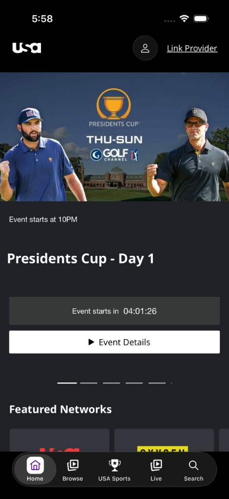
Figure 1. Home hero with logo, profile, Link Provider, Event Details CTA, Featured Networks heading, and selected Home tab.
Accessible names and roles
- Icon-only and text-light controls have accessible names (for example Search, Profile, Link Provider, Play, Close, Settings).
- Custom controls use appropriate traits such as button, header, adjustable (sliders), and selected tab state.
- Decorative loaders and redundant visuals are removed from the accessibility tree so they are not announced as meaningful images.
2. Images (accessibility labels)
- Informative images use descriptive accessibility labels (logos, content titles, provider names, channel logos).
- Decorative or redundant images are hidden from VoiceOver when a parent control already has a full accessible name (for example schedule tiles), so screen readers are not given duplicate announcements.
3. VoiceOver attributes (catalog)
Naming and description
| Attribute | Use |
|---|---|
| Accessibility label | Accessible names on icon buttons, tiles, logos, providers, search, and actions |
| Accessibility hint | Usage hints (for example “Double tap to activate”) on tiles and many player controls |
| Accessibility value | Toggle state (On/Off), selected tab / filter, slider percent, selected caption option |
State and relationship
| Pattern | Use |
|---|---|
| Selected / Unselected | Tab bar destinations and search category filters |
| Expanded / Collapsed | Date dropdowns (for example Today) and series expand / collapse CTAs |
| On / Off | Subtitles and similar toggles (stable label + value) |
| Selected for {setting} | Caption / audio / quality options (for example “Off, selected for Closed Captions”) |
| Announcement | Live updates (search result counts, EPG current program, TVE provider counts) |
| Hidden / not an element | Decorative visuals when a parent label already conveys meaning |
| Custom accessibility elements | Reading order on player skin and game / show detail |
Traits commonly used
| Trait / pattern | Use |
|---|---|
| Button | Tiles, CTAs, player controls, account rows, provider tiles |
| Header | Titles and section headings |
| Adjustable | Playback slider and volume slider |
| Selected | Current tab or filter |
| Static text | Metadata rows that should be read but not activated as buttons |
4. VoiceOver gestures and focus
Gestures
| Gesture | Behavior |
|---|---|
| Swipe right / left | Move through controls; custom reading order is used on player and detail where implemented |
| Double-tap | Activate buttons, tiles, menus, and similar controls |
| Rotor | Navigate by heading, control, and other rotors |
| Swipe up / down (on adjustable) | Change slider value (playback / volume) |
Focus management
- Player chrome can remain visible while VoiceOver is running so controls stay reachable.
- Screen-changed / announcement posts can move VoiceOver attention to play controls or status messages after layout changes.
- Search and TVE flows announce live result counts when VoiceOver is running.
Areas with VoiceOver support
Header and logo, search, navigation and profile actions, trays and carousels, schedule tiles, program guide date selector and program tiles, TV-provider selection, settings and account actions, watchlist / like / share, and player controls / captions.
5. Accessibility by area
Header and navigation
- Logo, Link Provider, and profile controls are labeled and VoiceOver-operable.
- Bottom tab bar items (Home, Browse, USA Sports, Live, Search) include visible text labels and expose selected state.
- When a TV provider is linked, provider branding (for example optimum.tv) can appear in the header in place of Link Provider.
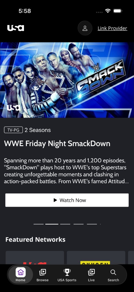
Figure 2. Header / navigation and featured carousel with rating, seasons, Watch Now CTA, and selected Home tab.
Search
- Back, search field, and clear (X) actions are labeled.
- Category filters (Top Results, Episodes, Videos) expose selected / unselected state.
- Result rows are VoiceOver-activable and group thumbnail, duration, title, and description into a focusable item.
- Result counts can be announced live (for example “N, search results found for text …”).
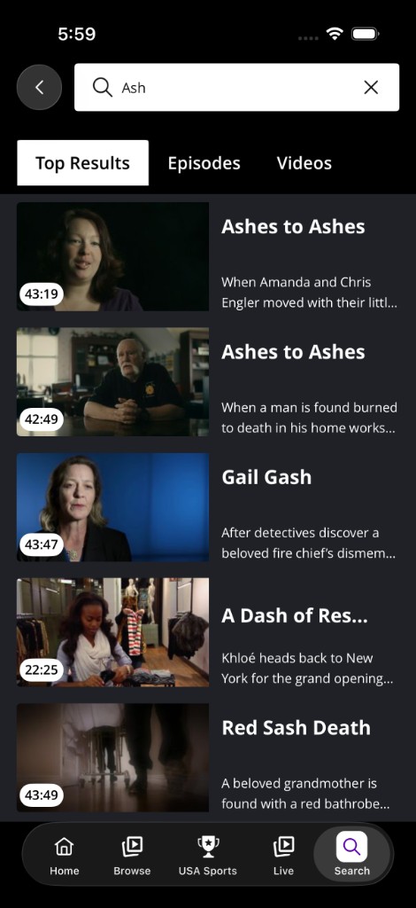
Figure 3. Search field and related controls (clear, Top Results filter, or results) used with VoiceOver; Search tab selected.
Home, trays, and carousels
- Carousels support VoiceOver labeling (including headings and page indicators where implemented).
- Tray items and primary CTAs (for example Watch Now, Event Details) have accessible names.
- Watchlist, like, and share actions are VoiceOver-operable where offered.
- Live / upcoming badges (Live), air times, and NEW badges are included in rich tile speech where implemented.
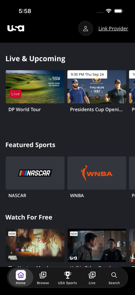
Figure 4. Content trays with Live & Upcoming, Featured Sports, and Watch For Free; Home tab selected.
Schedule and live listings
- Schedule tiles use one rich screen-reader label covering title, network, live/upcoming status, time, and locked content when relevant.
- Decorative tile visuals can be hidden from the accessibility tree to avoid duplicate speech.
- Tiles and related actions are VoiceOver-operable (hint: Double tap to activate where applied).
Program guide
- Date dropdown (Today) is labeled and announces Expanded / Collapsed state.
- On Now and time headers provide schedule context.
- Channel logos and program tiles are VoiceOver-activable and announce channel, title, rating, time / progress where implemented.
- A visible selection outline on the focused program card keeps assistive and sighted focus aligned.
- Link to TV Provider and related CTAs are labeled buttons where shown.
- On play, VoiceOver can announce Current program is {title}.
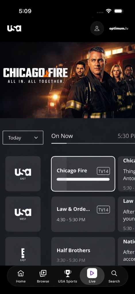
Figure 5. Live / On Now program guide with channel list, program cards, progress, and selection outline on the focused program; Live tab selected.
Video and show detail
- Back control and provider branding in the header are labeled where shown.
- Player / hero region and on-page metadata (title, series/sport, description, rating, categories) are labeled for assistive technology.
- Rating, season count, and genre (for example TV-14, 1 Seasons | Crime drama) are available to VoiceOver.
- Description can include a See More action to expand truncated copy.
- Primary CTAs (for example Resume S1:E2) are labeled buttons.
- Season selector (for example Season 1) is labeled and exposes expanded / collapsed state where implemented.
- Episode tiles are VoiceOver-activable (title and episode number).
- Custom reading order places player controls and metadata in a logical sequence.
- Watchlist, like, share, and related actions are VoiceOver-operable where offered.
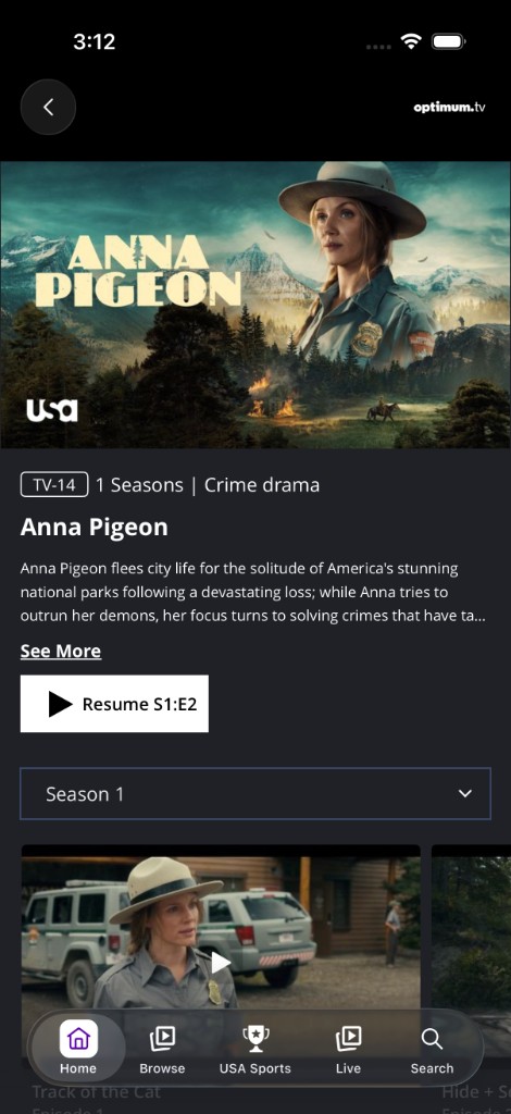
Figure 6. Show detail — back, rating, title, description with See More, Resume CTA, Season selector, and episode tray.
Account, forms, checkout, and settings
- Form fields and actions (including save, confirm, and related CTAs) have accessible names where implemented.
- Device activation / pairing fields and submit controls are labeled where offered.
- Checkout fields and primary actions are labeled; VoiceOver order is supported through account flows where implemented.
TV provider login
- Screen title Choose Your TV Provider and instructional copy are available to VoiceOver.
- Back control is labeled.
- full list is an actionable link within the instructional text.
- Search field is labeled; provider tiles are buttons whose accessible name is the provider name.
- Search can announce how many providers were found.
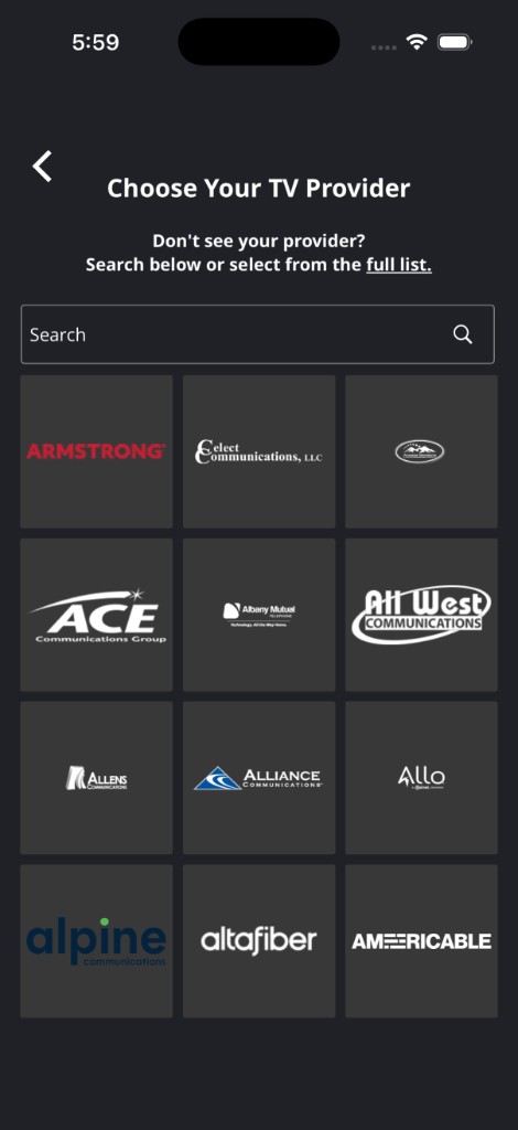
Figure 7. Choose Your TV Provider — back, title, search, and provider grid tiles labeled by provider name.
Modals and overlays
- Account and related overlays keep a sensible VoiceOver reading order where implemented.
- Dismiss / back controls are labeled.
6. Video player accessibility
Captions and subtitles
- Closed captions / subtitles can be loaded, labeled by language, turned on or off, and selected from captions or settings panels.
- The Subtitles control uses label Subtitles with value On / Off (UI may show Subtitles: Off).
- Caption options announce selection in context (for example Off, selected for Closed Captions).
Controls and live status
Accessible player controls include:
| Control (as shown) | Spoken / accessible behavior |
|---|---|
| Close (X) | Close |
| Title / metadata | Labeled text (for example show title and air date) |
| Rewind 10 / Forward 10 | Rewind 10 seconds / Forward 10 seconds |
| Pause / Play | Pause / Play |
| Playback slider | Playback slider; adjustable; progress exposed to VoiceOver |
| Time (06:39 / 10:26) | Spoken as elapsed of total |
| Volume On | Mute / Unmute action; volume slider where offered |
| Slow mo | Slow motion |
| Lock Controls | Lock screen / Unlock screen |
| Subtitles: Off | Subtitles with value On / Off |
| Settings | Player settings |
| Full screen / Cast / AirPlay / PiP / Live | Labeled where offered on the skin |
Live playback can show LIVE / Watch live status. Seek controls expose progress values for assistive technology.
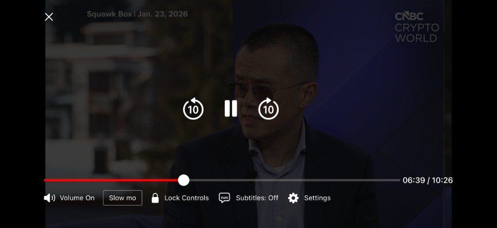
Figure 8. Player captions / controls — Close, title, Rewind 10 / Pause / Forward 10, slider and time, Volume, Slow mo, Lock Controls, Subtitles, and Settings.
VoiceOver interaction notes
- Play / Pause label tracks playback state.
- Volume announces the action a double-tap performs (Mute / Unmute).
- Rewind / Forward announce Rewind 10 seconds / Forward 10 seconds.
- Subtitles keep a stable label with On / Off value.
- When VoiceOver is running, player controls can remain on screen longer so they stay reachable.
7. Coverage summary
| Area | Labels / traits | VoiceOver | Images | Focus / selection | Captions |
|---|---|---|---|---|---|
| Headings & global model | Yes | Yes | — | Yes | — |
| Header / nav / search | Yes | Yes | Logo / result labels | Tab / filter selected | — |
| Trays / carousels | Yes | Yes | Mixed | Yes | — |
| Schedule | Rich tile labels | Yes | Often hidden by design | Yes | — |
| Program guide | Dropdown + tile labels | Announcements | Channel labels | Card selection | — |
| Detail pages | Metadata + actions | Reading order | Mixed | Yes | Page + player |
| Account / checkout | Field & CTA labels | Yes | Where needed | Yes | — |
| TV provider / modals | Names + search | Yes | Provider names | Yes | — |
| Video player | Control & time labels | Gestures + UI | Episode / thumb | Custom order | Yes |
8. Summary of accessibility themes
- Accessible names — labels on icon and custom controls
- Image text alternatives — descriptive labels for informative images; tree exclusion for decorative / redundant images
- VoiceOver support — swipe, double-tap, rotor, and adjustable controls
- Focus clarity — selected tabs, program-card outlines, and player reading order
- State disclosure — expanded, selected, On/Off, and related accessibility values
- Rich screen-reader copy — especially schedule and program-guide tiles
- Player media accessibility — captions, labeled controls, spoken time, live status, and accessible settings
9. Out of scope for this document
- Web / browser and Apple TV platforms (see companion ADA guides)
- Formal legal certification or WCAG / App Store Accessibility Nutrition Label claims
10. Closing note
Accessibility support combines screen-level improvements (navigation, labeling, VoiceOver access, and selection state) with video player support (captions, control labels, spoken time, and in-player panels). Together, these make core browse, search, account, schedule, and playback journeys usable with VoiceOver and assistive technologies.