Accessibility support in the web experience is always enabled. There is no separate accessibility mode.
This guide describes what is available for keyboard and screen-reader users across browsing, search, account flows, schedules, and video playback.
1. Global page accessibility
Skip link and landmarks
- A “Skip to main content” link appears on keyboard focus and moves focus into the main content.
- Page regions use landmarks: header, navigation, main, and footer.
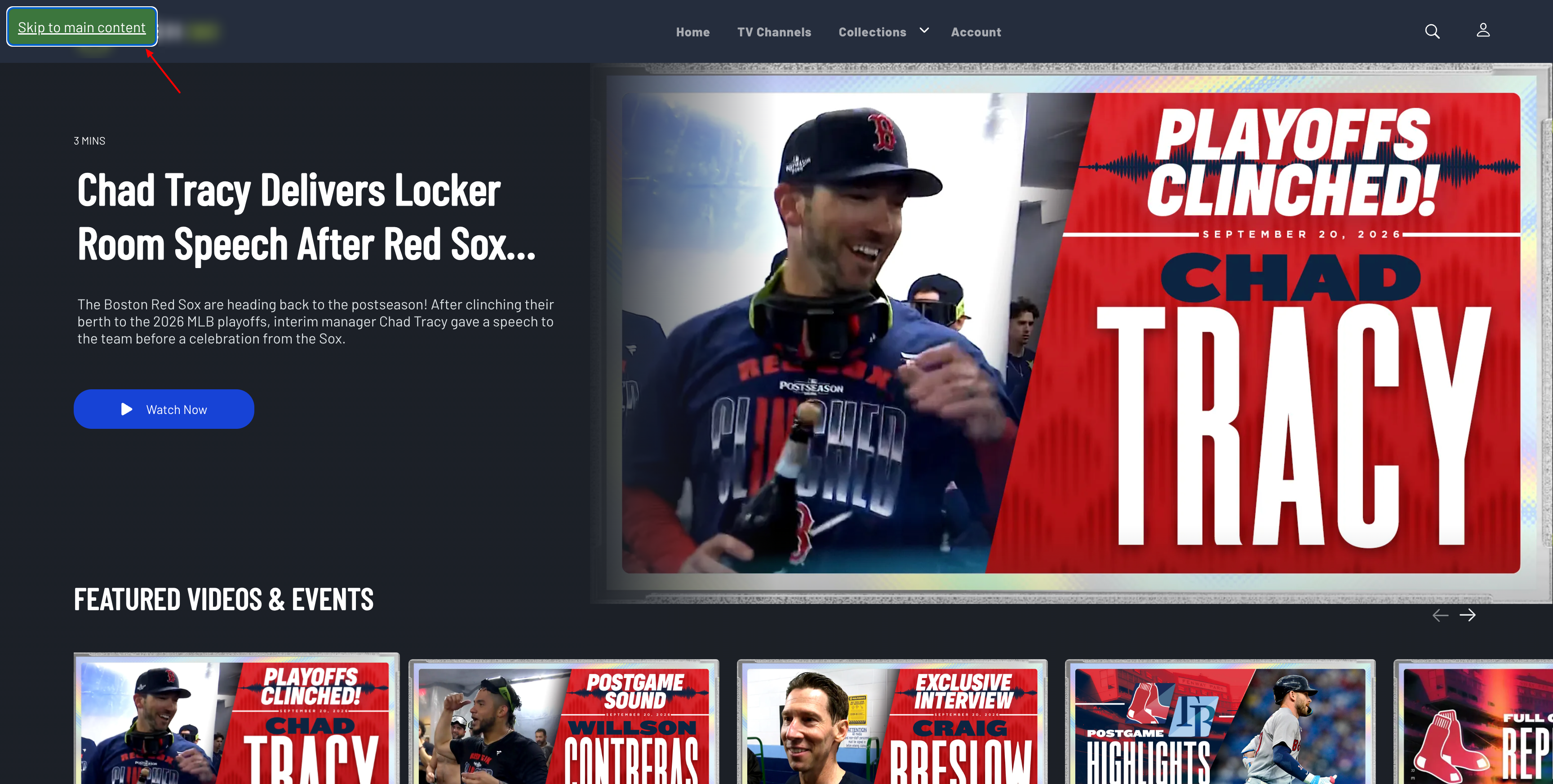
Figure 1. “Skip to main content” link when focused with the keyboard.
Headings
- A site-level heading is available for assistive technology.
- Tray and splash titles can use clear heading levels (for example level-2 tray titles).
Visible focus
- Interactive controls show a clear focus outline for keyboard navigation.
- Focus styling works on desktop and mobile; keyboard focus is distinguished from mouse-only interaction where appropriate.
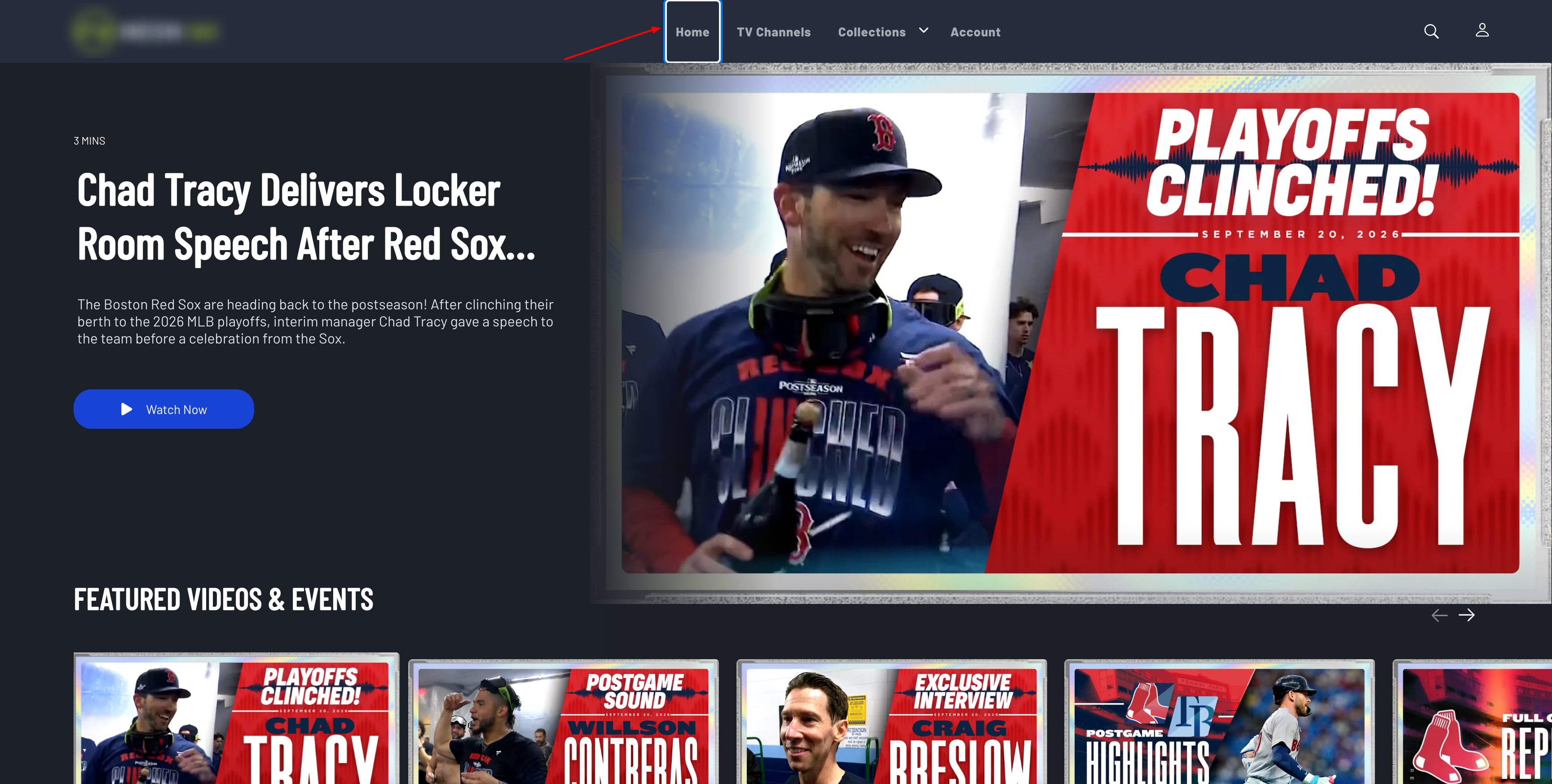
Figure 2. Visible focus outline on an interactive control during keyboard navigation.
Accessible names and roles
- Icon-only and text-light controls have accessible names (for example Search, Close, User actions).
- Custom controls use appropriate roles such as button, link, dialog, region, navigation, menu, listbox, option, group, alert, and tooltip.
- Decorative loaders use presentation semantics so they are not announced as meaningful images.
2. Images (alt text)
- Informative images use descriptive
alttext (logos, content titles, team/venue names, provider names, channel logos). - Decorative or redundant images use empty
altwhen a parent control already has a full accessible name (for example schedule tiles), so screen readers are not given duplicate announcements.
3. ARIA attribute changes (catalog)
Naming and description
| Attribute | Use |
|---|---|
aria-label |
Accessible names on icon buttons, tiles, logos, providers, search, calendar, social links, and actions |
aria-labelledby |
Associates inputs and dialogs with visible or related text |
aria-describedby |
Associates helper text / tooltips with controls |
State and relationship
| Attribute | Use |
|---|---|
aria-expanded |
Open/closed state for menus, mobile nav, dropdowns, and calendar |
aria-controls |
Links a trigger to the region or dialog it opens |
aria-haspopup |
Indicates a control opens a menu or dialog |
aria-pressed |
Toggle state (for example list vs grid view) |
aria-selected |
Selected option in list/combo patterns |
aria-activedescendant |
Keyboard highlight in season dropdowns |
aria-hidden |
Hides decorative visuals when a parent label already conveys meaning |
aria-busy |
Loading / loading-more state on content lists |
aria-live |
Announcements for important UI state changes (for example dialogs and player season selector) |
Roles commonly used
| Role / pattern | Use |
|---|---|
dialog + aria-modal |
Account popups, calendar, cookie banner, player season selector, and similar overlays |
tooltip |
Contextual help on toggles and info controls |
region |
Carousels, schedule trays, and grouped content |
navigation / menu / menuitem |
Primary and mobile navigation |
listbox / option / combobox |
Carousels and season selectors |
group |
Player shell and some program-guide groupings |
alert |
Error / status messaging in content lists |
4. Keyboard and focus
Keys
| Key | Behavior |
|---|---|
| Tab / Shift+Tab | Move through controls; dialogs may keep focus inside while open |
| Enter / Space | Activate custom buttons, tiles, menus, and similar controls |
| Escape | Close menus, account popups, and other dismissible overlays |
Focus management
- Account popups trap focus while open and support Escape to close.
- Calendar and player season selectors restore or return focus when closed.
- The skip link focuses the first actionable control in main content.
Areas with keyboard support
Header and logo, search, navigation and profile menu, trays and carousels, schedule tiles, program guide calendar and program tiles, TV-provider selection, settings and account actions, watchlist / like / share, season dropdowns, and player controls / shortcuts.
5. Accessibility by area
Header and navigation
- Logo, search, login, and profile controls are labeled and keyboard-operable.
- Menus expose expanded/collapsed state; profile menu supports Escape to close.
- Mobile navigation toggle is labeled and keyboard-operable.
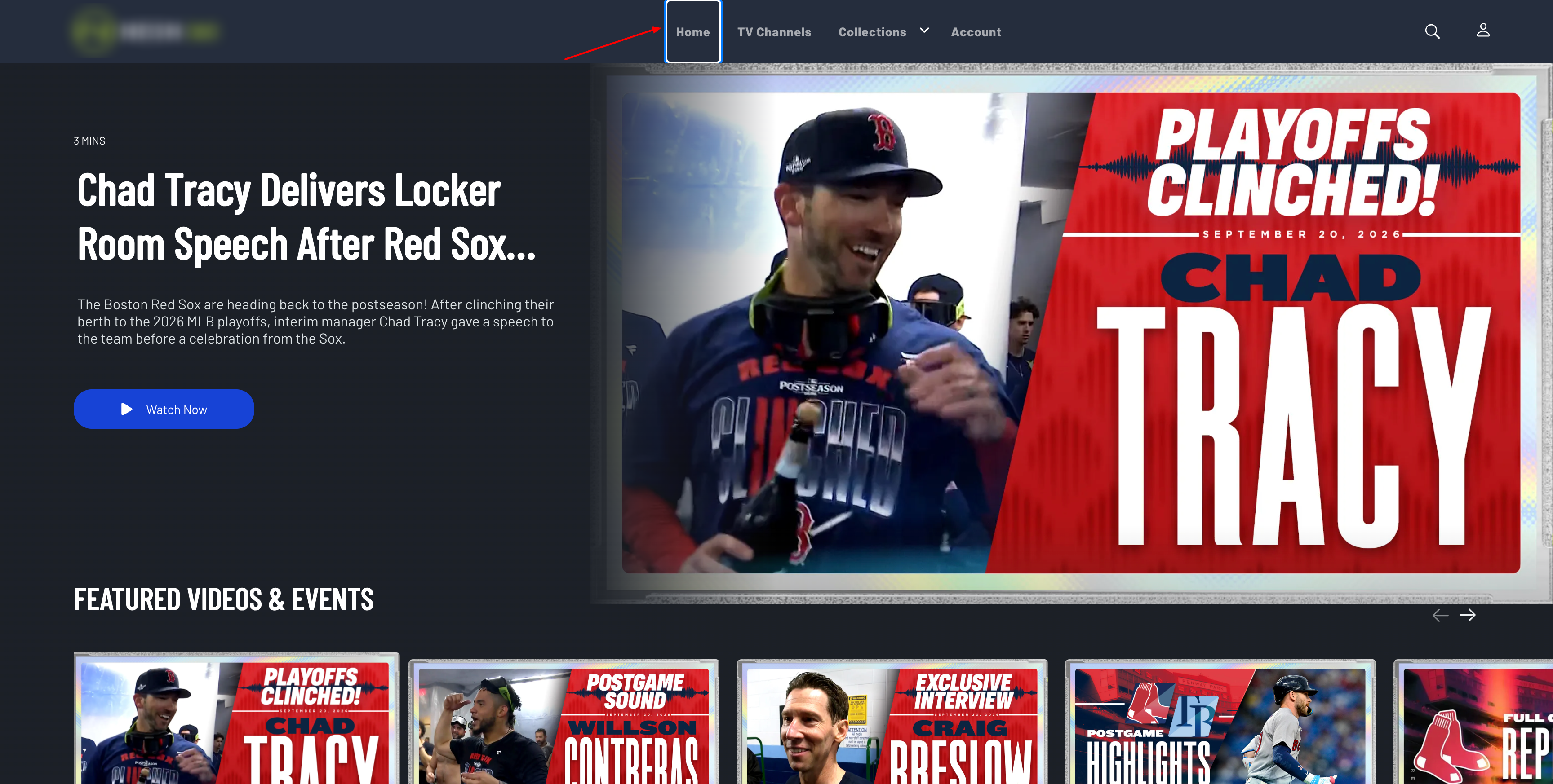
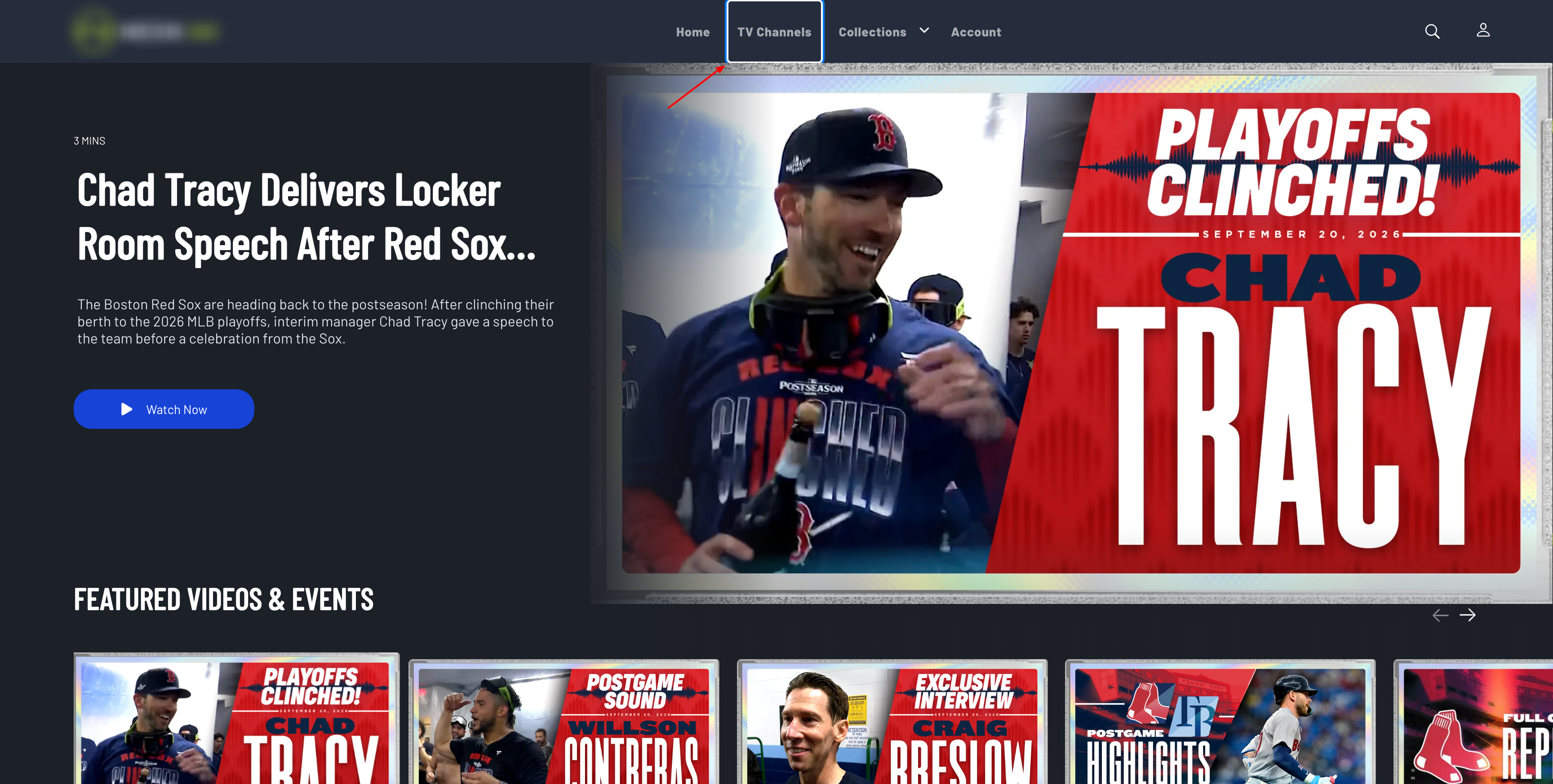
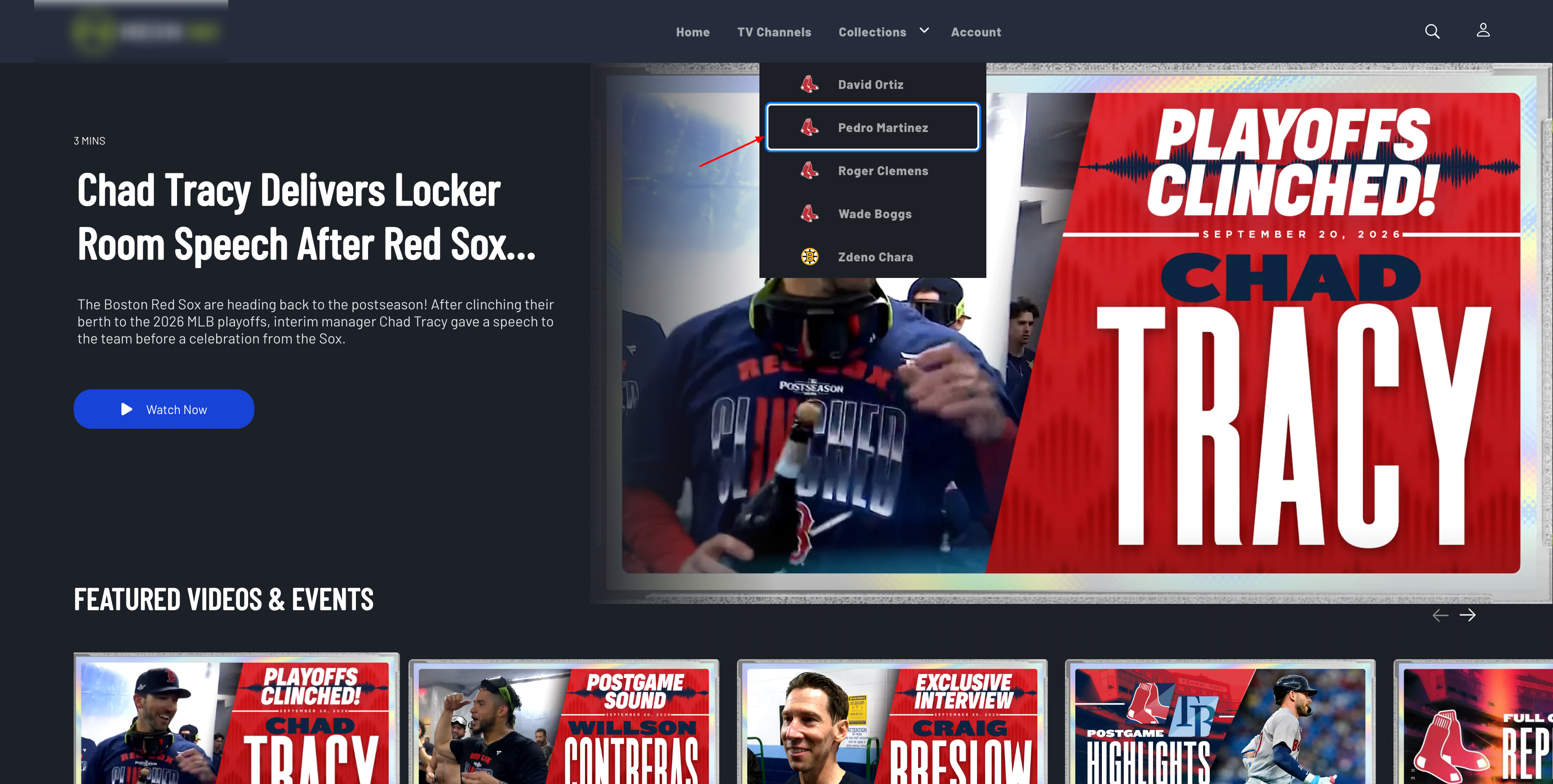
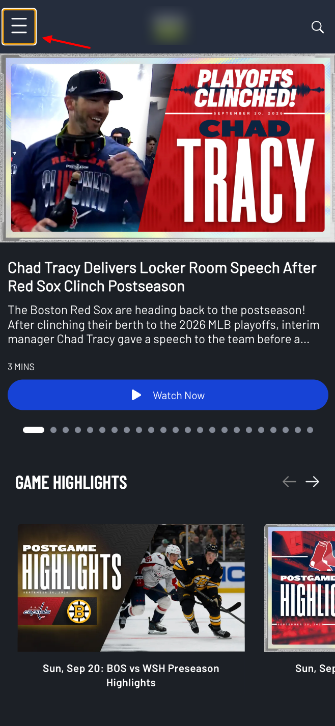
Figure 3. Header / navigation controls reachable and focused with the keyboard.
Search
- Search field, submit, close, back, and clear actions are labeled.
- Result / suggestion cards are keyboard-activable and use content titles for image
alt.
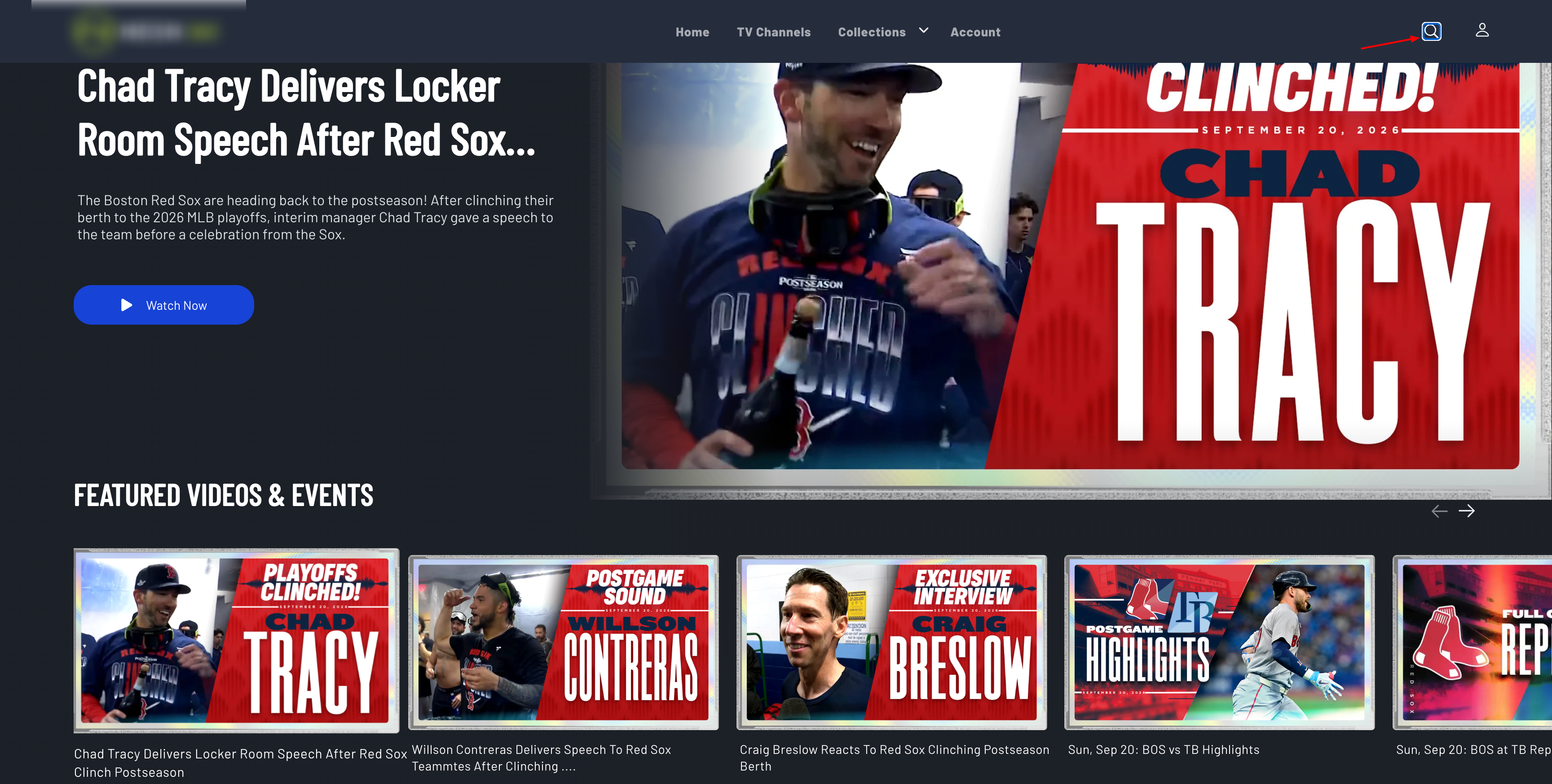
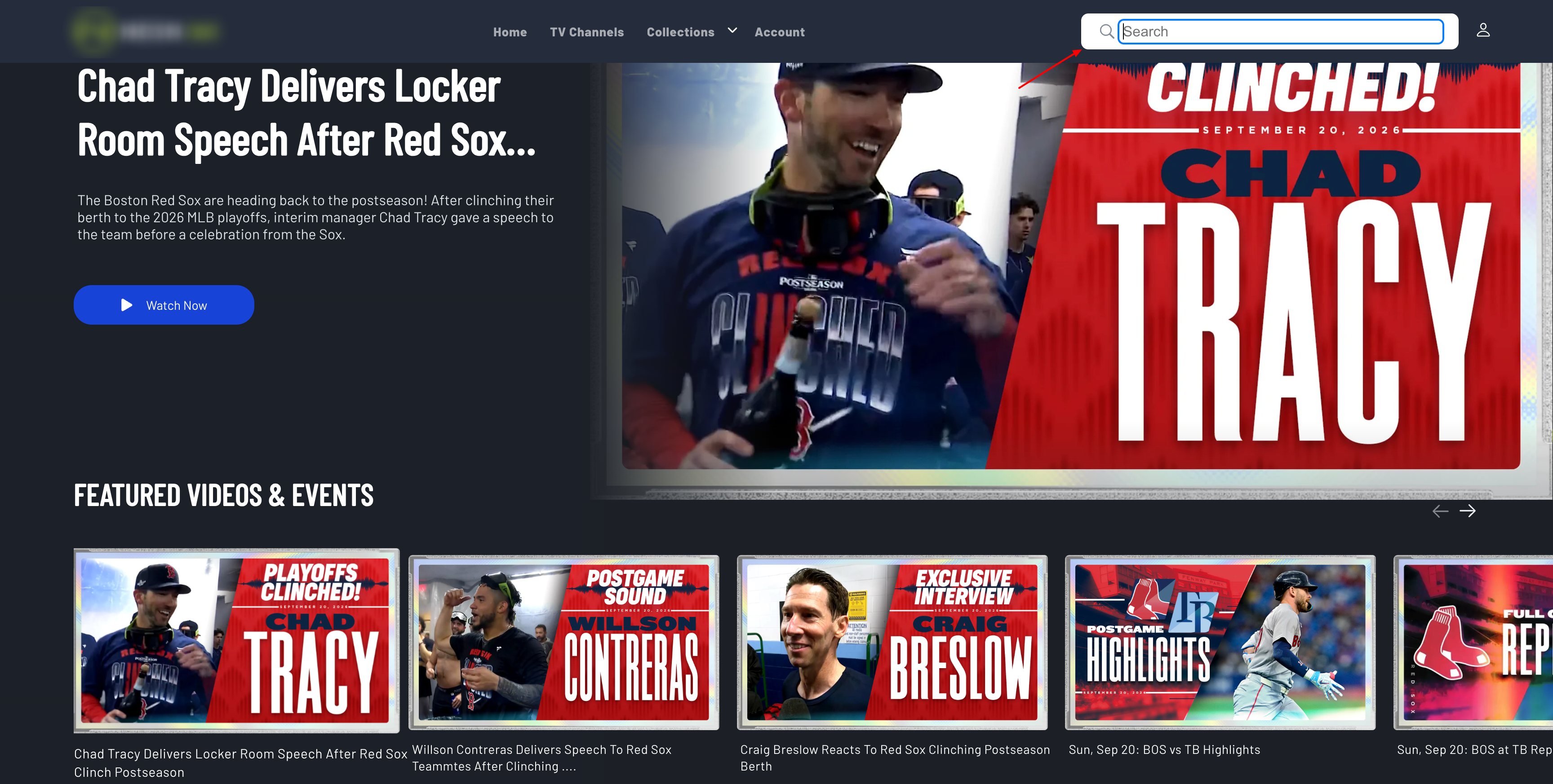
Figure 4. Search field and related controls (submit, clear, or results) used with the keyboard.
Home, trays, and carousels
- Carousels support keyboard use and accessibility labeling (including named regions and slide labels).
- Tray items and See More actions have accessible names.
- Watchlist, like, and share actions are keyboard-operable.
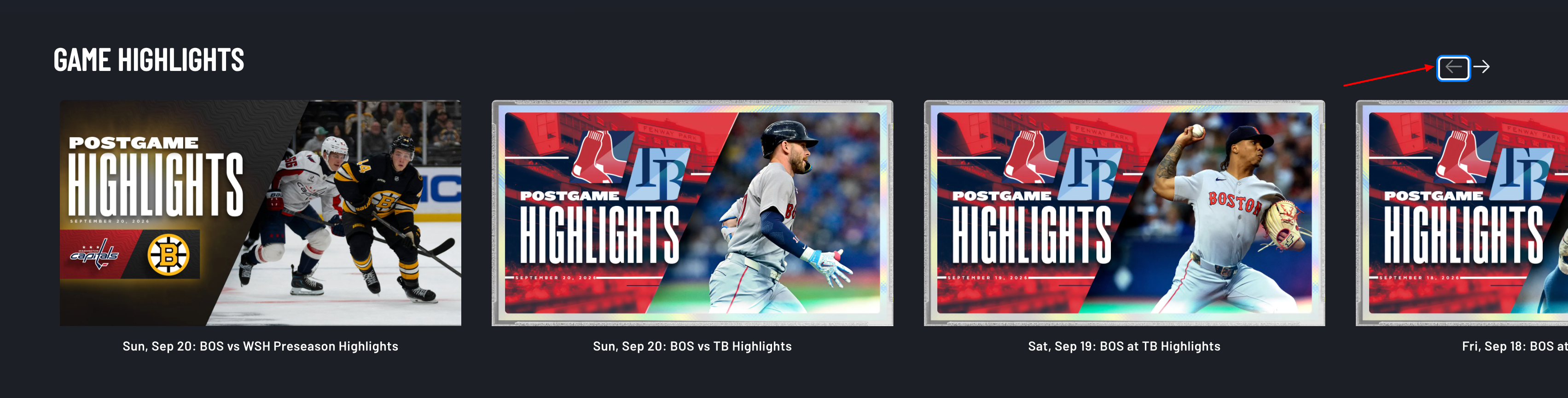
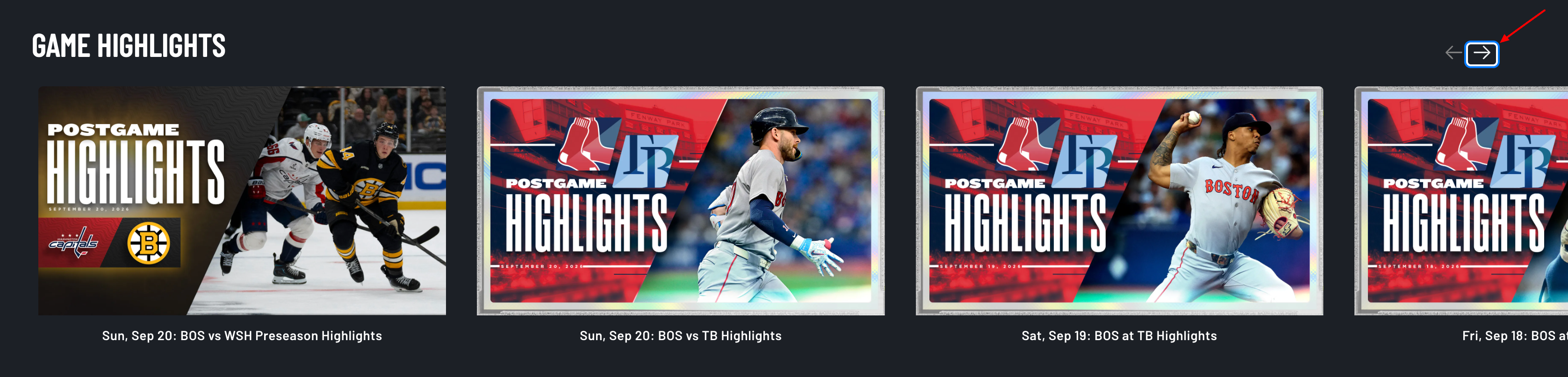
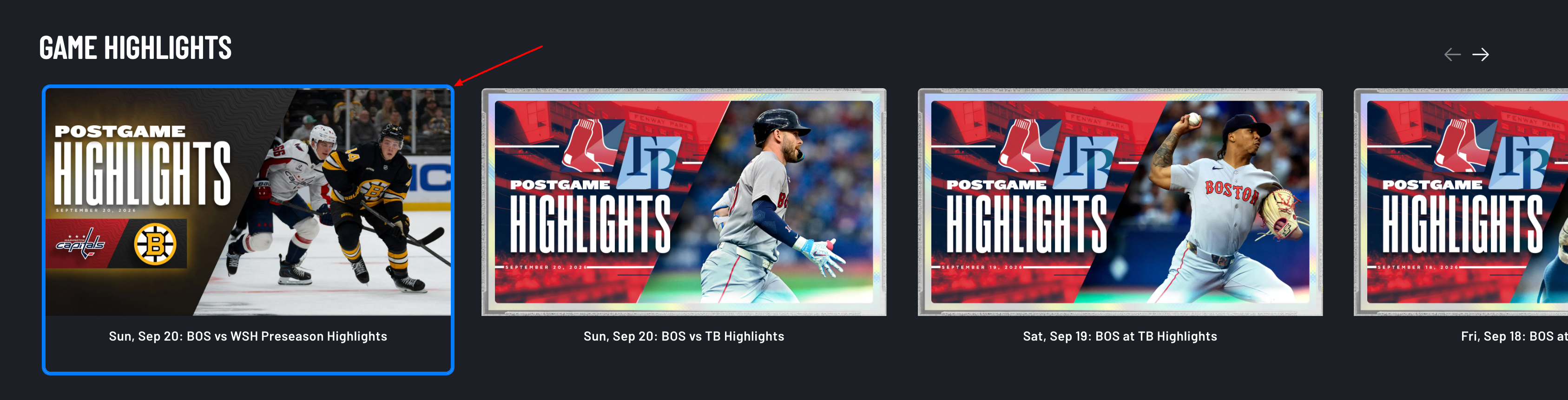
Figure 5. Carousel or content tray with keyboard focus on a slide or See More action.
Schedule and live listings
- Schedule tiles use one rich screen-reader label covering title, league, network, live/upcoming status, time, and locked content when relevant.
- Decorative tile visuals can be hidden from the accessibility tree to avoid duplicate speech.
- Tiles and related actions are keyboard-operable.
Program guide
- Calendar control is labeled, keyboard-operable, and opens a dialog (with expanded/open state).
- Month navigation and close controls are labeled and keyboard-operable.
- Program tiles are keyboard-activable and announce channel, title, description, and time / remaining time.
Video and show detail
- Player region and on-page metadata (title, series/sport, description, rating, categories) are labeled for assistive technology.
- Season selector uses a combobox / listbox pattern for keyboard selection.
- Watchlist, like, share, and related actions are keyboard-operable.
Account, forms, checkout, and settings
- Form fields and actions (including OTP digits, save, confirm, resend, delete, consent checkboxes) have accessible names.
- Device activation / pairing fields and submit controls are labeled.
- Viewing-restrictions save action is labeled.
- Checkout fields and primary actions (for example promo, consent, Subscribe & Pay, Confirm Purchase) are labeled; keyboard tab order is supported through checkout.
TV provider login
- Dialog is labeled as a modal; provider tiles are keyboard buttons with provider names.
- Search, list/grid toggle, and help tooltip are accessible (including tooltip on keyboard focus).
Modals, footer, and cookies
- Account and related dialogs use dialog semantics, Escape to close, and focus trapping where implemented.
- Footer social and privacy/cookie links are labeled.
- Cookie preference UI uses dialog labeling and keyboard-accessible dismiss / settings actions.

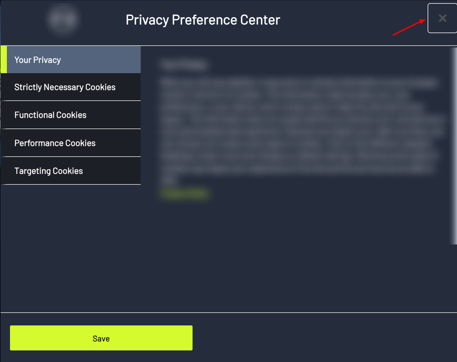
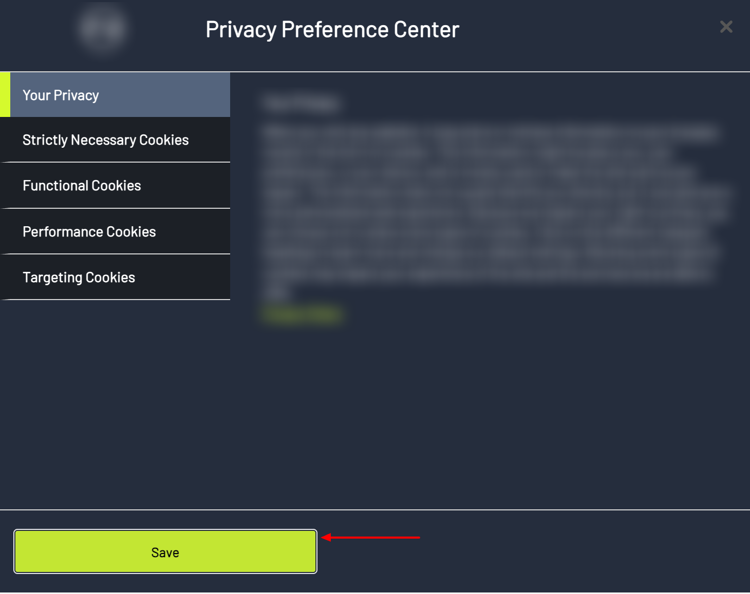
Figure 6. Cookie / privacy preference dialog with accessible dismiss or settings actions.
6. Video player accessibility
Captions and subtitles
- Closed captions / subtitles can be loaded, labeled by language, turned on or off, and selected from captions or settings panels.
- Caption options are keyboard-operable; cast sessions can keep caption selection in sync where supported.
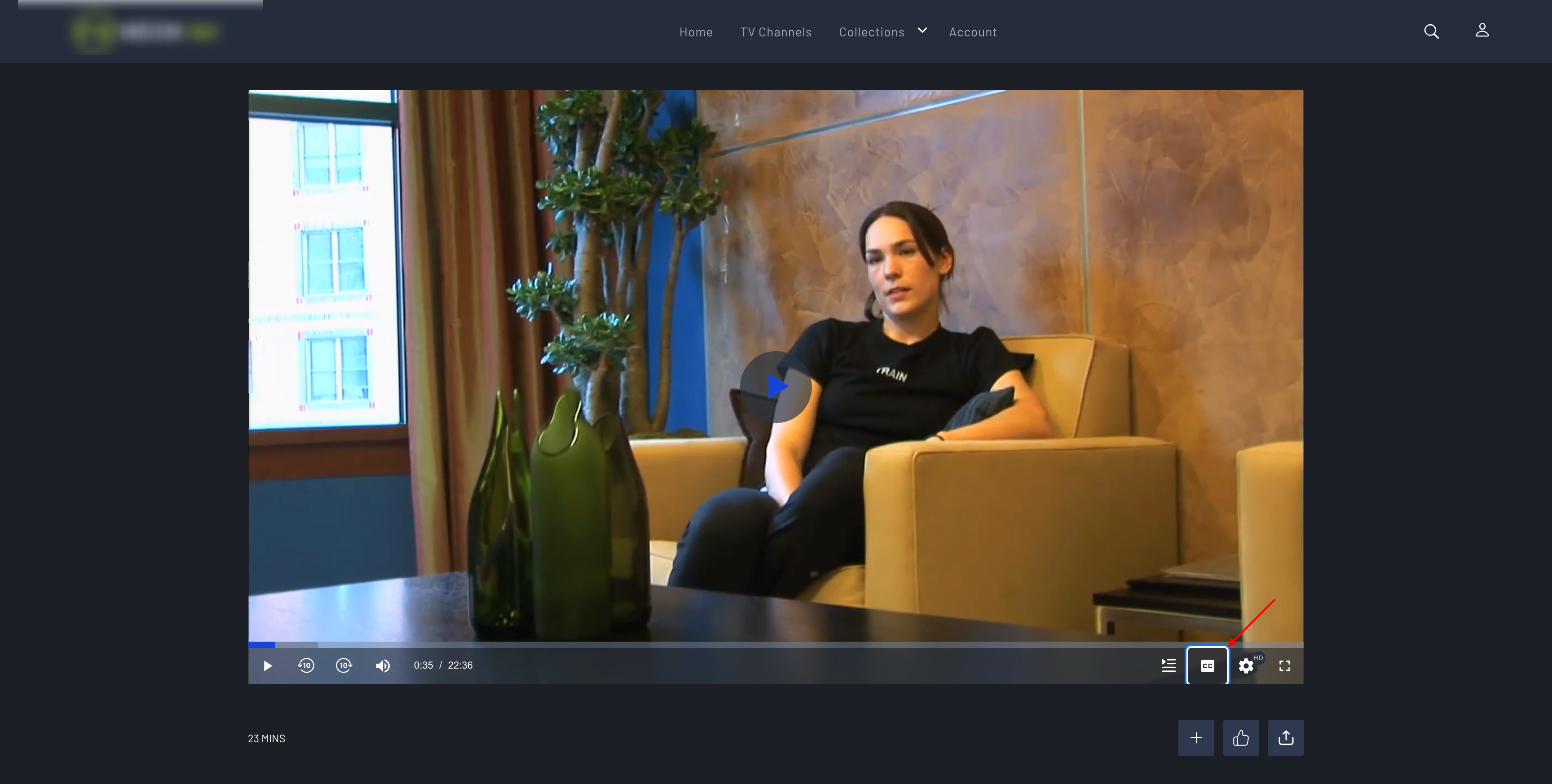
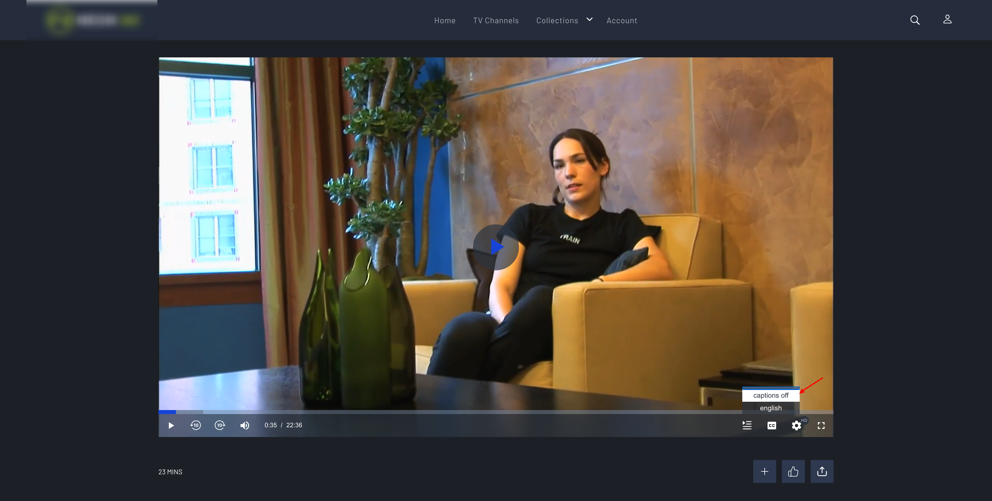
Figure 7. Player captions / subtitles menu with language options.
Controls and live status
Accessible player controls include:
- Play / Pause
- Mute / volume toggle and volume slider
- Seek / progress (with time labeling)
- Current time and total duration
- Captions / subtitles
- Settings (quality, speed, audio, subtitles where offered)
- Fullscreen
Live playback can show LIVE / GO LIVE (or Watch Live) status. DVR seek controls expose progress values for assistive technology. Chapter markers on the timeline are keyboard-operable and labeled.
Video player keyboard shortcuts
| Key | Action |
|---|---|
| Space | Play / pause |
| M | Mute / unmute |
| F | Fullscreen |
| Left arrow | Rewind (about 10 seconds; allowed on live when timeshift is available) |
| Right arrow | Skip forward (about 10 seconds on on-demand; limited on some live modes) |
Additional keyboard behavior:
- Shortcuts focus the video element when used.
- Shortcuts are ignored while typing in text inputs or textareas.
- Shortcuts can be temporarily disabled during ads so ads are not skipped unintentionally.
- Chapter markers and season / recommended selector close controls also support Enter / Space.
- Season and recommended selectors use dialog labeling, keyboard support, and focus return when closed.
7. Coverage summary
| Area | Labels / ARIA | Keyboard | Images | Focus | Captions |
|---|---|---|---|---|---|
| Skip link & landmarks | Yes | Yes | — | Yes | — |
| Header / nav / search | Yes | Yes | Logo / result alts | Yes | — |
| Trays / carousels | Yes | Yes | Mixed | Yes | — |
| Schedule | Rich tile labels | Yes | Often empty by design | Yes | — |
| Program guide | Dialog + tile labels | Yes | Channel alts | Yes | — |
| Detail pages | Metadata + actions | Yes | Mixed | Yes | Page + player |
| Account / checkout | Field & CTA labels | Yes | Where needed | Yes | — |
| TV provider / modals | Dialog + names | Yes | Provider alts | Trap / restore | — |
| Footer / cookies | Link names | Yes | Logo alt | — | — |
| Video player | Control & time labels | Shortcuts + UI | Episode / thumb alts | Selector focus | Yes |
8. Summary of accessibility themes
- Accessible names — labels on icon and custom controls
- Image text alternatives — descriptive
altfor informative images; emptyaltfor decorative / redundant images - Keyboard support — Tab, Enter, Space, and Escape on interactive UI
- Focus clarity — visible focus rings and skip-to-content focus movement
- Dialog safety — modal roles, Escape, focus trap / restore
- State disclosure — expanded, pressed, selected, and related ARIA state
- Rich screen-reader copy — especially schedule and program-guide tiles
- Player media accessibility — captions, labeled controls, keyboard shortcuts, live status, and accessible in-player selectors
9. Out of scope for this document
- Native mobile applications and non-browser device platforms (separate accessibility support)
- Formal legal certification or WCAG conformance claims
10. Closing note
Accessibility support combines page-level improvements (navigation, labeling, keyboard access, and focus) with video player support (captions, control labels, keyboard shortcuts, and in-player panels). Together, these make core browse, search, account, schedule, and playback journeys usable with assistive technologies and keyboard-only interaction.