Live Preview Tray
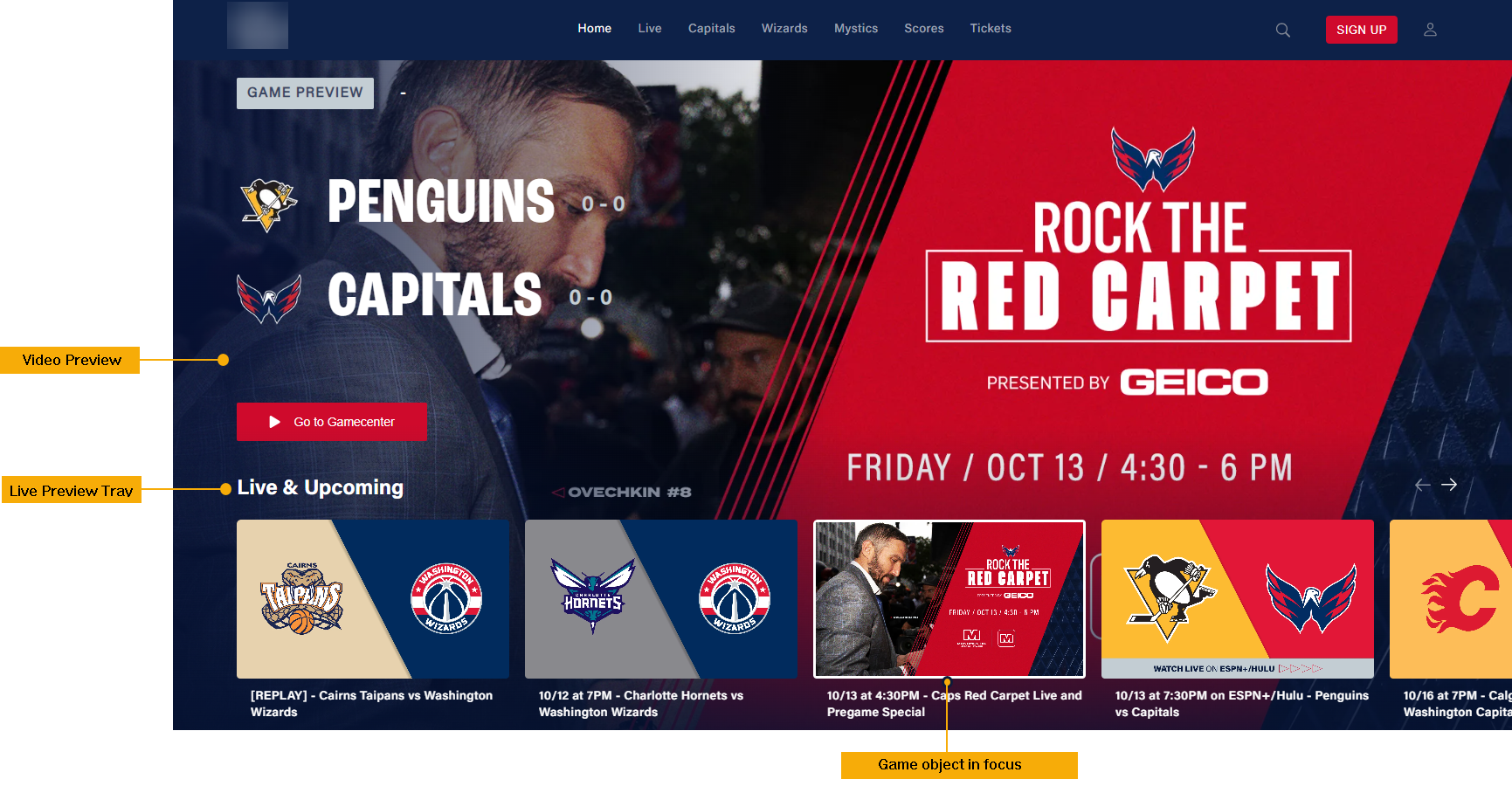
Live Preview Tray can be used to drop a grand preview visual for a game object on focus in the carousel area on top. Each game object loaded on the Live Preview Tray is displayed as a tile on the tray. On mobile, users can swipe through the cards while Web users can move their cursor over a game object to see the preview video for each game along with information about the game state and live scores. The preview video is preconfigured to play on mute. Clicking on a game object tile will take you to its Game Detail Page.
A Game object page must be in the Published state for curation.

Adding a Live Preview Tray

- To add a Live Preview Tray on the Home page, click Add Modules on top.
- From the Add a New Module panel, search for the Live Preview Tray module.
- Drag and drop it into the page below the masthead.
Live Preview Tray settings
If you click on the module settings, you will see the following options.
| Screen element | Description |
|---|---|
| Title | Provide a "tray title". |
| Sub Title | (Optional) Provide a Tray sub-title. |
| Tray Icon URL | (Optional) Provide the absolute URL for the Icon. Example: "https://image.exampletv.com/images/2023/09/23/icon.png?impolicy=resize&w=&h=" Provide the "w" and "h" as 2400 (px). |
| Sponsorship Logo URL | (Optional) Provide the absolute URL for the sponsorship logo of a partner. Usually this is skipped for a Live feature tray. |
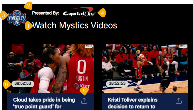
 1. Title of the tray 2. Sub Title 3. Tray Icon 4. Sponsorship Logo 5. Enable Sharing 6. Content Duration 1. Title of the tray 2. Sub Title 3. Tray Icon 4. Sponsorship Logo 5. Enable Sharing 6. Content Duration | |
| Content Settings | |
| Content Selection | Programmatically Generate: Fetch the contents into a tray by selecting Title or Recently Added in the Fetch Strategy option. Manually Curate: Search the CMS and add the published game objects into the tray. |
| Content Type | Although Game/Event objects are typically curated in the Live Preview tray, you can also select the "Any" option if you want to curate any type of content object, like, VOD, podcast, articles, etc. |
| Thumbnail Type | Select the thumbnail of a specific image aspect ratio. Recommended setting: 16:9. |
| Enable Sharing | (Optional) Select to allow social sharing of the tray contents. |
| Show Content Duration | (Optional) Select the flag to show video duration on the thumbnails. |
| Thumbnail Placement | Center the thumbnail placement to the left, top, or right. Recommended setting: left. |
| Show Parallax Image | Enable this toggle to add a background image at the modular tray-level. This setting applies to all trays in the Template Builder except the Featured tray (see an example below). Use the different image URL fields for Web, OTT, Apps, and Tab to maintain the correct image aspect ratio. |
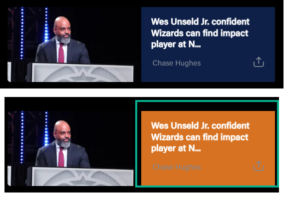
| Text Background Color | (Optional) Change the background color of a text element on an article thumbnail (applies specifically to the Article content trays). |
| Number of Display Items | Set the number of tiles to show without swiping the tray. Note that this setting applies to desktop, mobile web and OTT and does not apply to mobile apps, as the number of thumbnails displayed will vary depending on the screen size of the device. |
| Show More | Add a Show More button at the end of a tray, clicking on it will redirect you to the category page configured in the Show More Permalink field. |
| Show More Permalink | Add the URI of the category page. Example, /category/wizards, /category/drama, etc. |
| Load items vertically on mobile | (Optional) Stack the tray items vertically on mobile apps. |
| Auto playback on load | (Optional) Allow auto-playback of the preview video. |
| Game State Color | (Optional) Define a custom color for game states. To apply global settings, see Color code game states. |
| Brand | (Optional) Define the following at a tray-level, if necessary: - Tray Title Color - Watch Time Completed Color - Watch Time Background Color |
| Localisation | |
| Labels | Customize the global UX copy at a tray-level. The text is otherwise fetched from Generic Messages. |
| Font Settings (Optional) | |
| Item 1, Item 2, Item 3, etc. | Set custom fonts per platform as necessary. Click on the +ADD button to open up an Item form for platform-wise configuration. |
| Select Platform(s) | Select the platforms to apply the custom font settings. |
| Title | Choose the desired font from the Font Family Name drop-down. Font Size: Type the font size into the text box. Example, 24px. Font Weight: Select the font weight from the preset. Example: Bold. |
| Subtitle | Apply custom font for the tray subtitle. Font Size: Type the font size into the text box. Example, 18px. Font Weight: Select the font weight from the preset. Example: Medium. |
| Tray Item Title | Apply custom font for tray item title. Font Size: Type the font size into the text box. Example, 14px. Font Weight: Select the font weight from the preset. Example: Regular. |
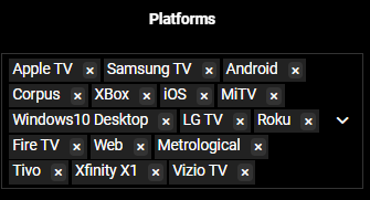
Platform | Select the platforms on which you want to display this tray. By default, the tray will be displayed on all platforms. |