- Print
- DarkLight
- PDF
Article summary
Did you find this summary helpful?
Thank you for your feedback
VL Landscape Tray
Trays or tray modules are containers to add contents into.
You can use the VL Landscape Tray to populate content objects into a landscape mode tray.
 VL Landscape Tray: 3.2 number of displayed items on Web
Adding a VL Landscape Tray

- To add a VL Landscape Tray, assuming that you are already on the page for editing as in this screenshot above, click Add Modules on top.
- From the Add a New Module panel, type the tray name on the search bar.
- Drag and drop it into the required page.
Customizing the VL Landscape Tray
If you click on the module settings, you will see the following options.
| Screen element | Description |
|---|---|
| Title | Title of the tray. |
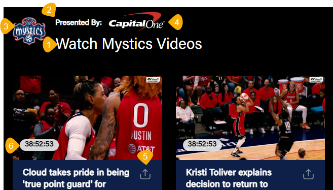
| Sub Title | (Optional) Provide a tray sub-title. |
| Tray Icon URL | (Optional) Provide the absolute URL for the Icon. Example: "https://image.exampletv.com/images/2023/09/23/icon.png?impolicy=resize&w=&h=" Provide the "w" and "h" as 2400 (px). |
| Sponsorship Logo URL | (Optional) Provide the absolute URL for the sponsorship logo of a partner. |
 1. Title of the tray 2. Sub Title 3. Tray Icon 4. Sponsorship Logo 5. Enable Sharing 6. Content Duration 1. Title of the tray 2. Sub Title 3. Tray Icon 4. Sponsorship Logo 5. Enable Sharing 6. Content Duration | |
| Content Settings | |
| Content Selection | Programmatically Generate: Fetch the contents into a tray by selecting Title or Recently Added in the Fetch Strategy option. Manually Curate: Search the CMS and add the published content objects into the tray. |
| Content Type | Select "Any" in the drop-down to add any content type you want to the tray, or select a specific type. |
| Layout Settings | |
| Thumbnail Type | Select 16:9 as the image aspect ratio for the Landscape tray. Make sure that an image thumbnail of 16:9 is present in the content detail page for the object curated here. |
| Enable Sharing | (Optional) Select the flag to add a share icon and allow social sharing of tray contents. |
| Show Content Duration | (Optional) Select to show video duration on the thumbnails. |
| Thumbnail Placement | Center the thumbnail placement to the left, top, or right. Recommended setting: left. |
| Show Parallax Image | Enable this toggle to apply a background image to a tray. This setting applies to all trays in the Template Builder except the Featured tray. Use the parallax image URL fields for Web, OTT, Apps, and Tab to maintain the correct image aspect ratio to apply the correct image aspect ratio depending on the platform type. |
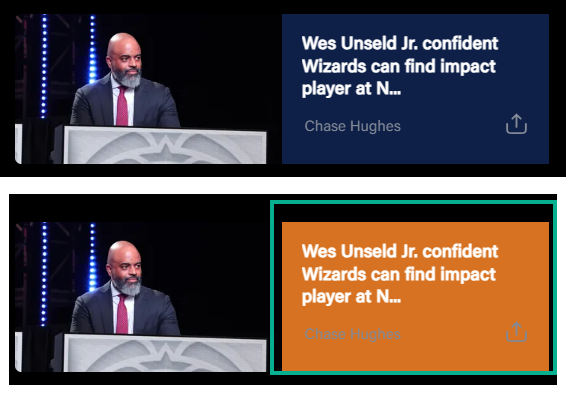
| Text Background Color | (Optional) Customize text background color on Articles (this feature is intended for use on Article content trays). |
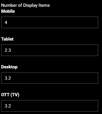
Number of Display Items | Set the number of tiles to show in the initial load without swiping the tray. Note that this setting applies to desktop, mobile web, and OTT and does not apply to mobile apps, as the number of thumbnails displayed will vary depending on the screen size of the device. |
| Show More | Add a Show More button at the end of a tray, clicking on it will redirect you to the category page configured in the Show More Permalink field. |
| Show More Permalink | Add the URI of the category page. Example, /category/wizards, /category/drama, etc. |
| Load items vertically on mobile | (Optional) Stack the tray items vertically on mobile apps. |
| Brand | (Optional) Expand the chevron icon and customize the following elements at a tray-level when necessary: - Tray Title Color - Watch Time Completed Color - Watch Time Background Colora |
| Localisation | |
| Labels | Customize the global UX copy at a tray-level. The text is otherwise fetched from Generic Messages. |
| Font Settings (Optional) | |
| Item 1, Item 2, Item 3, etc. | Set custom fonts per platform as necessary. Click on the +ADD button to open up an Item form for platform-wise configuration. |
| Select Platform(s) | Select the platforms to apply the custom font settings. |
| Title | Apply custom font for the tray title. Font Size: Type the font size into the text box. Example, 24px. Font Weight: Select the font weight from the preset. Example: Bold. |
| Subtitle | Apply custom font for the tray subtitle. Font Size: Type the font size into the text box. Example, 18px. Font Weight: Select the font weight from the preset. Example: Medium. |
| Tray Item Title | Apply custom font for tray item title. Font Size: Type the font size into the text box. Example, 14px. Font Weight: Select the font weight from the preset. Example: Regular. |
| Platform | Select the platforms on which you want to display this tray. By default, the tray will be displayed on all platforms. |
Was this article helpful?
.png)
