- Print
- DarkLight
- PDF
Subnavigation Configuration
Introduction
This user guide provides step-by-step instructions for configuring Sub Navigation within the application. Users will learn how to log in, navigate through the settings, add sub-items, and publish their changes. This guide aims to enhance user experience by streamlining navigation.
Overview
Sub Navigation is crucial for organizing content and improving user navigation within the application. This guide outlines the procedures for adding sub-navigation items, setting permissions, and managing icons, ensuring effective navigation management.
Prerequisites
Before proceeding, ensure you have:
Access to the tools and AppCMS.
Adequate permissions to modify settings.
Familiarity with existing icons and navigation structures.
Steps/Instructions
1. Login to Tools
Navigate to the Tools login page.
Enter your credentials and click Login.
2. Login to AppCMS
Access the AppCMS through tools.

AppCMS Section
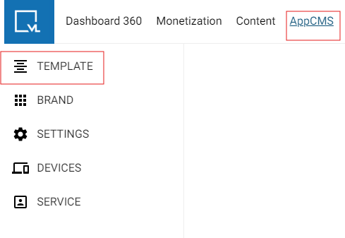
3. Click on Template Builder
Click Template Builder under AppCMS section.
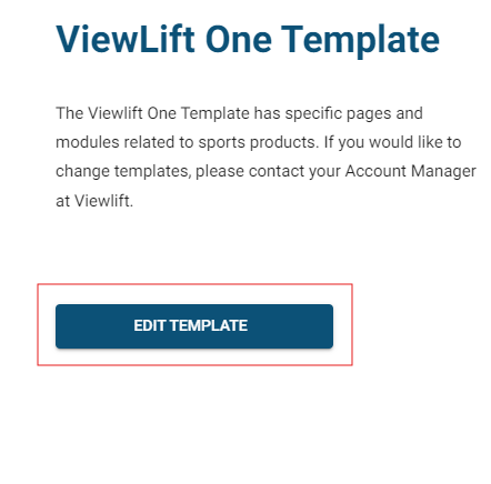
Select Edit Template to modify the desired template.

Template Builder
4. Global Settings
After accessing the Template Builder, navigate to Global Settings.
Review the current settings to understand the existing configuration.
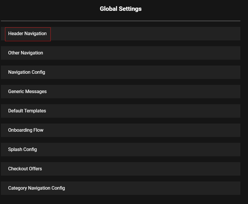
5. Header Navigation
Click on Header Navigation to view the current navigation structure.
Familiarize yourself with the layout and existing items.

Global Settings
6. Teams Section
Navigate to the Teams section from the main menu.
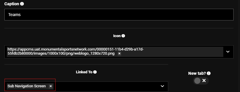
In the Teams section, input Sub Navigation Screen in the Linked To field.

Teams Section Page
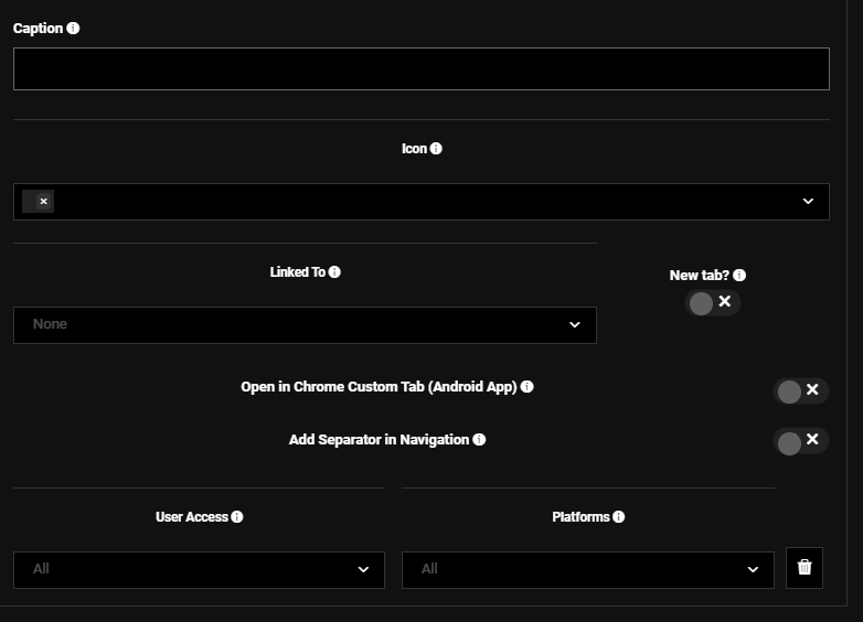
Click on + ADD SUB ITEM to create a new sub-navigation item

7. Complete the Required Fields
Fill out the following fields as part of the sub-navigation setup:
Caption: Enter a descriptive title for the sub-navigation item.
Icon: Choose or upload an icon that will represent the sub-navigation item.
Linked To: Specify the destination URL where users will be directed when they click on this item.
New Tab: Select this option if you want the link to open in a new tab.
Add Separator in Navigation: Check this option if you want to include a visual separator in the navigation menu.
User Access: Set permissions to control who can view or interact with this navigation item.
Platforms: Choose the specific platforms or areas within the system where this navigation item will be accessible.

Sub Navigation Setup Page
📖 Important Information:
In the Icons field, you can select existing icons or add new icons via a URL link.
Sub Navigations
Sub Navigations refer to sections or subsections that fall under the main navigation.
ADD SUB ITEM
The ADD SUB ITEM button allows you to add new items under any navigation or sub-navigation.
Linked To Field
Specify the Destination URL in the Linked To field, which directs users to the appropriate location when the navigation item is clicked.
User Access
Set User Access permissions to determine who can view or interact with the navigation item.
Platform
Choose the specific Platform or area within the system where the navigation item will be accessible.
New Tab
The sub-navigation will redirect to a new tab when clicked.
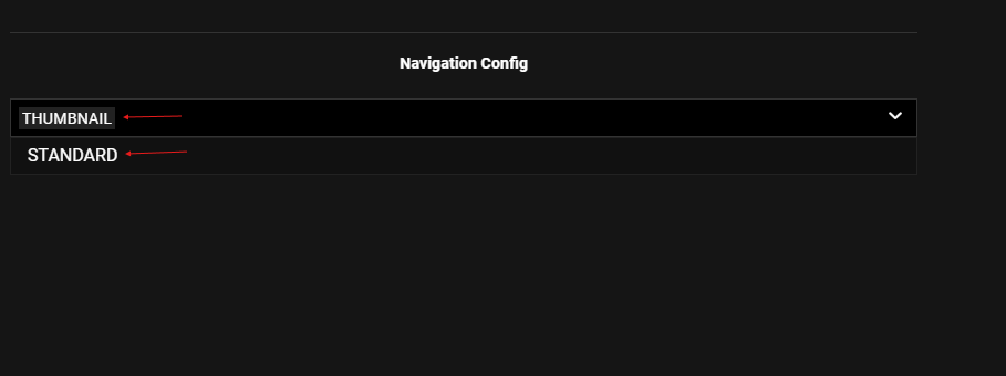
Navigation Config Feature
Under Navigation Config, you can select between Standard and Thumbnail Navigation.
Standard Navigation: Displays items in a list format.
Thumbnail Navigation: Utilizes images or thumbnails for a more visual approach.

Navigation Config Settings
Publishing Settings
After configuring your settings, click PUBLISH ALL to apply all changes.
Adding Thumbnail Sub Navigation Types
To add a thumbnail icon:
Search for the relevant page under the Pages section.
Click on Settings.
Go to the Thumbnail Type section.
Choose Thumbnail Types
Select from the following available Thumbnail Types for your sub-navigation:
3×4: A portrait layout that is taller than it is wide, ideal for displaying vertical images.
16×9: A widescreen format commonly used for videos, offering a balanced aspect ratio suitable for various content types.
1×1: A square format that is versatile and works well for icons or images where equal height and width are desired.
32×9: An ultra-wide format that is great for panoramic images, providing a cinematic feel to your thumbnails.
9×16: A vertical layout perfect for mobile displays, often used for stories or content intended to be viewed on smartphones.
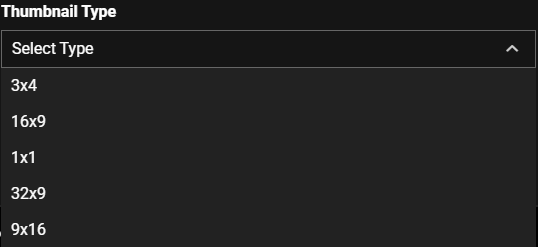
Thumbnail Types
Select the desired thumbnail type or click ADD THUMBNAIL.
Finally, click Publish Page to make the page live.

📄 Notes
Double-check all links to ensure they direct to the correct location before publishing.
Review user access settings to avoid unauthorized access to navigation items.
Ensure icons and URLs are correct for a seamless user experience.
FAQ
Q1: What should I do if I cannot see the ADD SUB ITEM option?
A: Ensure you have the necessary permissions to modify navigation settings. Contact your administrator if you lack permissions.
Q2: How can I verify that my changes have published successfully?
A: A confirmation message will appear after clicking PUBLISH ALL. You can also check the live application to confirm your changes.
Q3: Can I edit an existing sub-item?
A: Yes, navigate to the specific sub-item you wish to edit, make the necessary changes, and click PUBLISH ALL.
Troubleshooting Steps
🔰 If you encounter issues saving or publishing changes, try refreshing the page and attempting again.
🔰 Clear your browser cache if the application does not reflect the latest changes.
🔰 If the problem persists, check for system-wide outages or issues.
Contact Support
If you encounter any issues or have questions, please reach out to our support team:
1. Contact Information
Email: techsupport@viewlift.com
Phone:
US: +1-800-859-0420
UK: +44-203-014-8921
2. Support Hours
B2C (Business to Consumer): Monday to Friday
B2B (Business to Business): 24/7 support available
.png)

