1. Introduction
The Brand section in AppCMS allows you to manage the visual identity of your platform across various devices and platforms, including web, mobile apps, and OTT. This guide will help you navigate and utilize the different features available in this section.
2. Prerequisites
Before accessing the Brand section, ensure you meet the following requirements:
Access to the Tools interface.
Ensure devices/platforms for the client are selected under the Device section.
3. Configuring Platform-Specific Settings
Customize settings for specific platforms or apply default settings across all platforms.
Ensure Device Selection:
Make sure you have selected the devices/platforms for the client under the Devices section.
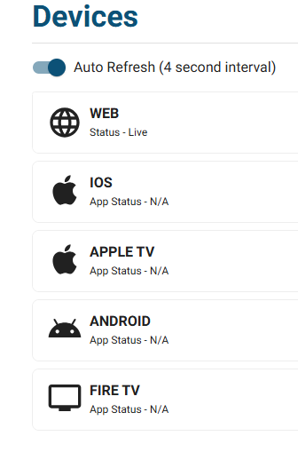
Device Selection Settings
NOTE:
In the Configuring Platform-Specific Settings section, you’ll find an Auto Refresh toggle. This toggle allows for automatic updates to be displayed across platforms without manual refreshing.
Turn On the Auto Refresh toggle if you want platform changes to appear instantly for end users as updates are made.
Turn Off the Auto Refresh toggle if you prefer to review and finalize all changes before, they are visible to users.
4. Accessing the Brand Section
Learn how to log in to the Tools interface and navigate to the Brand section in AppCMS.
Log in to Tools:
Open your web browser and navigate to the Tools login page.
Enter the desired credentials and log in.
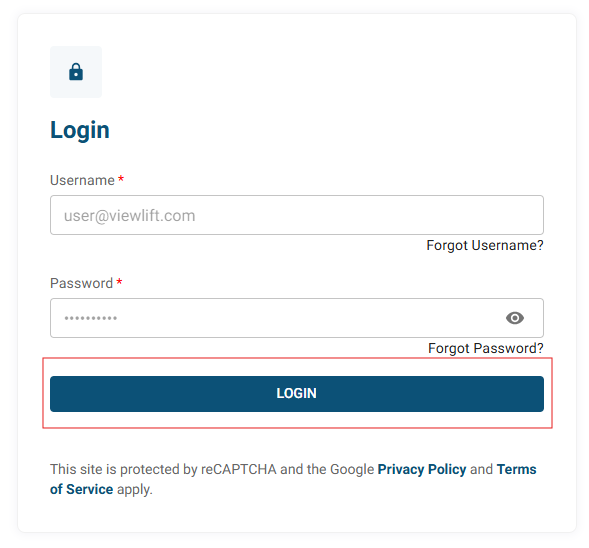
Login Page
Navigate to Tools:
From the dashboard, click on the AppCMS option.
Select Brand Section: Click on the Brand section in the AppCMS menu.
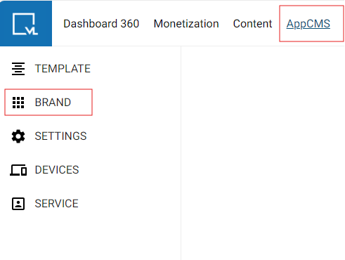
5. Branding Overview
The Brand section in AppCMS consists of three main sub-sections that allow you to manage your platform's visual identity effectively. These sub-sections are:
Theme
Logos & Icons
Version History
1. Theme
The Theme sub-section enables you to customize the overall look and feel of your platform. You can choose from predefined themes or create a Custom Theme that reflects your brand's identity.
Available Themes:
Sky Theme
Fire Theme
Custom Theme
2. Logos & Icons
The Logos & Icons sub-section provides options to upload and manage various logos and icons used across your platform. This includes logos for desktop and mobile views, favicons, and icons for notifications.
Example:
Upload Options:
Desktop Logo: Upload a high-resolution logo for desktop viewing.
Mobile Logo: Ensure your mobile logo is optimized for smaller screens.
Favicon: Upload a small icon that appears in browser tabs.
3. Version History
The Version History sub-section allows you to track and manage changes made to your branding settings. You can view previously published versions, making it easy to revert to earlier configurations if needed.
Example:
Version Details:
Published At: 15 Oct 2024
Published By: John Dev
Action Taken: Updated primary colors for the Call-to-Action buttons.

6. Themes Overview
AppCMS provides three themes:
Sky Theme: A fresh blue aesthetic.
Fire Theme: A vibrant red and orange palette.
Custom Theme (currently in use): Tailored branding as per the platform's needs.
NOTE:
When using the Custom Theme, you can tailor your platform's branding to meet specific needs. This flexibility allows you to customize colors, fonts, and other visual elements to align with your unique brand identity.
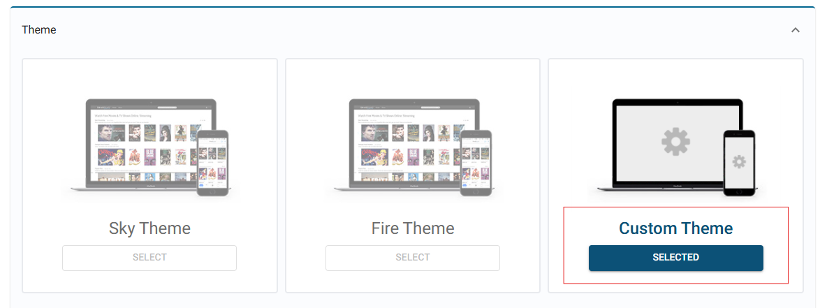
Settings for Web, Apps, and OTT
Use Default Toggle:
If this toggle is turned ON, all settings (colors, fonts, etc.) will be identical across web, mobile apps, and OTT platforms.
If you wish to customize the settings for mobile apps and OTT separately from the web, turn the Use Default toggle OFF. This will allow you to manually adjust all settings for both Apps and OTT according to your preferences.
7. Meta Data
Meta Data settings control how content details are displayed to users, such as publish dates, authorship, and hover states.
Display Duration: Toggle to show or hide the duration for which content is displayed.
Display Publish Date: Toggle to show or hide the date when the content was published.
Display Author: Toggle to show or hide the author of the content.
Display Hover State: Toggle to enable or disable hover effects on content elements.

Meta Data Settings
8. Player Settings
Player settings customize the appearance of the video player on your platform, including the color and style of the progress bar.
Progress Bar Background Color: Set the background color of the progress bar (e.g., white).
Progress Bar Color: Set the color of the progress indicator (e.g., yellow).

Player Settings
9. Tray Glow
Customize the glow effect on trays to enhance visual appeal.
Tray Glow Toggle: Enable or disable the glow effect on trays.
Tray Glow Color: Choose the color for the glow effect (e.g., yellow).

Tray Glow Settings
10. Font Family
Choose the typography for your platform’s text to maintain brand consistency and readability.
Font Family Options: Select the font family for text elements, such as Cabin or Titillium Web.

Font Family Options
11. General Settings
Customize the overall appearance of your platform by setting default colors for various elements like backgrounds, text, links, and shadows.
Background: Set the main background color (e.g., black).
Text: Choose the default text color (e.g., white).
Link: Set the color for hyperlinks (e.g., yellow).
Link Hover: Choose the hover color for links (e.g., red).
Page Title: Set the color for the main page title (e.g., white).
Block Title: Set the color for block titles (e.g., white).
Box Shadow: Choose the color for box shadows (e.g., grey).
Page Skeleton Color: Set the background color for page skeletons (e.g., grey).
Banner Background Color: Set the background color for banners (e.g., white).

General Settings
12. Call-to-Action (CTA) Settings
Define the appearance of primary and secondary CTA buttons on your platform to guide users towards important actions.
Primary CTA: Customize the main action button with colors (e.g., yellow background, black text).
Primary Hover: Set hover styles for the primary CTA (e.g., yellow background, white text).
Secondary CTA: Customize the secondary action button (e.g., black background, yellow text).
Secondary Hover: Define hover styles for the secondary CTA (e.g., grey background, white text).

CTA Settings
13. Navigation
Personalize the colors for your navigation bar, including background, links, and hover styles, to enhance user experience and consistency.
Background: Set the background color for the navigation bar (e.g., black).
Link: Customize link colors (e.g., yellow background, yellow text).
Link Hover: Set hover styles for navigation links (e.g., red background, white text).
Link Active: Define styles for active links (e.g., yellow background, yellow text).
Dropdown Link: Set the background and text colors for dropdown links (e.g., black background, white text).
Dropdown Link Hover: Define hover styles for dropdown links (e.g., white background).
Dropdown Link Active: Set styles for active dropdown links (e.g., black background, maroon text).
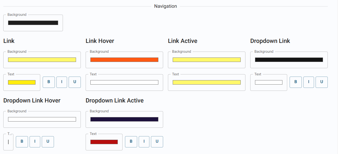
Navigation Settings
14. Footer
Customize the footer area of your platform to match the overall branding and provide a consistent user experience.
Background Color: Set the footer background color (e.g., black).
Text Color: Choose the text color for footer elements (e.g., white).
Text Links: Set the color for links in the footer (e.g., grey).
Link Hover: Define hover color for footer links (e.g., white).
Link Active: Set the color for active footer links (e.g., yellow).

Footer Settings
15. Text Box
Text boxes are customizable fields where users can input data. You can adjust their appearance for regular use, hover states, and error conditions.
Default Text: Set the background color for default text boxes (e.g., white).
Text Box Hover: Define the hover state for text boxes (e.g., white).
Text Box Error: Set the background color for error states in text boxes (e.g., yellow).
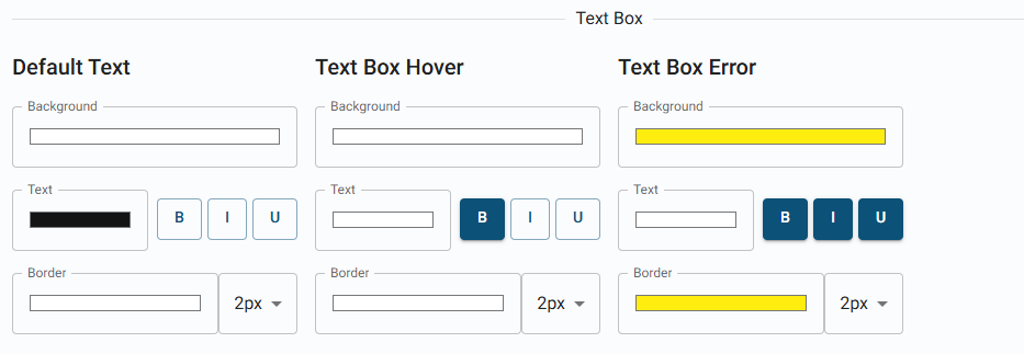
Text Box Settings
16. Event States
Customize the color coding for live, upcoming, default, and past events to make it easy for users to identify the event status.
Live: Set the color for live events (e.g., blue).
Pre: Define the color for upcoming events (e.g., yellow).
Default: Set the default color for events (e.g., black).
Post: Define the color for past events (e.g., black).
Live Text Color: Set the text color for live events (e.g., black).
Pre Text Color: Define text color for pre-events (e.g., black).
Default Text Color: Set the default text color (e.g., grey).
Post Text Color: Define text color for post-events (e.g., grey).
Losing Team Color: Set the color for losing team indicators (e.g., grey).

Event States Settings
17. Error Page
Customize the background and gradient colors for error pages to provide a visually distinct experience when users encounter issues.
Background Color: Set the background color for error pages (e.g., black).
Gradient Color: Choose a gradient color for error backgrounds (e.g., grey).

Error Page Color Settings
18. Monetization CTA
Monetization CTA settings allow you to define the look of call-to-action buttons related to subscription or payment options.
Primary CTA: Set styles for the primary monetization call-to-action (e.g., yellow background, black text).
Primary Hover: Define hover styles for the primary monetization CTA (e.g., yellow background, white text).
Secondary CTA: Customize the secondary monetization CTA (e.g., grey background, grey text).
Secondary Hover: Set hover styles for secondary CTAs (e.g., grey background, white text).
More Options CTA: Define styles for additional options CTA (e.g., black background, white text).
More Options Hover: Set hover styles for more options (e.g., grey background, white text).
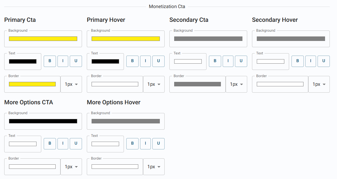
Monetization Cta Settings
Banner Colors
The Banner Color section allows you to define the appearance of various banners that are displayed on your web, app, or OTT platforms.
Error Color: Used for banners that indicate an error or issue (e.g., failed actions, invalid inputs, or technical problems) (e.g., White).
Success Color: Used for banners that confirm successful actions (e.g., successful form submissions or saved settings) (e.g., White).

Banner Color Settings
19. Logos & Icons
Control the appearance of banners used to communicate important messages, such as errors or successes, across your platform.
Procedure:
Click +SELECT AND UPLOAD to upload relevant media for each platform

Desktop Logo: Upload logo for desktop view.
Mobile Logo: Upload logo for mobile view.
Desktop Loader: Set a loading graphic for desktop.
Mobile Loader: Set a loading graphic for mobile.
Placeholder Poster: Upload a placeholder poster with a specific background color.
Placeholder Cover: Upload a cover image with a specific background color.
Placeholder 1X1: Upload a 1x1 aspect ratio placeholder with a specific background color.
Favicon: Upload the small icon displayed in browser tabs.
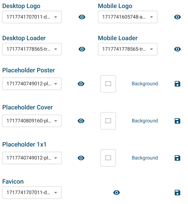
Logos, Loaders & Placeholders
Mobile App Icon: Set the app icon for mobile applications.
Notification Icon: Upload the icon used in push notifications.
OTT App Icon: Define the icon for Over-the-Top (OTT) platforms.
Mobile Splash Screen: Upload the splash screen for mobile applications.
Mobile Splash Screen Video: Upload a video for the mobile splash screen.
OTT Splash Screen Video: Upload a video for the OTT splash screen.
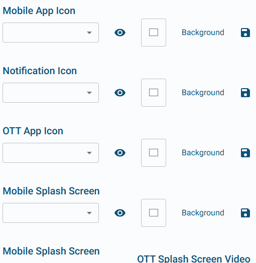
Icons & Splash Screen Upload
AppleTV Top Shelf: Upload images for AppleTV's top shelf display.
No Internet Connection Graphic: Design an image for no internet connection scenarios.
Monetization Badge: Visual indicator that highlights premium content options on your platform.
Transparent Loader: Upload a transparent loader graphic for ongoing processes.
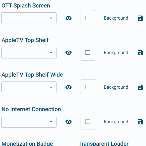
AppleTV & Other Graphics Upload
20. Version History
Access and review the history of published versions in the Brand section.
Click on the Version History Section:
Under the Brand section, select the Version History tab.
View History Details:
You can see a list of published versions with details such as:
Published At: Date and time of publication.
Published By: User who published the version.
Action: Actions taken during publication.

Version History Tab
21. Saving Your Work
Finalizing Your Changes
Click Save: After making changes in any section, always remember to click the Save button.
Confirmation: A confirmation message will appear indicating that your changes have been saved successfully.

22. Product Branding Asset List
1. Android
Built Assets | Size |
logo.png | 512 x 512 |
icon_logo.png (svg preferable) | 56 x 42 (for top bar) |
ic_notification.png (svg preferable) | 512 x 512 |
background_image.png | 414 x 896 |
placeholder_cover.png | 1920 x 1080 |
placeholder_poster.png | 1080 x 1920 |
subscription_badge.png (svg preferable) | 15 x 15 |
ic_launcher_108.svg | 108 x 108 (with viewport 108 x 108) |
2. Video Assets
Video Assets | Size |
login_video.mp4 | 1080 x 1920 (not more than 8 - 10 MB, 3 - 4 secs max, 9:16) |
splash_video.mp4 | 1080 x 1920 (not more than 8 - 10 MB, 3 - 4 secs max, 9:16) |
splash_landscape_video.mp4 | 1920 x 1080 (not more than 8 - 10 MB, 3 - 4 secs max, 16:9) |
3. GIF Assets
GIF Assets | Size |
loader.gif | 300 x 300 |
loader_transparent.gif | 300 x 300 |
4. Store Listing Assets
Asset Name | Size | Resolution/Aspect Ratio | Media Format |
App icon | up to 1MB | 512 x 512 | PNG/JPEG |
Feature Graphics | up to 15MB | 1024 x 500 | PNG/JPEG |
Phone Screenshots (8 images) | up to 8MB | ratio of 9:16 or 16:9 (min 320px, max 3840px) | PNG/JPEG |
7-inch tablet screenshots (8 images) | up to 8MB | ratio of 9:16 or 16:9 (min 320px, max 3840px) | PNG/JPEG |
10-inch tablet screenshots (8 images) | up to 8MB | ratio of 9:16 or 16:9 (min 1080px, max 7680px) | PNG/JPEG |
Android/Fire TV screenshots | up to 8MB | ratio of 9:16 or 16:9 (min 320px, max 3840px) | PNG/JPEG |
Chromebook screenshots | up to 8MB | ratio of 9:16 or 16:9 (min 1080px, max 7680px) | PNG/JPEG |
5. Apple TV Assets
Assets | Size | Dimensions | Comments |
Splash Video Landscape | 1 MB | 1920 x 1080 (mp4) | Not more than 5 sec |
Create Account/Onboarding Video | 5-7 MB | 1920 x 1080 (mp4) | Should not exceed size |
Navigation App Logo Topbar | 1x, 2x, 3x dimension | 1x1 Resolution (png) [max width 200] | |
Placeholder Cover Landscape | 1x, 2x, 3x sizes | 1920 x 1080 (png) | |
Placeholder Cover Portrait | 1x, 2x, 3x sizes | 1080 x 1920 (png) | |
Placeholder Cover Square | 1x, 2x, 3x sizes | 1024 x 1024 (png) | |
Top Shelf Image Wide | 1x, 2x | 2320 x 720 (png) | |
Top Shelf Image | 1x, 2x | 1920 x 720 (png) | |
App Icon | 1x, 2x | 1920 x 1080 (png) | |
Splash Launch Image | 1x, 2x | 1920 x 1080 (png) |
6. Fire TV + Android TV Assets
Build Assets | Dimensions |
Banner Logo | 160 x 90 |
240 x 135 | |
320 x 180 | |
480 x 270 | |
640 x 360 | |
App Icon | 80 x 80 |
120 x 120 | |
160 x 160 px | |
240 x 240 px | |
320 x 320 px | |
Logo Icon | 68 x 44 |
100 x 100 | |
Placeholder 1 x 1 | 200 x 200 |
Placeholder landscape | 630 x 354 |
Placeholder portrait | 709 x 1080 |
Placeholder Featured | 630 x 354 |
Videos | "Landscape video (MP4) Onboarding (10-20 sec, max 10 MB) Splash (3-5 sec, max 2 MB) Loader gif" |
7. App Store Assets
Asset Name | Size |
App Icon | 512 x 512 |
114 x 114 | |
1280 x 720 | |
Background Image | 1920 x 1080 |
Promotional Image (Optional) | 1024 x 500 |
Featured content logo (Optional) | 640 x 260 |
Featured content background (Optional) | 1920 x 720 |
8. Smart TV Assets
Assets | Dimensions | Size |
icon-130x130.png | 130 x 130 | <100 KB |
AppLogo.png | 400 x 400 | <200 KB |
AppLogo.png | 1280 x 1280 | <200 KB |
AppLogo.png | 1920 x 1080 | <200 KB |
placeholderCover.png | 1600 x 900 | <200 KB |
placeholder32x9.png | 2048 x 576 | <200 KB |
placeholderPoster.png | 900 x 1600 | <200 KB |
placeholder3x4.png | 900 x 1200 | <200 KB |
placeholder4x3.png | 1600 x 1200 | <200 KB |
placeholder1x1.png | 1080 x 1080 | <200 KB |
largeIcon.png | 117 x 117 | <100 KB |
icon.png | 70 x 70 | <100 KB |
SplashLogo.png | 429 x 152 | <100 KB |
splashAppLogo.png | 200 x 106 | <100 KB |
GIF File for loader | 200 x 200 | <100 KB |
selectedTeam.png | <100 KB | |
TVODLogo.png | <100 KB | |
authenticationScreenVideoOTT.mp4 | <5 MB | |
splashVideoOTT.mp4 | <2 MB, 2-4 secs |
9. LG Store Logo
Assets | Dimensions | Size |
LG store Icon (png) | 400 x 400 | <300 KB |
10. Samsung Store Assets
Assets | Dimensions | Size |
App Icon with transparent background (png) | 1920 x 1080 | <500 KB |
App Icon background Image (without app logo) (png) | 1920 x 1080 | <500 KB |
App Icon (png) | 512 x 423 | <500 KB |
11. Roku TV Assets
Assets (PNG) | Format | Dimensions |
Channel icon FHD | PNG | 540 x 405 |
Channel icon HD | PNG | 290 x 218 |
Transparent app logo | PNG | 68 x 44 |
Splash logo with transparent background | PNG | 208 x 208 |
Individual image frames of loader GIF | PNG | 128 x 128 |
Personalization tick background | PNG | 78 x 73 |
Checkbox Off (solid fill) | PNG | 56 x 56 |
Checkbox On (solid fill) | PNG | 56 x 56 |
Checkbox Off (transparent fill) | PNG | 32 x 32 |
Checkbox On (transparent fill) | PNG | 32 x 32 |
Checkbox Off (transparent fill) Unfocused state | PNG | 32 x 32 |
Checkbox On (transparent fill) Unfocused state | PNG | 32 x 32 |
Toggle switch on | PNG | 44 x 24 |
Toggle switch off | PNG | 44 x 24 |
Login video | MP4 | 1920 x 1080 |
Splash video | MP4 | 1920 x 1080 (1-2 MB, 3 sec length) |
12. Web Assets
Assets | Size | Dimensions |
For all the images | Under 1 MB | |
Desktop logo | 32:9 | |
Fab Icon | under 10 KB | 64 x 64 |
loader.gif | 300 x 300 | |
loader_transparent.gif | 300 x 300 | |
Monetisation badge | Square image | |
Category Icon | Under 1 MB | "32:9, 1:1, 16:9" |
Tips and Best Practices
Consistency: Ensure that your branding elements are consistent across all platforms to maintain a unified brand identity.
High-Quality Assets: Use high-resolution images and logos to ensure clarity and professionalism.
Preview Changes: Always preview your changes before finalizing to ensure that they appear as expected.
Regular Updates: Keep your branding elements up to date to reflect any changes in your brand’s identity.
Troubleshooting Common Issues
🔰 Issue: Changes Not Saving: Ensure you have a stable internet connection and try refreshing the page.
🔰 Issue: Incorrect Display of Logos: Check the file format and resolution of uploaded logos.
🔰 Issue: Color Changes Not Appearing: Clear your browser cache or refresh the page to see updated styles.
FAQ
Q1: What file formats are required for logos and images?
A: Supported formats include PNG and JPEG. For SVG files, it's preferable for icons and logos.
Q2: What are the size limitations for video assets?
A: Video files should not exceed 10 MB for login and splash videos, with a maximum duration of 3-4 seconds for vertical videos (9:16) and up to 5 seconds for horizontal videos (16:9).
Q3: How many phone screenshots can I upload?
A: You can upload up to 8 screenshots for each device type, with each image having a maximum size of 8 MB.
Q4: Are there specific dimensions for app icons?
A: Yes, app icons should be 512 x 512 pixels, with additional sizes of 80 x 80, 120 x 120, and more for various platforms.
Q5: What is the maximum file size for feature graphics?
A: Feature graphics can be up to 15 MB in size, with dimensions of 1024 x 500 pixels.
Q6: Can I use GIFs for loading animations?
A: Yes, you can use GIFs for loading animations, with a recommended size of 300 x 300 pixels
Q7: How should I format the placeholder images?
A: Placeholder images should be in PNG format, with specified dimensions like 1920 x 1080 for landscape and 1080 x 1920 for portrait.
Q8: What are the requirements for the subscription badge?
A: The subscription badge should preferably be in SVG format and sized at 15 x 15 pixels.
Q9: Is there a limit on the number of video assets I can upload?
A: Yes, you should limit video uploads, ensuring that each video meets the specified size and length requirements.
Q10: How often should I update my branding assets?
A: It is advisable to regularly review and update your branding assets to ensure they align with your current branding strategy and platform requirements.
User Roles and Permissions
Admin Roles: Administrators have full access to all branding features and settings.
Editor Roles: Editors can make changes but may have limited access to sensitive settings.
Viewer Roles: Viewers can only see branding configurations without the ability to make changes.
22. Glossary Table
Term | Definition |
|---|---|
AppCMS | A content management system (CMS) that allows managing content, branding, and settings for apps across web, mobile, and OTT. |
Brand Section | A section within AppCMS for configuring the visual identity of a platform, including logos, colors, and themes. |
Tools Interface | The main interface used to access and manage different AppCMS sections, including brand and platform settings. |
Devices/Platforms | Refers to the different formats where the app can be accessed, such as web, mobile, and OTT platforms. |
Use Default Toggle | A setting that enables applying the same configuration across all platforms or customizing each platform individually. |
Theme | A predefined or custom visual style applied to the platform, including colors, fonts, and layout. |
Sky Theme, Fire Theme | Predefined visual themes available in AppCMS, each with distinct colors and design styles. |
Custom Theme | A user-defined theme that allows full customization of colors, fonts, and other branding elements. |
Logos & Icons | Visual assets representing the brand, including desktop and mobile logos, favicons, and notification icons. |
Version History | A log of previous branding configurations, enabling users to track and revert to earlier versions if needed. |
Meta Data | Information displayed with content, like publish dates and authorship, often used to enhance search and user interaction. |
Player Settings | Configurations for the video player’s appearance, including the progress bar’s colors and style. |
Tray Glow | A visual effect applied to content trays, which can enhance visibility and emphasize certain content. |
Font Family | A selection of fonts used across the platform, contributing to brand consistency and readability. |
General Settings | Controls for the overall appearance of the platform, including colors for text, backgrounds, links, and shadows. |
Call-to-Action (CTA) Settings | Configuration options for primary and secondary buttons that guide users to important actions. |
Navigation | The interface element that allows users to browse the platform, including customizable colors and link styles. |
Footer | The bottom section of the platform, where colors for text and links can be customized to match branding. |
Text Box | An input field where users enter data, with configurable colors for normal, hover, and error states. |
Event States | Color settings indicating event statuses, such as live, upcoming, and past events. |
Error Page | A page that displays when an error occurs, with customizable background and gradient colors for brand consistency. |
Monetization CTA | Buttons related to payment or subscription options, designed to stand out for easy user identification. |
Banner Colors | Configurable colors for informational banners, such as success or error messages, enhancing visual communication. |
Placeholder | Temporary images used when actual content is unavailable, with options for covers, posters, and different aspect ratios. |
Loader | An animated graphic indicating that content is loading, helping users understand that a process is ongoing. |
Splash Screen | An initial screen displayed when an app loads, often used for branding with customizable logos or videos. |
Top Shelf (AppleTV) | A dedicated display space in the Apple TV interface, showcasing featured app content. |
Transparent Loader | A loader image without a background, allowing it to blend with the platform’s interface. |
Admin, Editor, Viewer Roles | User access levels within the platform, ranging from full administrative rights to view-only access. |
Preview Feature | A tool to view changes made to the branding settings before finalizing, ensuring accuracy and consistency. |
Cache Refresh | The process of clearing stored web data in a browser to display the latest updates on a platform. |
23. Contact Support
If you encounter any challenges or have questions:
Email: techsupport@viewlift.com
Phone (US): +1-800-859-0420
Phone (UK): +44-203-014-8921
Support Hours:
B2C: Monday to Friday
B2B: 24/7