- Print
- DarkLight
- PDF
Add a Multi-Image Carousel Module
1. Overview
The Multi-Image Carousel module in the AppCMS Template Builder allows you to create engaging and dynamic carousels with multiple images. This article will walk you through the step-by-step process of adding a Multi-Image Carousel to your template.
2. Prerequisites
Before we begin, make sure you meet the following requirements:
Access to AppCMS Template Builder.
Edit permissions for the desired template.
Images for the carousel with a 32:9 or 16:9 aspect ratio.
3. Access Template Builder
Follow the steps outlined below to access the Template Builder:
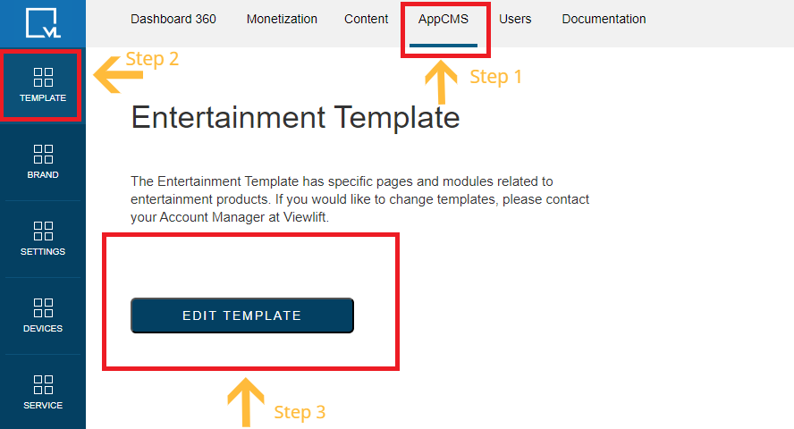
Click AppCMS in the main menu.
Select Template Builder from the dropdown.
Click Edit Template for the template where you want to add the Multi-Image Carousel.

Access Template Builder
4. Navigate to Modular Pages
Once you are in the Template Builder, proceed with the following steps for navigating Modular Pages:
In the Template Builder, click on Modular Pages.

Modular Pages Navigation Click Add Modules in the top menu.

Add Modules
5. Add Multi-Image Carousel Module
Refer to the steps provided below to add the Multi-Image Carousel Module within Modular Pages:
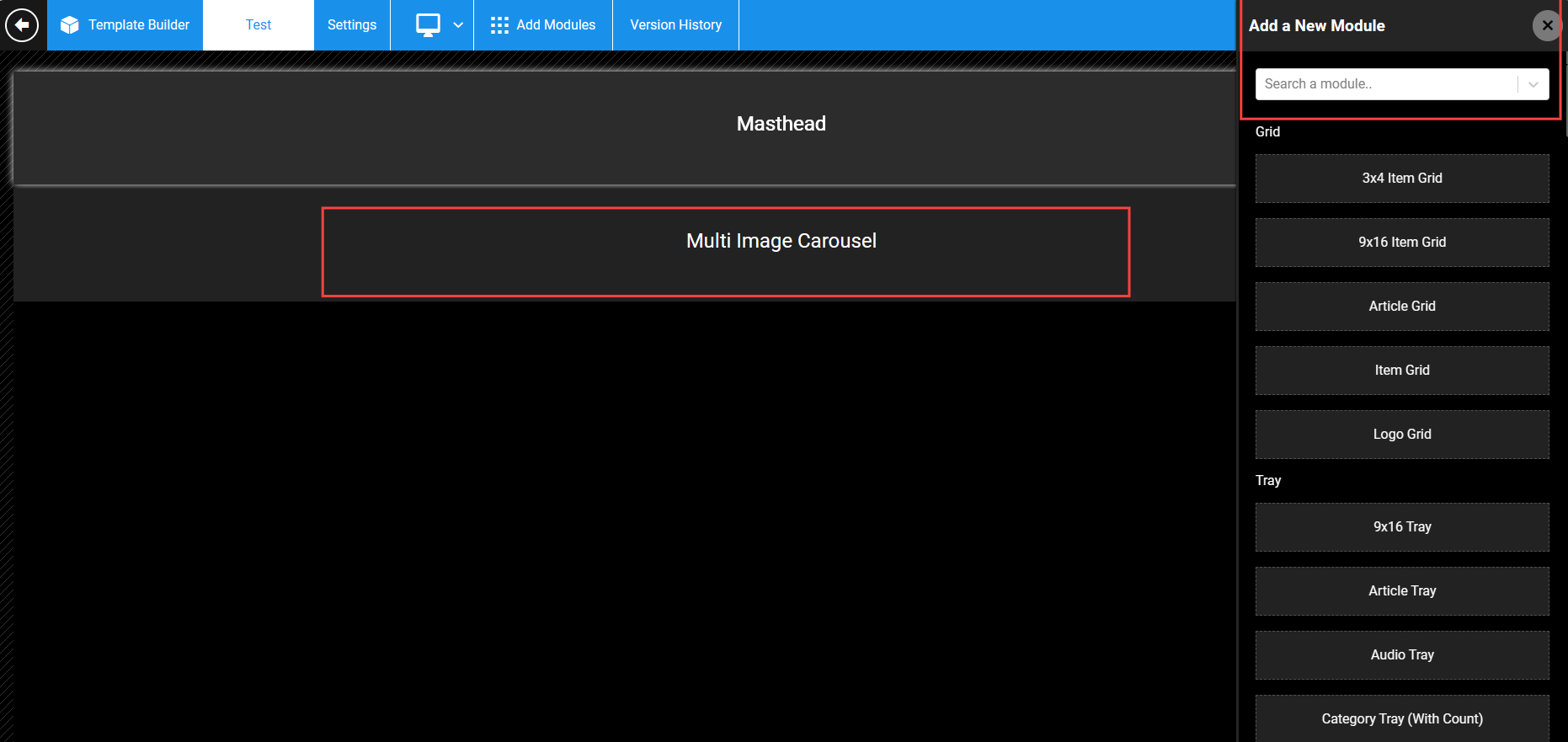
A new module bar will appear on the right. Use the search bar to find the Multi-Image Carousel module.
Drag the Multi-Image Carousel module onto the screen.
NOTE:
Users have the option to either create a Multi-Image Carousel within an existing modular page or create a new page to incorporate the image carousel module.
6. Configure Carousel Settings
Once the carousel module is added, you can edit its settings by following these steps:
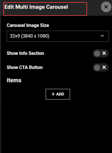
Click on the settings icon on the Multi-Image Carousel module.
Below the Carousel Image Size, you will find two toggles:
Show Info Section: Toggle to display information about carousel items.
Show CTA Button: Toggle to display a Call-to-Action button.
NOTE:
Toggle both if you want to display the Info Section and CTA buttons on the carousel.
7. Add Items to Carousel
Follow the steps below to add items to the carousel:
Click the +ADD button to add items to the carousel.
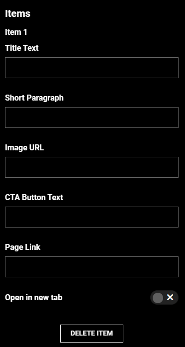
Enter information in the following fields for each item:
Title Text:
Short Paragraph
Image URL
CTA Button Text
Page Link (Redirects to a landing page)
Toggle the Open in New Tab switch if you want the page link to open in a new tab.
Repeat the above steps to add multiple items.

Add Items
8. Publish Changes
After completing all the steps, follow the instructions below to publish the changes:
After configuring the Multi-Image Carousel, click the Publish button in the top right corner to save your changes.

9. Website Carousel Preview
Once you have added items to your carousel and configured its settings, you may want to preview how it will appear on your website's frontend. Here's how you can do it:
Save Changes: Before previewing, ensure that you have saved any changes made to your carousel settings and added items.
Navigate to Preview Mode: Go to the preview mode or preview your template changes on your website's CMS platform.
Locate Carousel Module: Locate the section of your webpage where you have added the multi-image carousel module.
View Carousel: Observe how the carousel appears on your webpage. You should see each item displayed with the provided title, description, image, and CTA button.
Test Functionality: Click on the CTA buttons to ensure they redirect users to the specified landing pages correctly. Verify that the carousel operates smoothly and displays as expected.
Alert
Ensure that all page links added to the carousel are functional and lead to relevant landing pages. Broken links can negatively impact user experience and website credibility.
10. Checklist for Effective Carousel Implementation
✅ User-Friendly Interface: The multi-image carousel module offers a user-friendly interface, allowing easy addition and customization of carousel items through a straightforward process.
✅ Versatility: Users can integrate the carousel module into both existing modular pages and new pages, providing flexibility in its application.
✅ Interactive Preview: The ability to preview the carousel on the website's frontend ensures users can assess its appearance and functionality before publishing.
✅ Efficient Content Addition: The use of the +ADD button simplifies the process of adding items to the carousel, making content creation and management efficient.
✅ Responsive Design: The carousel is designed to be responsive, ensuring optimal display and functionality across various devices and screen sizes.
✅ Customization Options: Users can tailor each carousel item by specifying title text, short paragraphs, image URLs, CTA button text, and page links, allowing for a personalized and engaging user experience.
.png)

