Context
The existing Content Details page had grown into a single, monolithic React component exceeding ~2000 lines.
It handled:
- UI layout
- content-type branching
- data fetching and autosave logic
- rendering of dozens of conditionally loaded sections
- content-type–specific business rules
This resulted in:
- Extremely high cognitive load when making changes
- Frequent regressions when adding or modifying content types
- Widespread
if (contentType === …)checks scattered across the page - Tight coupling between UI, content taxonomy, and backend GraphQL enums
- Poor extensibility and near-zero local reasoning (small changes required global understanding)
A decision was needed to stop incremental patching and instead redesign the Content Details page in a way that:
- scales with new content types and sections
- avoids conditional rendering logic in the page itself
- allows progressive migration without breaking production
- clearly separates “what is shown” from “how it is rendered”
Decision
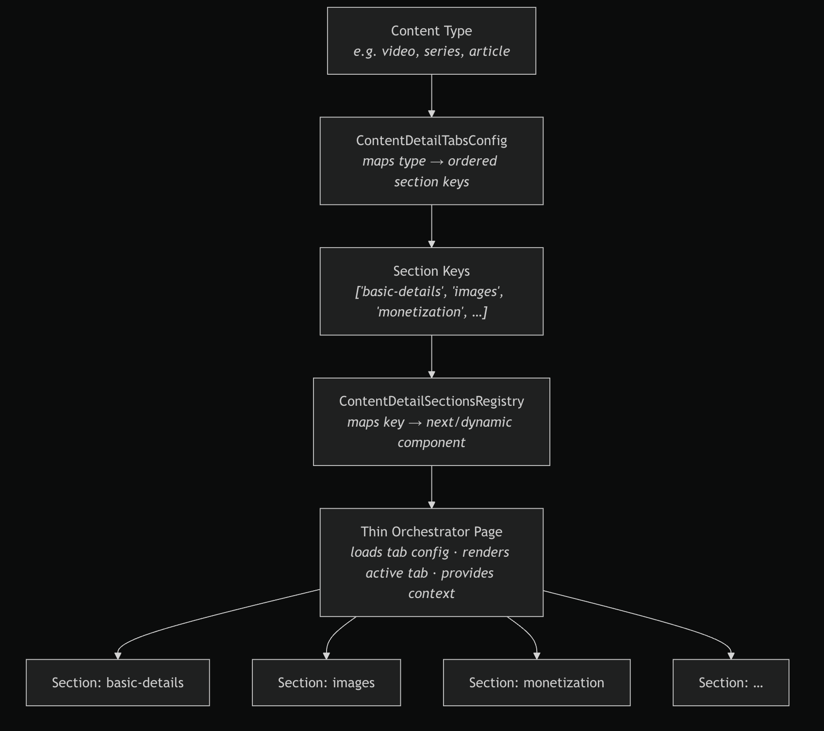
The Content Details page will be re-architected as a modular, registry-driven detail page with the following principles:
-
Section-based architecture
- The page is composed of independent, self-contained sections (e.g.
basic-details,images,monetization). - Each section owns its own UI and form logic.
- Sections never check
contentTypeand never import other sections.
- The page is composed of independent, self-contained sections (e.g.
-
Central Section Registry
- A single
ContentDetailSectionsRegistrymaps section keys to dynamically loaded section components. - Section keys are derived directly from the registry (
keyof typeof Registry) to ensure type safety and alignment. - All sections are loaded via
next/dynamicwithssr: false.
- A single
-
Declarative Tabs Configuration
- A
ContentDetailTabsConfigdefines, per content type, the ordered list of sections to render. - Tabs config uses section keys from the registry and contains no rendering logic.
- Content type → sections mapping is explicit and readable.
- A
-
Thin Orchestrator Page
-
The main Content Details page is responsible only for:
- loading the correct tab config
- rendering the active tab
- providing shared page context
-
No content-type branching or section-specific logic exists in the page.
-
-
react-hook-form for Form State
- Formik is replaced with
react-hook-formto better support dynamic mounting/unmounting of sections and improve performance. - Sections register their own fields via shared form context.
- Formik is replaced with
This design intentionally decouples UI composition from backend transport concerns (e.g. GraphQL enums).
Consequences
Enables
- Adding a new section without modifying existing sections or the main page
- Adding or reordering sections for a content type via configuration only
- Lazy-loading heavy sections for improved performance
- Safer, incremental migration from the legacy page
- Local reasoning: most changes are confined to a single section folder
Restricts
- Sections cannot directly depend on other sections
- Content-type–specific behavior must be expressed via configuration, not conditionals
- Some duplication of small UI patterns across sections is accepted to preserve isolation
Trade-offs
- Slightly higher upfront structural complexity
- Requires discipline to prevent reintroducing conditional logic
- Page logic is no longer colocated in a single file, requiring navigation across modules
These trade-offs were accepted to significantly reduce long-term maintenance cost and regression risk.
Notes
- This ADR establishes the architectural foundation; individual sections will be migrated incrementally.
- Content type keys are intentionally not hard-coupled to GraphQL enums, as backend support varies.
- Future ADRs may extend this pattern to other large modules/pages.
- A key invariant to preserve:
If a section needs to know the content type, the architecture is being violated.